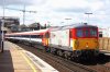
It's not even finished!
I quite enjoy graphic design, and studied it for a while; rail liveries do tend get my critical mind working. Rail liveries, due to the way they are applied to fairly geometric shapes, suit simplicity.
The new EC livery is awful. In fact, the grey version is a miniscule amount more palatable to my eye; I've never liked shiny silver for anything. The purple band looks so out of place and uncomplimentary, and the logo looks like it was designed by someone like me who studied graphic design briefly. The scheme doesn't seem to compliment the rolling stock at all.
SouthEastern has such a menagerie of colour schemes that it's hard to keep on top of them. The Networker design with the solid dark blue underframes look possibly the worst of the lot, it's a bit overwhelming seeing a dark rich colour in such amounts. The white/yellow is alright, personally, but is starting to look a bit tired.
DB Schenker red. It looks too "pink" when new, it's actually quite hard on the eyes. It's a nice simple scheme however, and looks ten times better once covered in a few thousand miles of grime, softening the red.
SWT inner suburban on the 455's. Like an explosion in the Art Attack poster paint store room.
Top liveries however; include NSE, Railfreight (the logos for each subsector were a fantastic idea, the pinnacle was probably the revised RfD Channel Tunnel livery with the dark blue/grey upper band), RES, FGW "Dynamic Lines" (probably get slated for that), the short lived Network Rail blue/white/red and Intercity Swallow.