• Our new ticketing site is now live! Using either this or the original site (both powered by TrainSplit) helps support the running of the forum with every ticket purchase! Find out more and ask any questions/give us feedback in this thread!

Worst livery on a UK train?

Status
Not open for further replies.

mallard

Established Member
Joined
12 Apr 2009
Messages
1,304
The current Northern livery, it's the wrong way round! The lines should go along the bodyside, not off the front of the train! It would look very nice (a little NSE-esque) if it were the "correct" way round.

Any livery that's predominately white. It looks cheap, unfinished and is virtually impossible to keep clean, so the trains always look dirty. SouthEastern (and their Connex predecessors) are worst at this.
 
Sponsor Post - registered members do not see these adverts; click here to register, or click here to log in
R

RailUK Forums

colchesterken

Member
Joined
12 Oct 2010
Messages
768
NXEA plain white .I know they have to keep it nondescript for when the Dutch take over but I hated the original NX branding
Trains should be plain Green ( BR EMU ) or plain Red with a stripe ( 60 s BR ) but that is me trying to relive the great days of British trains
 

bocaj

Member
Joined
23 Aug 2011
Messages
79
Location
Leeds
I don't know that much about liveries but the NSE Livery is not very nice.
 
Last edited:

trentside

Established Member
Joined
14 Aug 2010
Messages
3,391
Location
Messroom
I'm not at all keen on the National Express livery - looks far too bland. The same can be said for the East Coast colours.
 

Schnellzug

Established Member
Joined
22 Aug 2011
Messages
2,926
Location
Evercreech Junction
of course, people always say that everything today isn't as good as the Old days, but really, I do have to say that plain overall very dark green (as, for instance, Class 37s when new) was even duller than Rail Blue, and that's saying something.
Though to be fair, Rail Blue looked a lot- slightly better on some classes than others.
 

Martin nx

Member
Joined
15 Jun 2011
Messages
77
Location
North Walsham, Norfolk.
The "One" livery with the refresher stripes on the ends of the stock was really awful, and someone got paid to come up with it! scandalous. The new DB red traffic livery is nasty as well, to garish by far as someone else said.
 

Hydro

Established Member
Joined
5 Mar 2007
Messages
2,204
It's not even finished!

I quite enjoy graphic design, and studied it for a while; rail liveries do tend get my critical mind working. Rail liveries, due to the way they are applied to fairly geometric shapes, suit simplicity.

The new EC livery is awful. In fact, the grey version is a miniscule amount more palatable to my eye; I've never liked shiny silver for anything. The purple band looks so out of place and uncomplimentary, and the logo looks like it was designed by someone like me who studied graphic design briefly. The scheme doesn't seem to compliment the rolling stock at all.

SouthEastern has such a menagerie of colour schemes that it's hard to keep on top of them. The Networker design with the solid dark blue underframes look possibly the worst of the lot, it's a bit overwhelming seeing a dark rich colour in such amounts. The white/yellow is alright, personally, but is starting to look a bit tired.

DB Schenker red. It looks too "pink" when new, it's actually quite hard on the eyes. It's a nice simple scheme however, and looks ten times better once covered in a few thousand miles of grime, softening the red.

SWT inner suburban on the 455's. Like an explosion in the Art Attack poster paint store room.

Top liveries however; include NSE, Railfreight (the logos for each subsector were a fantastic idea, the pinnacle was probably the revised RfD Channel Tunnel livery with the dark blue/grey upper band), RES, FGW "Dynamic Lines" (probably get slated for that), the short lived Network Rail blue/white/red and Intercity Swallow.

 
Last edited:

Schnellzug

Established Member
Joined
22 Aug 2011
Messages
2,926
Location
Evercreech Junction
I'm not really sure if I can share the enthusiasm for Res; it's not so much the colours themselves, (the plain red & grey on 47s looked quite effective, I think), but the overly fiddly details with the logo. Same, I think, with the pale two-tone grey version of Railfreight; the colours themselves were bland, and the logos were too fiddly. I think they were both designed by the same agency, who did seem to be rather fond of getting a bit pretentious on the marketing speak.
 

Spaceflower

Established Member
Joined
13 Jul 2007
Messages
1,506
Grand central! especially when it crawls along the coast and the side window comes down and the drivers mate pops out an uzi......
 

Hydro

Established Member
Joined
5 Mar 2007
Messages
2,204
I'm not really sure if I can share the enthusiasm for Res; it's not so much the colours themselves, (the plain red & grey on 47s looked quite effective, I think), but the overly fiddly details with the logo. Same, I think, with the pale two-tone grey version of Railfreight; the colours themselves were bland, and the logos were too fiddly. I think they were both designed by the same agency, who did seem to be rather fond of getting a bit pretentious on the marketing speak.

Both gave their individual divisions real identity, IMO. They were the culmination of BR actually trying to give itself a marketable identity throughout it's sectors. The Railfreight logos were far from fiddly, in my eyes. They were simple and conveyed a distinct identity as to what BR were doing with freight. No longer were trains anonymous in blue or variations thereof, or rather plain RF grey. The concept of the RES livery bordered on the pretentious, but the way it was implemented actually works for me. The red/grey was well broken up by the light blue flashes, which again, were hardly fiddly.
 

33056

Established Member
Joined
12 Nov 2007
Messages
2,424
Location
On a train somewhere in Europe
.......the colours themselves were bland, and the logos were too fiddly. I think they were both designed by the same agency, who did seem to be rather fond of getting a bit pretentious on the marketing speak.
You have reminded me of another dislike, unbranded Railfreight though I didn't mind it with the sub-sector makings.

The logos were very much a 1980s "style" thing; my father worked for an engineering firm which rebranded with very similar logos around the same time as the railfreight launch.
 

Burkitt

Member
Joined
16 Mar 2008
Messages
131
WAGN "we've pretty much given up" all over purple with peeling patches exposing bare metal. Particularly annoyed me as the trains wearing this livery replaced the 365s and refurbished 317s that had previously been more common on the routes I used.

Southeastern's current hotch-potch of liveries, with ever increasing amounts of oppressively dark blue.

First Dynamic Lines, City Lights etc - I like the patterns, but can't stand pink and purple on a train. They would look much better in grey and orange though - FGW 125 and FCC 319.

First Barbie - even worse, with terrible colours and a mess of curves, lines and fades.

East Coast dreary grey - if silver paint is too expensive, why design a livery using it in the first place?
 
Last edited:

Ivo

Established Member
Joined
8 Jan 2010
Messages
7,307
Location
Bath (or Southend)
'one' looked ridiculous, and its successor is bland. By contrast, and even I'm surprised I'm saying this, the old 321 livery under FGE was actually quite good. As for their 360s, the livery was all right but didn't suit them.

I was no fan of the old Connex livery; far too bland and dull. The same is true of the similar livery that used to adorn Merseyrail trains.

Also, although the modern 100% teal looks good, the old grey on ATW 158s was quite possibly dead last in terms of visual appeal!

I also don't particularly like the old livery on FGW 142s down in Exeter with the star. I forget whose livery it used to be :|

At the other end? NSE. Without doubt. Also IC125s under BR.
 

BestWestern

Established Member
Joined
6 Feb 2011
Messages
6,736
The obscure [Gatwick] 'Express' livery on the 442s. Looks absolutely bloody awful, totally the wrong design of scheme for the train, with that nasty solid diagonal line up the sides which completely clashes with the attractive, rounded styling of the cab ends. Just a total mess, 'designed' by somebody with absolutely no idea at all, and an insult to one of the few classes of multiple unit actually designed with some styling in mind! The scheme is an adaptation of the existing SWT livery as the units had mostly been freshly repainted prior to Southern having them, by why not keep something similar to the SWT 'swoop' effect rather than ruining it with a dirty great big straight line?! Just bloody awful! :(
 

Robinson

Member
Joined
1 Aug 2010
Messages
623
Location
Helensburgh
The livery with the gold star was First North Western.
I'd vote for that as the worst livery myself! Although I also don't like the National Express livery...
 

MK Tom

Established Member
Joined
31 Aug 2011
Messages
2,458
Location
Milton Keynes
The grey Arriva 158s are definitely the worst - they just look forgotten about and ruin the image of whatever line they're used on.

Northern Spirit was a pretty hideous livery in my opinion. I also found the colours in Midland Mainline's original HST/170 livery a bit unpleasant, but I liked their livery for the 222s.
 

RichW1

Member
Joined
9 Aug 2010
Messages
400
Location
Harrogate
If we took a whole mainline it would have to be the East Coast at the moment. I like the new livery but with the mess of different liveries going on there and with the open access operators, the uniformity is in a state! If it was a brand it would be a problem child for sure. As an over all mainline, with all those liveries, the ECML looks scruffy!
 

mallard

Established Member
Joined
12 Apr 2009
Messages
1,304
The scheme is an adaptation of the existing SWT livery

Are you sure about that? It's the same livery that was used on the 460s which have, so far, never worked for SWT. I agree that the livery does look somewhat Stagecoach-ish and it would be better if they had something more similar to the other Southern units though.
 

Schnellzug

Established Member
Joined
22 Aug 2011
Messages
2,926
Location
Evercreech Junction
Are you sure about that? It's the same livery that was used on the 460s which have, so far, never worked for SWT. I agree that the livery does look somewhat Stagecoach-ish and it would be better if they had something more similar to the other Southern units though.

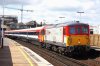
Yes, i think so. The remaining Gatwick Express loco, 73202, is in the same discordant clash of colours as well.
 

Attachments

  • 73202.jpg
    73202.jpg
    344.7 KB · Views: 55

sprinterguy

Veteran Member
Joined
4 Mar 2010
Messages
11,572
Location
Macclesfield
I feel moved to rise to the defence of Northern Spirit, North West Trains, GNER, Loadhaul, Rail Express Systems and the original Midland Mainline liveries which some other posters have berated: I think that those have been amongst the very best UK train liveries to have been designed (and Regional Railways, to a lesser extent).

GNER livery, particularly in its' original form, had an air of majesty about it, and Northern Spirit "Big N" and NWT Gold star liveries were both very bold and recognisable; far better than the generic, meaningless corporate schemes such as NatEx silver/white or First Group "barbie". And IMO, RES and Loadhaul liveries suited their locos like nothing that had gone before, although Trainload freight sub-sector wouldn't be far behind.
 

507 001

Established Member
Joined
3 Dec 2008
Messages
2,174
Location
Huyton
worst liveries?

Arriva trains merseyside has to be the top. The original regional rail version with the black stripe and painted doors was much nicer.
the new scotrail livery-What were they thinking?
DRS compass livery- tacky
never particularly liked NSE, too much like toothpaste.
New merseyrail silver. looked nice at first, but once its been through the wash a couple of times and graffitied it just looks scruffy. Its usually hanging off the trains, and in places where its been chipped away you can see rail blue underneath! Strip them right back to blue and grey and put merseyrail 69 logos back on them! :D


Best liveries?

Merseyrail regional rail, especially on a 150/2!
new ATW WAG livery, now thats just classy, suits the 158's so well!
GNER was nice.
Loadhaul
London Midland
but the nicest of them all, and the one I'm most sad to see go is the EWS livery.
 

BestWestern

Established Member
Joined
6 Feb 2011
Messages
6,736
Are you sure about that? It's the same livery that was used on the 460s which have, so far, never worked for SWT. I agree that the livery does look somewhat Stagecoach-ish and it would be better if they had something more similar to the other Southern units though.

Yes, the 442 sets were still being given fresh paint jobs even though SWT had decided they no longer wanted them, something to do with the existing lease agreements I believe. It was fortunate for Southern that the SWT livery was similar in essence to the existing GatEx scheme, and they were able to just modify it a bit. Had they stuck with something swoopy over the cab ends they'd look far better, but sadly they thought the straight line paintjob that worked on the previous 'Darth Vader' units would also go on a Wessex, which it doesn't. I agree that they'd look lovely in Southern's house livery.
 
Status
Not open for further replies.

Top