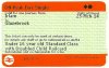
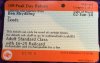
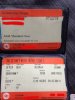
Fascinating results today.
FGW guard number 1 looked at the ticket and said it was a receipt. Then it sunk in and he said he had never seen or heard of such tickets before, but stamped it and handed it back anyway.
FGW guard 2 was very shocked. He did know of the ticket redesign and recalled the brief about them being trialled 'somewhere up North' which he implied had been quite some time ago. He said he never thought he would see one. He checked my return portion too and commented it was good that there was a neat little space in which to stamp, so the usual inky mess had the potential to come out legible rather than stuck on top of the ticket's own printing. He also commented the writing could be made a bit bigger or more spaced out.
--- old post above --- --- new post below ---
Next was SWT guard 1 who was lovely and expressed interest in my tickets and really liked the fact they had the reserved train printed on them which he thought would help his passengers and 'save us both a lot of aggro when people lose or 'loose' the reservation or ticket'.
He didn't seem to have heard that a redesign was taking place, but this didn't dampen his enthusiasm. I mentioned Northern and he said "Well if THEY can do it then we definitely can!" Which I thought rather telling!
SWT guard 2 was clearly aware of the redesign and seemed almost to have taken ownership of it . He clearly thought I'd gotten it from a SWT Machine. He was nonplussed by the mention of the Northern trial. Suggests that Parkeon's products for SWT may be reconfigured now / coming soon? Dunno!
--- old post above --- --- new post below ---
Finally Virgin RPI intially recated with "Whoaaa now" sor of thing, but then clicked and thanked me. The VT guard and I had a brief chat about the new design because whe whwn I passed My tickets her initial comment was "Ooh, now what do you think of these new tickets?" Her main thought was that the fewer coupons passengers were required to carry and organise the better, less important the design, as this would benefit both them (less likely to lose) and her (quick to check, less likely to be errors).
To all the staff who chatted to me about it we all kind of agreed that they are an improvement but need a bit more development in that overlapping writing should never appear, and having them print a bit bigger might be preferable. I think it just goes to show how many aspects to this there are to be considered!
I'd like to thank everyone I spoke to, who gave me an interesting discussion, even though you'll never read this