• Our new ticketing site is now live! Using either this or the original site (both powered by TrainSplit) helps support the running of the forum with every ticket purchase! Find out more and ask any questions/give us feedback in this thread!

New Ticket Design Launched

Status
Not open for further replies.

greatkingrat

Established Member
Joined
20 Jan 2011
Messages
3,291
In the Burley Park - Ilkley example, why not just print "not valid before 0930" on the ticket instead of the link to the NRE site?

Obviously not all restriction codes will fit on a ticket, but many of the simple ones will.
 
Sponsor Post - registered members do not see these adverts; click here to register, or click here to log in
R

RailUK Forums

ModernRailways

Established Member
Joined
21 Apr 2011
Messages
2,180
In the Burley Park - Ilkley example, why not just print "not valid before 0930" on the ticket instead of the link to the NRE site?

Obviously not all restriction codes will fit on a ticket, but many of the simple ones will.

That would be too simple.
 

kieron

Established Member
Joined
22 Mar 2012
Messages
3,276
Location
Connah's Quay
In the Burley Park - Ilkley example, why not just print "not valid before 0930" on the ticket instead of the link to the NRE site?

Obviously not all restriction codes will fit on a ticket, but many of the simple ones will.
Or rather "not valid before 09:30 Monday-Friday" on the outbound ticket (the page for the code doesn't mention bank holidays anyway), and nothing at all on the return.

I wonder if the line about only being usable at certain times is on tickets which are usable at any time in either direction, such as an off-peak Burley Park-Wigan return.
 
Last edited:

John @ home

Established Member
Joined
1 Mar 2008
Messages
5,148
Last edited:

swt_passenger

Veteran Member
Joined
7 Apr 2010
Messages
34,259
...And why does the above not stress the ticket is invalid without the railcard? It says about single usage and time restrictions. There's plenty of room.

They just need to add two words 'Only valid...'

Or would people say that wasn't good enough cos it didn't explicitly say it had to be present...

"Only valid with XXX Raicard" would fit OK

"Only valid with accompanying XXX Railcard" might start getting too much...

--- old post above --- --- new post below ---

...oh and what about route information. Is it deemed to be 'any permitted' unless shown otherwise - because on the recent example there is nothing shown in that area at all.
 
Last edited:

John @ home

Established Member
Joined
1 Mar 2008
Messages
5,148
what about route information. Is it deemed to be 'any permitted' unless shown otherwise
It appears so. NRCoC Condition 13 defines the route(s) a passenger is entitled to take. Condition 13(c) defines “permitted routes”. Condition 13(d) then tells us that “the use of some tickets may be restricted” in certain circumstances and that “these restrictions will be shown on the ticket”.

In the absence of any such restriction shown on the ticket, a ticket is valid by any “permitted route”.
 
Last edited:

Crossover

Established Member
Joined
4 Jun 2009
Messages
9,493
Location
Yorkshire
As for the date, why not just have the month written in full? Again, there's the room.

I suspect it is consistency. A fixed length field is always going to more desirable than one that can alter - March may not be so bad, but the likes of November are quite lengthy - in such a case every print would have to be designed around being able to fit the longest version of text in the space, which would de detrimental to other aspects.

In the Burley Park - Ilkley example, why not just print "not valid before 0930" on the ticket instead of the link to the NRE site?

Obviously not all restriction codes will fit on a ticket, but many of the simple ones will.

Consistency - that is an easy restriction, but the majority are much more complex. Unless you're going to have A4 tickets that fit all the longest restriction codes on, it is a better solution to have the code - this is an improvement on the old format where it was kind of hidden away!
 

John @ home

Established Member
Joined
1 Mar 2008
Messages
5,148
I was wondering about ... the line (This Off-Peak ticket can only be used at certain times, for details ask staff or go to nationalrail.co.uk/
Code:
[/I]). Do you happen to know whether it's included or not?[/QUOTE]Sorry, no.
 

jon0844

Veteran Member
Joined
1 Feb 2009
Messages
30,871
Location
UK
They just need to add two words 'Only valid...'

Or would people say that wasn't good enough cos it didn't explicitly say it had to be present...

"Only valid with XXX Raicard" would fit OK

"Only valid with accompanying XXX Railcard" might start getting too much...

...oh and what about route information. Is it deemed to be 'any permitted' unless shown otherwise - because on the recent example there is nothing shown in that area at all.

I'd simply make it absolutely clear, without any shadow of a doubt, that a railcard ticket is only valid with a valid railcard being held (and worded so it's clear that you have it with you, not that you just have one).

I think it would be better to word it to say it is 'invalid without carrying a valid railcard with you' or similar. Far less ambiguous.

And the same for advance tickets, where it's made clear that the ticket is invalid unless used on the booked service.

I think saying a ticket will be rendered invalid is perhaps better and might make people take more notice.

More importantly, clearer wording (whatever it might be) will help staff... both arguing at the time, and also stopping people claiming it's so unfair to have been made to buy a new ticket. It will be harder for someone to go moaning on Facebook about being stung when their ticket said it was invalid without a railcard.

I suspect it is consistency. A fixed length field is always going to more desirable than one that can alter - March may not be so bad, but the likes of November are quite lengthy - in such a case every print would have to be designed around being able to fit the longest version of text in the space, which would de detrimental to other aspects.

As long as it's right justified, I would have thought it would be okay (but I might be wrong as I've not seen every possible combination).

The rest of the ticket design seems fairly dynamic in how it can lay things out.

It's not a massive problem, and I'd rather more time spent on better descriptions on validity etc.

 
Last edited:

bb21

Emeritus Moderator
Joined
4 Feb 2010
Messages
24,452
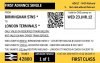
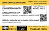
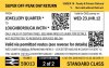
So how about something like this.

I made a few changes to a design I did a few years ago and incorporated some of the comments on here. I have only used two fonts, one large and one small, both roughly matching the current ones in use on RSP9599 stock but slightly larger, so in real life the same number of characters would fit.

That's about as well as I can do incorporating reservations onto the ticket itself.
 

Attachments

  • ADVANCE1.jpg
    ADVANCE1.jpg
    92.1 KB · Views: 262
  • WALKON1.jpg
    WALKON1.jpg
    87.7 KB · Views: 217
  • WALKON2.jpg
    WALKON2.jpg
    104.7 KB · Views: 216

greatkingrat

Established Member
Joined
20 Jan 2011
Messages
3,291
What are you intending to put on the back to explain the permitted routes? For long distance routes it will be impractical to list every route that could be used.
 

Starmill

Veteran Member
Joined
18 May 2012
Messages
27,215
Location
Bolton
[Routeing 'any permitted' absent from new tickets]

Could be a 'rod for their own back', then?

"It doesn't say I can't use this ticket via London, or wherever, so I must be able to..."

Could be an issue with the machine at BUY.

I've collected a ticket since the update which is in the old format but still has a missing route!
 

bb21

Emeritus Moderator
Joined
4 Feb 2010
Messages
24,452
What are you intending to put on the back to explain the permitted routes? For long distance routes it will be impractical to list every route that could be used.

The back of the ticket would contain a reference to the NRCoC.

For Any Permitted tickets, there is very little else I can think of.
 

bb21

Emeritus Moderator
Joined
4 Feb 2010
Messages
24,452
You could save a few characters by changing the time format from:

0959 hrs to 09:59

Yes, of course. I drafted this quickly so exact wordings can be improved.

I was more making a point about the layout and format.
 

transmanche

Established Member
Joined
27 Feb 2011
Messages
6,021
Yes, of course. I drafted this quickly so exact wordings can be improved.

I was more making a point about the layout and format.
Fair doos! :)

I think it looks a bit 'busy' overall, which makes it harder to visually scan than the 'official' design. For example; I don't think it's necessary to specify "Only valid on reserved trains below" and "Not valid on any other train service" - just the first line should suffice.

However, I would like to see the train number (e.g. XC6070) shown next to the date & time, in anticipation of more trains showing this info in future (and hopefully departure boards/announcements too)

Having two QR codes (presumably one that can be scanned by staff/gates and one for passengers to access restriction code/routeing information[*]) is clever, but could be confusing without explanation - perhaps an explanation could be on the pre-printed text on the reverse of the ticket?

* Did I read once about a potential project to replace mapped routes with a database that would hold details of all valid permitted routes between each pair of stations?
 

bb21

Emeritus Moderator
Joined
4 Feb 2010
Messages
24,452
I think it looks a bit 'busy' overall, which makes it harder to visually scan than the 'official' design. For example; I don't think it's necessary to specify "Only valid on reserved trains below" and "Not valid on any other train service" - just the first line should suffice.

It is a bit busy I have already noted. I am not exactly sure how many lines would fit on the ticket, so have underestimated that. It may be that there would actually be more space between lines. I just can't be sure. The only thing I can say is that the amount of text included in this example would definitely fit on the actual ticket.

I actually think it is easier to scan than the official one released. Advanced fares are distinguished through reverse print of the ticket type. Railcard information is listed in the top-right corner. The only two other important pieces of information are origin/destination and the days of validity which are both in large fonts.

Most importantly, the design is consistent across walk-on fares and Advance fares.

To be honest, I do struggle to think of a way to make it less cluttered while including all the information most people on this thread want.

However, I would like to see the train number (e.g. XC6070) shown next to the date & time, in anticipation of more trains showing this info in future (and hopefully departure boards/announcements too)

Yes, that would be a useful feature.

Having two QR codes (presumably one that can be scanned by staff/gates and one for passengers to access restriction code/routeing information[*]) is clever, but could be confusing without explanation - perhaps an explanation could be on the pre-printed text on the reverse of the ticket?

The top one is supposed to be for use by staff (barcode perhaps?). The bottom one is supposed to be for restrictions. They should look different. I just put two QR codes in because it's easy to do that. ;)

* Did I read once about a potential project to replace mapped routes with a database that would hold details of all valid permitted routes between each pair of stations?

Basemaps? Not going anywhere by the look of things I suppose.
 

transmanche

Established Member
Joined
27 Feb 2011
Messages
6,021
It is a bit busy I have already noted. I am not exactly sure how many lines would fit on the ticket, so have underestimated that. It may be that there would actually be more space between lines. I just can't be sure. The only thing I can say is that the amount of text included in this example would definitely fit on the actual ticket.

I actually think it is easier to scan than the official one released. Advanced fares are distinguished through reverse print of the ticket type. Railcard information is listed in the top-right corner. The only two other important pieces of information are origin/destination and the days of validity which are both in large fonts.
I think it's a pretty good effort overall and does have some advantages over the official design (especially the consistent layout).

(Apologies if I seemed a bit over-critical. I've spent too many years working in software and having to write (and re-write) the text in step-by-step wizards, trying to make it simple, informative and comprehensive, suitable for both experts and novices - but also not too 'busy'! :D)
 

ModernRailways

Established Member
Joined
21 Apr 2011
Messages
2,180
So how about something like this.

I made a few changes to a design I did a few years ago and incorporated some of the comments on here. I have only used two fonts, one large and one small, both roughly matching the current ones in use on RSP9599 stock but slightly larger, so in real life the same number of characters would fit.

That's about as well as I can do incorporating reservations onto the ticket itself.

Why don't you work for ATOC :P

A lot easier to read, and the information is clear to the passenger.

I'm not sure how train guards inspect tickets, but I would presume they only skim read certain parts that aren't overly important and mainly check whether they are on the correct train/route, on the correct date and with a railcard (if applicable) the rest they aren't likely to care much about. For this, in the small box you put with the date, it might be an idea for Advance tickets that it would display the date/time and then the guard doesn't even have to look at reservations. It would speed up the ticket checking, and would be easier for a passenger. A specific seat isn't the main thing, the main thing should be getting the right train and having that in a larger font means it's more accessible and generally easier to view if just wanting to double check. The problem would be when you need to change trains somewhere, but there will always be some problems, maybe the time in the top right though would just be for the first train with text underneath saying 'See Reservations' or words to that effect.
 
Last edited:

Peter Mugridge

Veteran Member
Joined
8 Apr 2010
Messages
17,813
Location
Epsom
So how about something like this.

I made a few changes to a design I did a few years ago and incorporated some of the comments on here. I have only used two fonts, one large and one small, both roughly matching the current ones in use on RSP9599 stock but slightly larger, so in real life the same number of characters would fit.

That's about as well as I can do incorporating reservations onto the ticket itself.

Those are very good, but please don't give them any more ideas about putting fares up... £147 for a child super off peak return for that sector?!
 

Starmill

Veteran Member
Joined
18 May 2012
Messages
27,215
Location
Bolton
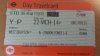
The ticket I was referring to earlier: is there something wrong here?
 

Attachments

  • 2014-03-23 15.37.25.jpg
    2014-03-23 15.37.25.jpg
    105.8 KB · Views: 258

MikeWh

Established Member
Associate Staff
Senior Fares Advisor
Joined
15 Jun 2010
Messages
8,561
Location
Crayford
The ticket I was referring to earlier: is there something wrong here?

No, that's an in-boundary standard travelcard. West Drayton could be any station within zones 1-6. It is valid anywhere within the zones apart from HS1 and Hayes-Heathrow
 

Starmill

Veteran Member
Joined
18 May 2012
Messages
27,215
Location
Bolton
Is it something related to West Drayton?
 

Attachments

  • 2014-03-23 18.30.46.jpg
    2014-03-23 18.30.46.jpg
    111.3 KB · Views: 167

Paul Kelly

Verified Rep - BR Fares
Joined
16 Apr 2010
Messages
4,227
Location
Reading
Didn't someone else (furlong perhaps?) already mention that, for ticket types that are still printed in the old APTIS-style layout from the upgraded Parkeon machines, the route field is now not shown if it is ANY PERMITTED. The large blank area on starmill's Travelcard certainly looks unusual, but this was common back in the day, e.g. as shown below:
aptis7.JPG
 

CyrusWuff

Established Member
Joined
20 May 2013
Messages
5,439
Location
London
Didn't someone else (furlong perhaps?) already mention that, for ticket types that are still printed in the old APTIS-style layout from the upgraded Parkeon machines, the route field is now not shown if it is ANY PERMITTED. The large blank area on starmill's Travelcard certainly looks unusual, but this was common back in the day

I know APTIS was outdated pretty much instantly, but I can't help feeling it'd be more suitable than a modern TIS at certain stations! Certainly more efficient for the most popular tickets, which you could issue with three or four button presses (destination, ticket type, discount, method of payment).
 

Hassocks5489

Member
Joined
2 Feb 2014
Messages
256
Location
Hove, Sunny Sussex by the Sea
Didn't someone else (furlong perhaps?) already mention that, for ticket types that are still printed in the old APTIS-style layout from the upgraded Parkeon machines, the route field is now not shown if it is ANY PERMITTED. The large blank area on starmill's Travelcard certainly looks unusual, but this was common back in the day, e.g. as shown below:
aptis7.JPG

Yep, on APTIS the convention was to leave the route field blank unless there was actually a route to display. It was only with the advent of New Generation systems that it became a mandatory field - i.e. if no route was specified, ANY PERMITTED would be shown. Interesting how on the remote-issue West Drayton ODTC we seem to have gone full circle!

Anyway, I am going to give my own feedback on the new design soon, but I have canvassed opinion from a colleague who kindly went to some of the stations last week and bought some for our respective collections, and here is what he had to say - this is particularly for the attention of northernman when he's around...


"I suspect much of the thinking behind the new design is to make life easier for those checking tickets and from that point of view the new design is good. What ticket checkers need to know is now clearly highlighted and what they do not need to know immediately has been moved to the perimeters of the ticket in a small font. I like the use of a sans serif font – many with impaired vision can have difficulty with serif fonts.

From the traveller’s point of view I suspect most won’t be bothered about the new design at all though the two lines beginning ‘This ticket....’ is an example of a lack of openness and clarity. Why not state what the validity restriction is, eg: ‘valid after 09.30 Mon – Fri, all day Sa – Su’. Only one line is needed rather than the two – isn’t it ATOC’s (or whoever) responsibility to make everything as clear as possible to the travelling public rather than blaming them for not having looked up the details of the validity on the National Rail website. It is possible that ticket checkers also are not too familiar with the wide variety of validities and it would be clear to them as well."


BTW, for those keeping a record (probably just me... :p) he got Glossop and Irlam on 21st March, but Hebden Bridge had still not been converted at that date.
 
Status
Not open for further replies.

Top