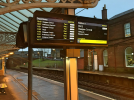
It’s amazing how many people just sit and stare at the screen (your top photo from the core), it’s almost like there is too much information and quite a lot of the public just cannot understand it.
Don’t ask me, I just stare in amazement at the public who cannot fathom it out.How is there too much information and can't be understood? It's got departure time, a list of stations and destination and expected time which are all fairly standard. What it has additionally to other (but not all) is a formation diagram and a scrolling message. It's just in a different layout (stops scrolling vertically instead of horizontally).
Don’t ask me, I just stare in amazement at the public who cannot fathom it out.
Definitely none at Tring. Can't recall at other stations I've passed through, but I don't think there are any.Might have been added at other south WCML stations
Definitely none south of Milton Keynes (furthest north I've been in a while)Definitely none at Tring. Can't recall at other stations I've passed through, but I don't think there are any.
I remember those CRTs. Impossible to read on a sunny day.Interesting to see things come full circle, when I first started using rail, screens based on color CRT monitors were the norm. Then we moved to LED dot matrix displays, now it seems we are moving back towards using monitors.
Depends entirely on the application. When I’m looking at specify technology for a station, if it’s exposed to the elements and has the potential for sun glare, you just can’t beat an LED full matrix screen. Under canopies, I’m a massive advocate of anti-glare coated portrait TFTs.Interesting to see things come full circle, when I first started using rail, screens based on color CRT monitors were the norm. Then we moved to LED dot matrix displays, now it seems we are moving back towards using monitors.
The GA ones are all style and no substance compared to what they replaced. Too much focus on being flashy with animations than there needs to be in many peoples opinion.
Some of the new-ish CIS screens at Greater Anglia stations are the smaller type, and mounted quite high up (with the screen at 90 degrees to the platform, not even angled) - I saw them at some stations between Tottenham Hale and Broxbourne. I imagine these would be very difficult to read from a distance!I think they could be better but they aren't awful in my view. Not as readable from a distance as LEDs, though.
There is a screen like in the image on post 2 at Derby on platform 2A. Seems a bit odd that just one has been done or is it like a trial?I believe EMR are retaining the Infotec screens (some stations have the new smooth scrolling white/orange LED screens) as well as ATOS Anne and TTS Acapela Rachel for their announcements.
I believe all screens at Derby are provided by Infotec. There are up to four different types of screens across all platforms. The reason for the huge variety is to simply ‘showcase’ their products, I believe.There is a screen like in the image on post 2 at Derby on platform 2A. Seems a bit odd that just one has been done or is it like a trial?
i feel the tfw one is nice but maybe showing loading if possible or facilities in each coach would be a nice touchAbellio is rolling them out at stations of all their TOCs - GA which is complete, EMR, WMT and ScotRail.
Then as you said above, Thameslink use them - a different type.
TfW have experimented with their own type in South Wales recently.
Don’t ask me, I just stare in amazement at the public who cannot fathom it out.
Probably just takes a bit of getting used to, or they’re reading the scrolling messsge: