• Our new ticketing site is now live! Using either this or the original site (both powered by TrainSplit) helps support the running of the forum with every ticket purchase! Find out more and ask any questions/give us feedback in this thread!

Great British Railways: Station identity and livery unveiling (09/12/25)

Status
Not open for further replies.

nilvaj395

Member
Joined
11 Oct 2025
Messages
217
Location
‎
Add a red curved sweep up after the dark blue on the current Northern livery and it'd look quite decent to be honest (the blue is already about right for the flag). Simple shapes work with brash colours.
@Bletchleyite I was literally about to suggest this too! I like the current Northern livery, and all it needs is a little more.

I am generally a fan of darker and colourful (not excessively white) liveries, so I would much like the idea of a Chiltern/Northern Rail 200 style livery, but that would also be a much better option. The goal is to hint and have a bit of class to things rather than scream a design in someone's face. I feel like this is something that the likes of ScotRail achieve a really good balance of.
 
Sponsor Post - registered members do not see these adverts; click here to register, or click here to log in
R

RailUK Forums

gswindale

Member
Joined
1 Jun 2010
Messages
1,028
The Scotrail livery works well because it is symmetrical and almost looks like a saltire between carriages.

This monstrosity of a livery has neither of these, which is a huge downside. I can't sort of visualise it being done on a 4/8 coach train to look vaguely sensible, but having a 3-2 split on the livery of a 5 car will just be odd

It would definitely be better if the flag-waving was kept to the driving units though.
 

b0b

Established Member
Joined
25 Jan 2010
Messages
1,371
The Swallow livery was understated and premium. It made our trains look like good, solid machines. This is a tacky, plasticky nightmare that just emphasizes the flimsy, uncomfortable nature of most of our trains these days.
the genius of the swallow logo was it was both understated and absolutely nailed the concept of fast and smooth travel. I don't see it ever being topped.
 

Sparks807Evo

Member
Joined
22 Aug 2010
Messages
464
This, this, and this - the new Chiltern livery is really good. I was also going to suggest the Northern Rail 200 livery (158903), with a splash of white or red (and with needless graphics removed), which might also work.
Thanks and agree with you on the Northern Rail 200 livery - another great starting point!

If you go with a bold colour - you either need to offset it with a fair amount of white with some swishes, go for a simple straight line design (so it doesn’t look messy) or go for similar colour palette for most of the colours with a small splash of the third etc.

Be interesting what AI would produce as an output :D
 

Sorcerer

Established Member
Joined
20 May 2022
Messages
2,132
Location
Liverpool
Absolutely not a fan of this livery. Much too busy and overbranded and does not compliment the shape of the trains whatsoever. I am fine with using the red, white and blue colour scheme, but it's application should've been more subtle and not so brash and in-your-face.

Personally I'd have kept dark blue as the base colour along with white doors and saved the red for the background of coach lettering and maybe for swooshes on the end of each train akin to the old Virgin livery or Northern 333 livery, and maybe have a long horizontal white line to run parallel beneath black window bands to break up the monotony of the dark blue base colour.
 

Elecman

Established Member
Joined
31 Dec 2013
Messages
3,578
Location
Lancashire
I wonder if they have the vinyls on the wrong way round on the second coach as it would look better reversed
 

Class 800

Member
Joined
5 Aug 2023
Messages
110
Location
London
Be interesting what AI would produce as an output :D
This livery looks AI generated. It’s just terrible that our beloved InterCity trains have to be defaced like this.

Even Avanti and LNER’s liveries now are miles nicer than this clunky, abysmally designed livery.

They could have brought Swallow back. They had the chance. If they wanted to appease the people who think Britain’s best days have been and gone the best thing would have been to bring back a strong symbol of those times.

I like our Union flag. I think this AI generated looking livery does it – and our trains – a great disservice.
 

nilvaj395

Member
Joined
11 Oct 2025
Messages
217
Location
‎
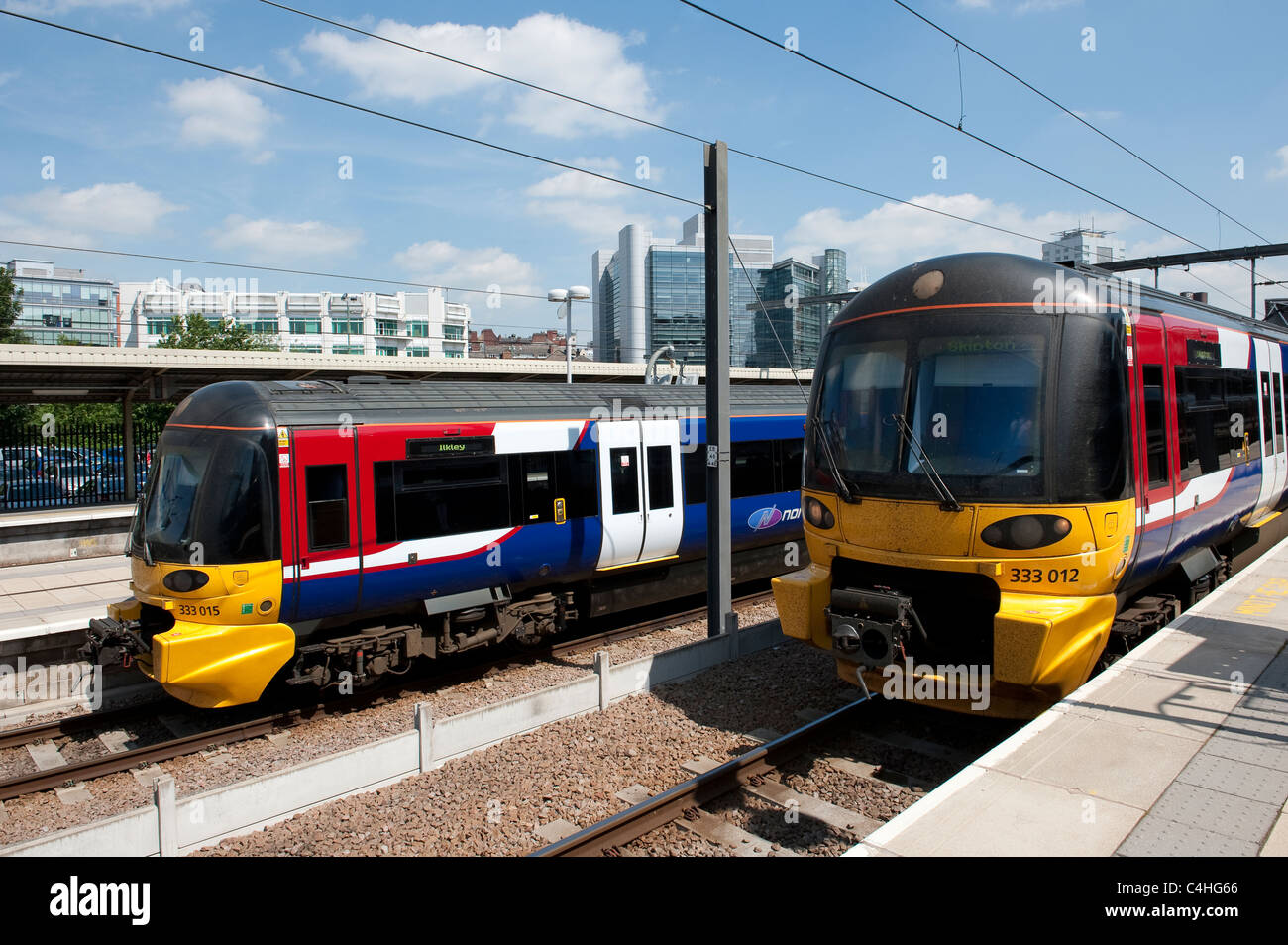
On the topic of Northern, the WYMPTE 333s do hilariously suit the requirements of a GBR livery better than this design, too.

two-class-333-trains-in-northern-rail-livery-at-leeds-railway-station-C4HG66.jpg
 

trains999

Member
Joined
11 Sep 2025
Messages
7
Location
england
the design doesn’t flow between carriages. the design will look a mess if you see a train moving at some speed.

i hope they keep regional branding because it is useful to identify that you are actually getting on the correct train.
 

nilvaj395

Member
Joined
11 Oct 2025
Messages
217
Location
‎
Thanks and agree with you on the Northern Rail 200 livery - another great starting point!

If you go with a bold colour - you either need to offset it with a fair amount of white with some swishes, go for a simple straight line design (so it doesn’t look messy) or go for similar colour palette for most of the colours with a small splash of the third etc.

Be interesting what AI would produce as an output :D
I was curious, so I inserted a shade of red in between the 158903 livery, and it really does not look that bad...

1765237937480.png
 

b0b

Established Member
Joined
25 Jan 2010
Messages
1,371
It works on NSE livery because while the colours are brash the livery shape is smooth and understated. Brash colours with simple shapes work, think NSE or South West Trains. Brash shapes with simple colours work, think TPE. Both together makes it too brash.
A big part of what made NSE work too was the interesting and varied "route branding" that was always eye catching
An example of station branding:View attachment 193516
Text reads "GBR A railway owned by you"
not the worst but has vibes of the Great Northern banner.
 

Class 800

Member
Joined
5 Aug 2023
Messages
110
Location
London
Was I the only one who hoped that maybe Swallow could make a return?
Our railway should not be used to virtue signal.
 

Sorcerer

Established Member
Joined
20 May 2022
Messages
2,132
Location
Liverpool
Bringing back the old liveries would've been nostalgia pandering at best and would've not done much good for building the image of a railway of the future. I for one welcome the decision to not use old liveries as a basis because GBR needed it's own identity. But even if they did, it surely couldn't have been worse than the rubbish they've just thrown at us now.

Part of me feels bad for how much disliking this has received because the graphic designer could've very well put some hard work into this and wouldn't exactly have much of a confidence boost if they were to read the criticisms here, but at the same I just couldn't bring myself to be so dishonest and pretend like it's good in any way shape or form when, quite honestly, it just isn't.
 

trains999

Member
Joined
11 Sep 2025
Messages
7
Location
england
considering the great design variation of trains in service at the moment, i really don’t think that this livery is suitable. fair enough, it looks decent enough (barely) on the azuma… but is this going to look good on a sprinter? is it going to look good on a turbo star?

obviously it’s hard to make a livery suitable for every train ever, but it’s definitely possible to create something a bit more….forgiving? i feel like it will only look okay on trains with triangle faces, and will look stupid on flat faced ones.
 

EdChap

Member
Joined
30 Nov 2018
Messages
37
I am really looking forward to seeing this new livery on the 2 Stourbridge shuttle units!!
 

RUK

Member
Joined
5 Aug 2009
Messages
480
Location
East of England
I wonder what it’ll look like on locomotives, such as the Class 68, Great Western Railway’s Class 57s/any rescue locomotives there might still be (I seem to remember seeing a Class 67 and maybe a Class 66 in a siding outside King’s Cross some years ago), Class 92s, and potentially new/future locomotives, such as the Class 93s and 99s, if they end up on passenger services, as they have been re-painted for passenger services in the past (or another future Stadler Euro loco, since they seem to be the future). Will it be double-ended/roughly mirrored?

Or even on Class 37s, Class 73s, and Class 43s, since Network Rail will be subsumed into Great British Railways, as well. Does Network Rail still have any Class 31s, or anything else? Network Rail do have single-carriage Class 153s, as well. I guess we’ll see it on Mark 1, Mark 2, and Mark 3 carriages too, since I believe Network Rail have them in their fleet.
 
Last edited:

Ellwill

Member
Joined
4 Aug 2021
Messages
157
Location
Medway
Part of me feels bad for how much disliking this has received because the graphic designer could've very well put some hard work into this and wouldn't exactly have much of a confidence boost if they were to read the criticisms here, but at the same I just couldn't bring myself to be so dishonest and pretend like it's good in any way shape or form when, quite honestly, it just isn't.
The BBC says this was produced in house by DaFT serpents, who probably used generative AI pretty heavily to 'assist' them...
 

Class 800

Member
Joined
5 Aug 2023
Messages
110
Location
London
The BBC says this was produced in house by DaFT serpents, who probably used generative AI pretty heavily to 'assist' them...
Of course they did.
They should consult on this. So we can all tell them as the traveling public, how utterly disgusting it is.

At least CrossCountry’s pink and turquoise gets shape right even if it is quite bright. I am not against bright colors, but the combination of color and shape is wrong here.

And I always wanted InterCity to be a brand of its own
 

Sorcerer

Established Member
Joined
20 May 2022
Messages
2,132
Location
Liverpool
The BBC says this was produced in house by DaFT serpents, who probably used generative AI pretty heavily to 'assist' them...
Well, if that's the case I feel no guilt whatsoever calling it absolute rubbish. In fact I feel more guilt at insulting graphic designers for suggesting one could've potentially designed this new livery. :lol:
 
Status
Not open for further replies.

Top