
-
Our new ticketing site is now live! Using either this or the original site (both powered by TrainSplit) helps support the running of the forum with every ticket purchase! Find out more and ask any questions/give us feedback in this thread!
You are using an out of date browser. It may not display this or other websites correctly.
You should upgrade or use an alternative browser.
You should upgrade or use an alternative browser.
Great British Railways: Station identity and livery unveiling (09/12/25)
- Thread starter skyhigh
- Start date
- Status
- Not open for further replies.
Sponsor Post - registered members do not see these adverts; click here to register, or click here to log in
R
RailUK Forums
Bletchleyite
Veteran Member
That's what Network Southeast livery used to do I think right? You might be on to something there, I think that would look very good
It works on NSE livery because while the colours are brash the livery shape is smooth and understated. Brash colours with simple shapes work, think NSE or South West Trains. Brash shapes with simple colours work, think TPE. Both together makes it too brash.

To be fair, I dont even mind the Avanti big A, it looks way more in place than the text/logo on this design.That nicely shows a big design error. RA2 is a utilitarian font. It looks awful in a logotype like that (just like Avanti's "big A" in Helvetica at the vehicle ends) yet undeneath the unit number is there in a stylised, modern font.
Any publicity company worth its salt would be embarrassed at this amateuish mess, it's nothing on the superb TfW and ScotRail branding packages.
== Doublepost prevention - post automatically merged: ==
I don't think it could have been much worse to be honest.
Why is it always the English side and only the English side in particular that try to scream an utter tacky patriotic mess. To be fair, ScotRail's livery is very much using the Saltire, but they aren't shoving it in people's faces.
And TfW, while its livery can be quite generic, has a lot of room to expand, I think 197120 'Made in Wales' is a great example of TfW using their brand + a bit of pride for them in a way that isn't tacky.
I think this falls into the same category as that clock, a lot of PR nonsense and keep in mind how much money it would cost to reliver every train with this. How much money will this take away from the implementation of other, more meaningful improvements? Besides, what will happen if an operator falls behind on its punctuality and 'loses' the right to use the brand, as it's been stated?

brooklynbound
Member
It's beyond bad.

CryoraptorA303
Member
Honestly, I'd much prefer for the regional identities to remain.
It may just be that I've grown up in the Privatisation Era and I'm used to every mainline having it's own branding, but I do think it's more aesthetically appealing, useful for creating regional brand loyalty and better at creating instant recognisability.
A compromise I could come to, if there must be a standardised livery, is for the livery to be regionalised, having different colour schemes etc. for different mainlines.
As for the livery itself, I'm not a big fan, it's far too loud and doesn't really mesh well between coaches. Turning down the contrast a bit and making the lines smoother would already greatly improve it and make it somewhat reminiscent of SWT's/EMT's old liveries. Better yet if, as I suggested, the colour schemes are regionalised, so roughly corresponding to the current colour schemes, LNER has a red variety, WCML/LNWR is blue, GWR is green, EMR is purple, etc. etc., to keep the regional identities.
It may just be that I've grown up in the Privatisation Era and I'm used to every mainline having it's own branding, but I do think it's more aesthetically appealing, useful for creating regional brand loyalty and better at creating instant recognisability.
A compromise I could come to, if there must be a standardised livery, is for the livery to be regionalised, having different colour schemes etc. for different mainlines.
As for the livery itself, I'm not a big fan, it's far too loud and doesn't really mesh well between coaches. Turning down the contrast a bit and making the lines smoother would already greatly improve it and make it somewhat reminiscent of SWT's/EMT's old liveries. Better yet if, as I suggested, the colour schemes are regionalised, so roughly corresponding to the current colour schemes, LNER has a red variety, WCML/LNWR is blue, GWR is green, EMR is purple, etc. etc., to keep the regional identities.

brad465
Veteran Member
The first time a flag waving nationalist says "Uh yeah can you get rid of that please?"
Was this designed by the same team that designed the London 2012 logo?
Was this designed by the same team that designed the London 2012 logo?
Dougal2345
Member
- Joined
- 29 Oct 2009
- Messages
- 635
That looks hideous. I'm no graphic designer, but here are my thoughts:
1) if the nose of the train is rounded/bulbous, as almost all are now, mirror that with curves, not straight lines and angles
2) drop the two shades of blue - just go with the darker one
3) definitely don't repeat the design on the coaches
...or better still, bin the entire thing and pick out a couple of the better current liveries and continue with those.
1) if the nose of the train is rounded/bulbous, as almost all are now, mirror that with curves, not straight lines and angles
2) drop the two shades of blue - just go with the darker one
3) definitely don't repeat the design on the coaches
...or better still, bin the entire thing and pick out a couple of the better current liveries and continue with those.
I'm not sure what I think of the new livery.
I'd prefer it if each local TOC kept their own livery & branding in some form. If it ain't broke, don't change it.
What does this mean for the current liveries & branding that each TOC has at the minute?
I'd prefer it if each local TOC kept their own livery & branding in some form. If it ain't broke, don't change it.
What does this mean for the current liveries & branding that each TOC has at the minute?
Cardiff123
Established Member
Well at least it'll be easy for "normal passengers" to compare the rail operations of England, Scotland and Wales now.
I'm convinced that if the NHS was proposed today, it'd be named something ridiculous like "the Great British Health Service" and we'd have union flags on all hospital buildings.
I'm convinced that if the NHS was proposed today, it'd be named something ridiculous like "the Great British Health Service" and we'd have union flags on all hospital buildings.
CryoraptorA303
Member
To be honest, I think they're going to struggle to get any operator to want to use the brandI think this falls into the same category as that clock, a lot of PR nonsense and keep in mind how much money it would cost to reliver every train with this. How much money will this take away from the implementation of other, more meaningful improvements? Besides, what will happen if an operator falls behind on its punctuality and 'loses' the right to use the brand, as it's been stated?


ABB125
Established Member
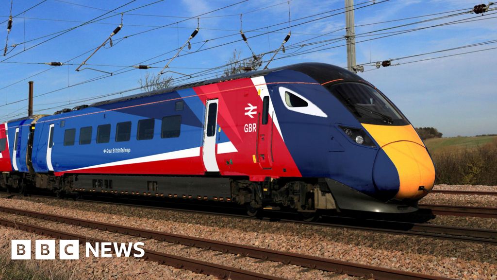
Echoing some previous comments, the "flag" red diagonal bits on the intermediate cars don't work at all, looks rubbish. It's not so bad for the end vehicles, but certainly isn't brilliant. The flag could at least be "wavy" rather than straight lines, as that would better match the curves of the cab. The little triangle of blue/white marooned in a sea of red to the front of the door looks terrible
alistairlees
Established Member
- Joined
- 29 Dec 2016
- Messages
- 4,413
I thought it was an April Fool's joke at first (in the wrong month)

Farigiraf
Member
While we'll probably get used to it after it being the standard for a few years (some news chains & groups likely won't - you know the kind), there's always the chance this'll only be the livery for Intercity Western Region or something similar.
(Edit: just noticed the Desiro 'regional' train image as being largely the same. Yikes, followed by oh dear. Followed by 'oh well', as it's just a livery)
The costcutting mentality of the railways in recent years may actually provide one of its first benefits here - the regional livery (the one that'll be on the hundreds of 2/3-car sprinters, turbos etc) may be largely scaled down to save money, which could be a benefit here. A simplification of this livery is much needed.
(Edit: just noticed the Desiro 'regional' train image as being largely the same. Yikes, followed by oh dear. Followed by 'oh well', as it's just a livery)
The costcutting mentality of the railways in recent years may actually provide one of its first benefits here - the regional livery (the one that'll be on the hundreds of 2/3-car sprinters, turbos etc) may be largely scaled down to save money, which could be a benefit here. A simplification of this livery is much needed.

Sparks807Evo
Member
- Joined
- 22 Aug 2010
- Messages
- 464
All they had to do was take something similar to the new Chiltern liveries, and make some subtle changes…it’s too brash and jarring. Besides the point that the complexity with the vinyl etc. will make it more challenging and costly when there is inevitable damage etc. Seriously hope WMR are spared it all on the basis I expect WMCA will want to keep a local identity (as I expect TfGM will likewise with their future rail devolution). Plenty of good examples out there in the rail and bus sectors to have taken inspiration from, not to mention airlines - simplicity is key. Suggest looking up Vy in Norway for example.
ABB125
Established Member
If we ignore the cringeworthy slogan, I think that red "flash" actually looks quite good in this context. Not entirely sure how you'd incorporate it into the train livery without it looking rubbish thoughAn example of station branding:View attachment 193516
Text reads "GBR A railway owned by you"
Bletchleyite
Veteran Member
pretty terrible. I guess the assignment must have been "take the ideas of the NSE livery and make it as awful as possible".
That will also age so fast (if it hasn't already!)
It is very close to being TPE livery with the colours changed. That does work but probably because the colours are quite understated.

I wonder what the oldest piece of rolling stock this gets put on will be , Northern 150 maybe?
However i do think this livery looks very ugly , it looks like you gave someone with no knowledge of graphic design buckets of paint in the colours of the union jack and got them to do a colour by numbers on a TPE liveried train.
What happened to aesthetically pleasing liveries like NSE , BR blue or Regional Railways.
Even if they couldn't be asked to design a nice looking livery like one of those they could have just covered a piece of rolling stock in black paint and touted it as a revival of BR Black and i bet it would look a whole lot more pleasing to the eye , especially as with all the white included on this livery it will end up looking half black from dirt after a while in service like one of Great Northern's Grubby 387's.
However i do think this livery looks very ugly , it looks like you gave someone with no knowledge of graphic design buckets of paint in the colours of the union jack and got them to do a colour by numbers on a TPE liveried train.
What happened to aesthetically pleasing liveries like NSE , BR blue or Regional Railways.
Even if they couldn't be asked to design a nice looking livery like one of those they could have just covered a piece of rolling stock in black paint and touted it as a revival of BR Black and i bet it would look a whole lot more pleasing to the eye , especially as with all the white included on this livery it will end up looking half black from dirt after a while in service like one of Great Northern's Grubby 387's.
Bletchleyite
Veteran Member
If we ignore the cringeworthy slogan, I think that red "flash" actually looks quite good in this context. Not entirely sure how you'd incorporate it into the train livery without it looking rubbish though
RA2 is just too utilitarian a font to use in a logotype. The double arrow would be better off on its own.
to be fair I like how they did the scotrail one. and anything beats strathclyde orange. send me your hate mail!What is this obsession with slapping flags on everything? Can’t anyone remember which country they live in?

Kite159
Veteran Member
Whatever next, the staff to be forced to wear something like this when Great English Railways comes into force? But don't worry I'm sure the design agency is laughing their way to the bank.
(Photo of a man wearing a suit covered with union flags)
(Photo of a man wearing a suit covered with union flags)
Attachments

This, this, and this - the new Chiltern livery is really good. I was also going to suggest the Northern Rail 200 livery (158903), with a splash of white or red (and with needless graphics removed), which might also work.All they had to do was take something similar to the new Chiltern liveries, and make some subtle changes…it’s too brash and jarring. Besides the point that the complexity with the vinyl etc. will make it more challenging and costly when there is inevitable damage etc. Seriously hope WMR are spared it all on the basis I expect WMCA will want to keep a local identity (as I expect TfGM will likewise with their future rail devolution). Plenty of good examples out there in the rail and bus sectors to have taken inspiration from, not to mention airlines - simplicity is key. Suggest looking up Vy in Norway for example.
Bletchleyite
Veteran Member
This, this, and this - the new Chiltern livery is really good. I was also going to suggest the Northern Rail 200 livery (158903), with a splash of white or red (and with needless graphics removed), which might also work.
Replied on the speculative thread:
Great British Railways: Branding options?
I thought it is predominately white with red lines in honour of who beat them in the 1966 World Cup Final. ;) Nah they are just trying to make a knock off version of DSB. They even copied our colour scheme!
 www.railforums.co.uk
Do not give them any ideas...Whatever next, the staff to be forced to wear something like this when Great English Railways comes into force? But don't worry I'm sure the design agency is laughing their way to the bank.
(Photo of a man wearing a suit covered with union flags)
For me, its that the red line goes in multiple directions (to represent the flag). I would much rather it all went in one, unified direction, but the need to promote patriotism came before that.If we ignore the cringeworthy slogan, I think that red "flash" actually looks quite good in this context. Not entirely sure how you'd incorporate it into the train livery without it looking rubbish though
Oh, I don’t like this. I don’t like this at all. It just looks cheap and plastic.
And here I was hoping that maybe in my lifetime I would see the InterCity Swallow fly high on the 800 series once again. I never got to be alive for when it was around.
The Swallow livery was understated and premium. It made our trains look like good, solid machines. This is a tacky, plasticky nightmare that just emphasizes the flimsy, uncomfortable nature of most of our trains these days.
There are ways to do the Union flag. This isn’t it. They could get away with it on a commuter train but InterCity deserves sooooo much better than this.
And here I was thinking they would try to bring back the InterCity of old. the one I never got to experience, before the race to the bottom.
And here I was hoping that maybe in my lifetime I would see the InterCity Swallow fly high on the 800 series once again. I never got to be alive for when it was around.
The Swallow livery was understated and premium. It made our trains look like good, solid machines. This is a tacky, plasticky nightmare that just emphasizes the flimsy, uncomfortable nature of most of our trains these days.
There are ways to do the Union flag. This isn’t it. They could get away with it on a commuter train but InterCity deserves sooooo much better than this.
And here I was thinking they would try to bring back the InterCity of old. the one I never got to experience, before the race to the bottom.
ABB125
Established Member
According to the BBC news article linked below, the design was created in-house rather than by a design consultancy...
BBC News - Branding and logo for Great British Railways unveiled
 www.bbc.com
BBC News - Branding and logo for Great British Railways unveiled
Branding and logo for Great British Railways unveiled
The new red, white and blue branding mirrors the colours of the Union Flag, and will start to appear from next year.
www.bbc.com
- Status
- Not open for further replies.