• Our new ticketing site is now live! Using either this or the original site (both powered by TrainSplit) helps support the running of the forum with every ticket purchase! Find out more and ask any questions/give us feedback in this thread!

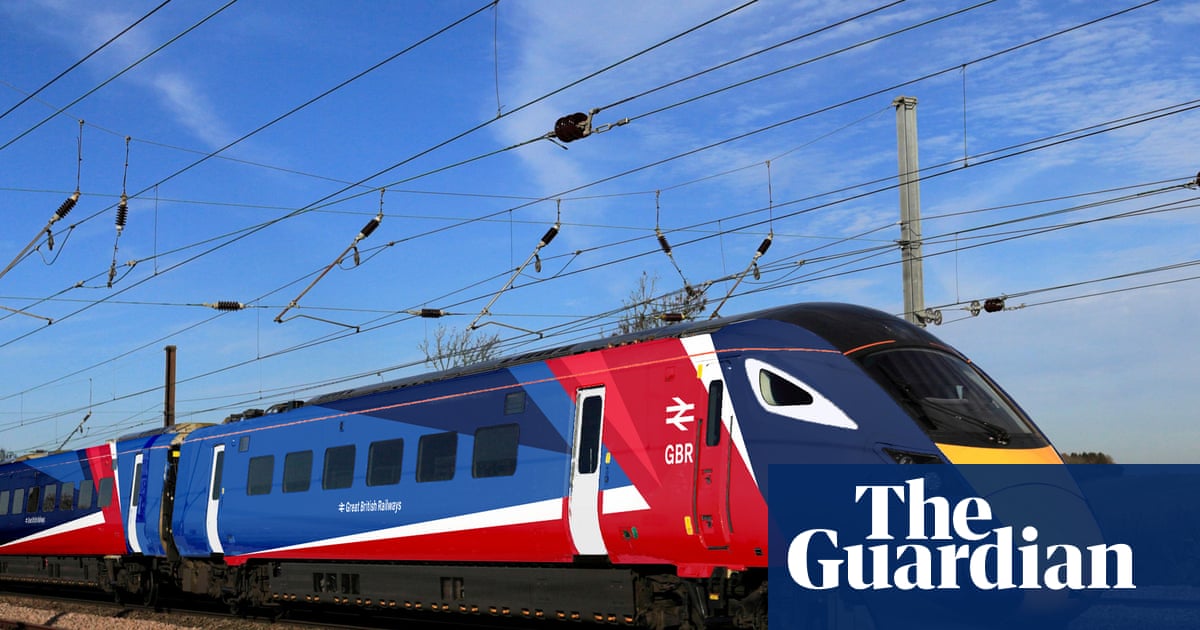
Great British Railways: Station identity and livery unveiling (09/12/25)

Status
Not open for further replies.

Mainline421

Member
Joined
7 May 2013
Messages
910
Location
Aberystwyth
"The" livery is disappointing. They could have a common brand and logo without everything having to make everything look the same. It would also save a lot of money on repainting in the medium term. Still at least it’s not plain grey like SWR or Thameslink
 
Sponsor Post - registered members do not see these adverts; click here to register, or click here to log in
R

RailUK Forums

Russel

Established Member
Joined
30 Jun 2022
Messages
5,531
Location
Lichfield
"The" livery is disappointing. They could have a common brand and logo without everything having to make everything look the same. It would also save a lot of money on repainting in the medium term. Still at least it’s not plain grey like SWR or Thameslink

You've seen the actual livery then?
 

800Travel

Member
Joined
3 Nov 2023
Messages
658
Location
UK
G7qfwREW4AAVX77

Placement of GBR is a bit odd

Source ~ https://x.com/PolitlcsUK/status/1998158147651793221
 

thomalex

Member
Joined
25 Aug 2021
Messages
532
Location
Leeds
"The" livery is disappointing. They could have a common brand and logo without everything having to make everything look the same. It would also save a lot of money on repainting in the medium term. Still at least it’s not plain grey like SWR or Thameslink

Personally what I'm hoping for is a common livery for the Intercity services and a separate livery for regional ones which allows some degree of customisation by region (such as colour) while retaining a familiar look, just to keep the network interesting.
 

tbtc

Veteran Member
Joined
16 Dec 2008
Messages
18,058
Location
Reston City Centre
Tomorrow's comments are going to be 50% "what's the point in worrying about branding, they should focus all resources on cheaper fares, nobody even notices the color of the train" and 50% obsessing about whether some minor detail is precisely the same as used on a part of one of 1960s/1970s/1980s British Rail's liveries

It’s funny that most of the train is blue, despite GBR not running any trains inside Scotland, just the cross border services.
https://www.realtimetrains.co.uk/service/gb-nr:C23835/2025-12-09/detailed there's the 06:42 XC service from Dundee to Aberdeen (he says, clutching at straws!) :)
 

m0ffy

Member
Joined
24 May 2022
Messages
371
Location
Leicestershire
What is this obsession with slapping flags on everything? Can’t anyone remember which country they live in?
 

Cardiff123

Established Member
Joined
10 Mar 2013
Messages
1,656
Location
South Wales
That's truly horrendous. Thankfully TfW and ScotRail won't have to waste millions re-branding into this livery.
 

eaet

Member
Joined
23 Aug 2017
Messages
26
Ignoring the actual livery, I'm a big fan of the simplicity of the logo itself, hope that is more representative of the overall branding style
 

Steddenm

Established Member
Joined
2 Mar 2017
Messages
1,251
Location
Clane, Co. Kildare
I don't like that at all. Looks too "cheap" for a brand. Not modern at all. Will be disappointing to see the current brands go on the 80x fleets. Think Lumo, Hull Trains, Grand Central will be OK as they are open access. Also same as ScotRail, Caledonian Sleeper and TfW will remain. Wonder if some in Manchester will go for the Bee Network grand and Metro for Merseyrail?
 
Joined
17 Mar 2024
Messages
6
Location
Aylesbury
Honestly it’s not as bad as I thought.

Would have been better if the ends of the trains had red then the rest was blue.

Still prefer the Chiltern Railways current liveries on the 168s.

Could have been so much worse
 

sad1e

Member
Joined
26 Aug 2024
Messages
1,021
Location
London
IMG-20251208-WA0011.jpg
Seen this on twitter. Looks like somebody's going to be in trouble for releasing the livery early.
 

nilvaj395

Member
Joined
11 Oct 2025
Messages
217
Location
‎
I prefered it better blurred to be honest, they've gone too complicated on it. Too much shoving Union Jack in the face once again, but not surprising for GBR.

The white around the cab window in particular I don't like , nor the small white stripe before the red. Also the comments about mirroring and poor flow as @MrJeeves said. Also to note the hideous font and logo they have used for this (and placement of said text/logo). They were so close to making something good but I set my expectations too high with it being GBR.

Honestly the dark blue, red stripe, and then the lighter blue all going in the same direction would've been so much better. But just incase you forget what country you're in, now the trains will tell you too. It seems like we are progressively becoming more yank-ified by having to plaster the flag on everything.

 

Horizon22

Established Member
Associate Staff
Jobs & Careers
Joined
8 Sep 2019
Messages
11,010
Location
London
Article on the guardian:

The logo, branding and livery for the impending renationalised and reformed railway will be unveiled by ministers at London Bridge on Tuesday. It is red, white and, yes, blue.

Designed in-house at the DfT, the logo is the GBR name in rail typeface accompanied by the double arrow symbol – what the DfT describes as a “nod to Britain’s proud railway heritage”, rather than a direct lift from British Rail.

The first actual trains to be repainted could arrive from next spring..
For me, it’s fine, but not amazing. Nice to at least some colour added into a stock design, considering how much grey there has been recently. Coaches seem a bit much though.
 
Last edited by a moderator:

jupiter

Member
Joined
9 May 2021
Messages
339
Location
Dorset
I think there’s too much going on there as well, and no coherence or ‘flow’ down the train.
 

thomalex

Member
Joined
25 Aug 2021
Messages
532
Location
Leeds
Personally I think it's too busy. I'm more of a fan of simplicity and just a large double arrow with a nice red and white line running the length of the carriages could have made the link to the union flag without having to literally put a jaunty, cartoon version of it all the way down the train.

Still, it's just a vision at the moment so hopefully it can at least be toned down a bit before it's rolled out. A very simple way would be to just have the union jack graphic part on the front and leave the rest of the carriages blue.
 

LUYMun

Established Member
Joined
15 Jul 2018
Messages
1,388
Location
Cancelled
How is it going to reflect onto other train designs? It may look fine on an IET but not on a Desiro, say.
 

sad1e

Member
Joined
26 Aug 2024
Messages
1,021
Location
London
Is it just me or does this livery look a bit like a recoloured TPE 80x Livery , they've obviously taken inspiration from the banding at the front of the TPE livery.
 
Status
Not open for further replies.

Top