It was designed by http://www.best-impressions.co.uk who have designed most stagecoach liveries. The designer Ray Stenning always seems to understand the lines of vehicles and I think this works.

-
Our new ticketing site is now live! Using either this or the original site (both powered by TrainSplit) helps support the running of the forum with every ticket purchase! Find out more and ask any questions/give us feedback in this thread!
You are using an out of date browser. It may not display this or other websites correctly.
You should upgrade or use an alternative browser.
You should upgrade or use an alternative browser.
Virgin Trains East Coast launch day
- Thread starter Joshrowlands
- Start date
- Status
- Not open for further replies.
Sponsor Post - registered members do not see these adverts; click here to register, or click here to log in
R
RailUK Forums

Joshrowlands
Member
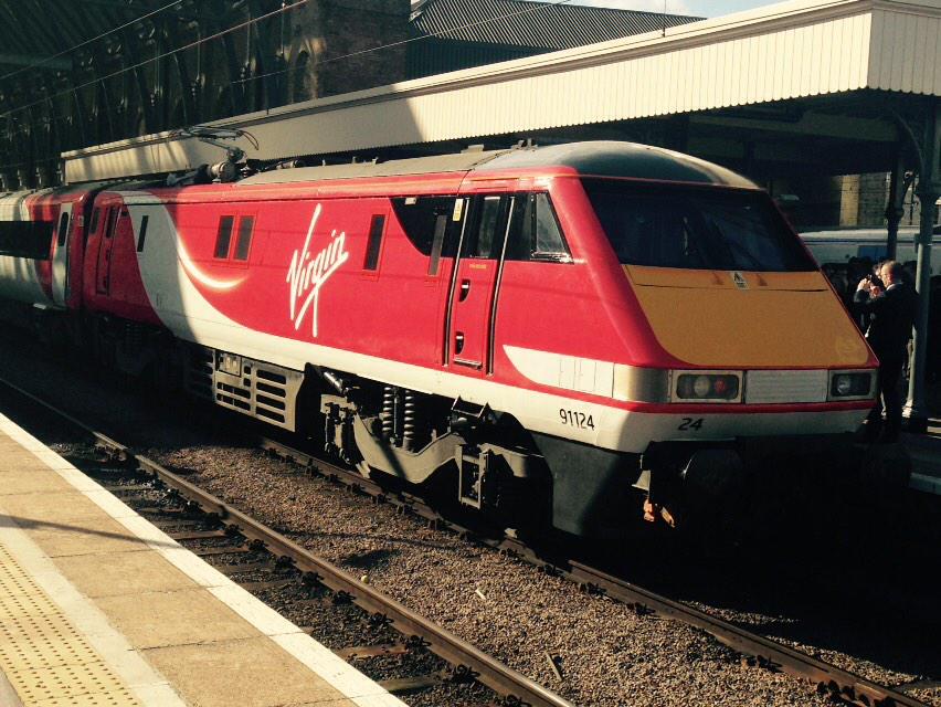
Are you referring to stagecoach's East midland Trains livery? I think it's boring and no meaning to it. People know Virgin for its striking red and when it comes to trains they expect the same I honestly think this has done the rolling stock a world of good they looked so drowt and miserable in that horrid boring grey livery.The thing is, as Stagecoach consistently prove, it's possible to be unsubtle, while remaining attractive and sympathetic to your stock. This is neither.
I suspect part of this branding is designed to make the current stock look bad and old. Then when the 800's come into service with an attractive livery they will appear to be even better. When you think how classy the 91s/Mk4s used to look in GNER livery, and compare that to this new look, it's quite obvious they haven't even attempted to make the stock look good.
This has made them stand out, like you know when a Virgin train is in the station, Striking and bold. Anyway it's not about the livery it's about the service right? Let's hope they can beat East coast's amazing reputation
If 1S13 keeps up its current pace it should be in York around 8 minutes early it passed Grantham 4 minutes early and current predictions are Doncaster 12:24 6 mins early and York at 12:42 8 minutes early
It'll get caught up either around Doncaster or just before York and will arrive on time or a just a minute or two early at York I'd bet.
45669
Member
The thing is, as Stagecoach consistently prove, it's possible to be unsubtle, while remaining attractive and sympathetic to your stock. This is neither.
I suspect part of this branding is designed to make the current stock look bad and old. Then when the 800's come into service with an attractive livery they will appear to be even better. When you think how classy the 91s/Mk4s used to look in GNER livery, and compare that to this new look, it's quite obvious they haven't even attempted to make the stock look good.
The GNER livery looked a bit drab when they took the branding off :
 RD2761. HST at Peterborough. by Ron Fisher, on Flickr
 RD2762. NXEC HST at Peterborough. by Ron Fisher, on Flickr
It was designed by http://www.best-impressions.co.uk who have designed most stagecoach liveries. The designer Ray Stenning always seems to understand the lines of vehicles and I think this works.
What? They actually paid someone to come up with that? I thought it was the work of the kids who operate the Virgin Twitter account on a day off. You live and learn.

The GNER livery looked a bit drab when they took the branding off :
That's surprising, a de-branded train not branded well...

fairysdad
Member
I reckon the locos have far too much red on them, which is probably what makes it a bit garish. I quite like the stripe denoting First Class, although it wasn't until I read more on here that I realised that is what it was doing; I just thought it was a purple stripe.
From my (albeit rather limited) experience with graphic design, I'd say that although a strong company was used to design the livery (assuming johnw is correct at the top of this page saying that it was Best Impressions), they are limited to what the client tells them to do, so when VTEC went to them and told them to design them a livery, they were probably told to use a lot of red so they had to. Given those constraints it's not too bad.
The coaches look good though, and at least they don't have those godawful striped doors that plague VWCs trains.
From my (albeit rather limited) experience with graphic design, I'd say that although a strong company was used to design the livery (assuming johnw is correct at the top of this page saying that it was Best Impressions), they are limited to what the client tells them to do, so when VTEC went to them and told them to design them a livery, they were probably told to use a lot of red so they had to. Given those constraints it's not too bad.
The coaches look good though, and at least they don't have those godawful striped doors that plague VWCs trains.

On the other hand, this does look like a cross between the old virgin livery and the Stagecoach-East Midlands Trains livery, particularly the coach running numbers.
Which looks better? This...

... or this?
For me, it's the pretendalino by a country mile.
Same! The Pretendolino Looked classy, it looked smart, It suited the Virgin brand perfectly. This I can't like. I just don't get the point of adding in the extra swirls, the fadey bits. In fact, it looks like an amateur Virgin / National Express hybrid with the black window frames and the Red end stripes. 3/10 I think. And if this is a Best Impressions design, I think Ray Stenning really is loosing touch - a lot of his designs are becoming rather 'samey' as it is.
I'm getting fed up of TOCs not using the standard yellow stripe. Time for DfT to insist?
Neil
Virgin not using the first class yellow stripe again? Funny, I remember a situation around 10 years ago with the Voyagers and a certain 'Club Class'.
Bletchleyite
Veteran Member
Virgin not using the first class yellow stripe again? Funny, I remember a situation around 10 years ago with the Voyagers and a certain 'Club Class'.
It is however present on the Voyagers now (but not the Pendolinos).
Neil
It is however present on the Voyagers now (but not the Pendolinos).
Neil
I know, But it was Virgin's thing at the time where they didn't believe that the 'customer' wanted First Class, they wanted Virgin's Club Class. So of course they dropped the stripe, and 1 stickers and branded it all Club Class. Eventually, was it complaints or pressure from the passengers that brought the return of the 1 and the Yellow stripe on VXC?
But I think this livery is far too busy. Too many angles, too many curves, the fadey bits, and disappointingly the ruined sleekness of the 91/82s cab end. If only at least the cab had the Pretendolino's Silver Light Cluster/Band. The front looks like it want's to join a DB Service.

61653 HTAFC
Veteran Member
It was designed by http://www.best-impressions.co.uk who have designed most stagecoach liveries. The designer Ray Stenning always seems to understand the lines of vehicles and I think this works.
Ray Stenning? Isn't he that weird beardy fella that looks (to me at least) like a 1970s sex-pest, and came up with the ridiculous Yorkshire Tiger brand?

I rather like the VTEC Livery.
Of course shows off the Virgin Branding, but different enough any person should be able to tell the difference between the VTEC and VTWC services. Especially at places like Edinburgh.
Of course though prefer the livery on the VTWC.
Chris
Of course shows off the Virgin Branding, but different enough any person should be able to tell the difference between the VTEC and VTWC services. Especially at places like Edinburgh.
Of course though prefer the livery on the VTWC.
Chris


ModernRailways
Established Member
- Joined
- 21 Apr 2011
- Messages
- 2,184
I for one think the new livery is very smart. Looks good, and suits the stock perfectly. Will be interesting to see it on a HST though!
I remember the East Coast livery on the MK4s was pretty bland, but on the HSTs it looked smart and very functional. There wasn't a lot going on in it, which I think suits a HST more. MK4s I think, need to have more going on in their livery.
Is there only the one full repainted rake whilst others get done?
I remember the East Coast livery on the MK4s was pretty bland, but on the HSTs it looked smart and very functional. There wasn't a lot going on in it, which I think suits a HST more. MK4s I think, need to have more going on in their livery.
Is there only the one full repainted rake whilst others get done?
Why? How many average punters know that a yellow stripe denotes First Class?
The vast majority of people know First Class is First Class because the coaches have either the exact words or a massive "1" on them.
Of course most punters probably don't know, but you can of course tell them!
And many trains don't have massive '1's on them either. In fact, some rolling stock liveries don't make first class clear, or also where the accessible carriage/doors are.
It should/could be something the DfT made happen across the board, rather than leaving it down to designers who would probably rather such things didn't spoil their designs. Contrasting doors IS a requirement, so can't be ignored.

It was designed by http://www.best-impressions.co.uk who have designed most stagecoach liveries. The designer Ray Stenning always seems to understand the lines of vehicles and I think this works.
He was at the launch wearing what I believe is the woman's Virgin Trains West Coast uniform!
Edit: I put quite a few photos on Twitter - https://twitter.com/JaJaWa/status/572359730754162688
Last edited:
Bletchleyite
Veteran Member
It looks a lot better on that - is it actually light silver rather than white?
Neil
Neil
For comparison with the original.

I think it's fine for a launch livery but I would prefer a simpler version across the fleet. No gradients. Remove the purple on first class coaches. Cab front similar to original 91 livery. ie wraparound black window. nor red on cab front above headlights.
Just departed KX on my first Virgin Trains EC service to Leeds (The first of many, I'm sure!) and interestingly the large poster at the end of the carriage by the door is one which says 'Still flying the Scotsman' along with some smaller text I cannot read from here.
Over the PA system the crew leader has also announced that they'll soon be coming through giving every customer a chocolate as a welcome to Virgin Trains. People may dislike them, but I cannot complain about a free bit of chocolate from Virgin Trains.
Over the PA system the crew leader has also announced that they'll soon be coming through giving every customer a chocolate as a welcome to Virgin Trains. People may dislike them, but I cannot complain about a free bit of chocolate from Virgin Trains.
Just departed KX on my first Virgin Trains EC service to Leeds (The first of many, I'm sure!) and interestingly the large poster at the end of the carriage by the door is one which says 'Still flying the Scotsman' along with some smaller text I cannot read from here.
Over the PA system the crew leader has also announced that they'll soon be coming through giving every customer a chocolate as a welcome to Virgin Trains. People may dislike them, but I cannot complain about a free bit of chocolate from Virgin Trains.
No chocolate spotted on the West Riding this morning

Does it have a competition on the wrapper?
Glad they seem to have made the seating numbers nice and clear - it's amazing how many people get on the opposite end of the carriage they're reserved in and then fight their way through.
Last edited:
No chocolate spotted on the West Riding this morning
Does it have a competition on the wrapper?
Glad they seem to have made the seating numbers nice and clear - it's amazing how many people get on the opposite end of the carriage they're reserved in and then fight their way through.
The wrapper has the website address to visit to enter a Virgin Trains EC competition, and they also announced the competition and some of the prizes over the PA when telling customers about the chocolate.
fairysdad
Member
Those photos seem to show it in a much better light (literally!). Still think the red is too overpowering though, but as red is Virgin's colour scheme, then it can't really be anything else. (I don't like SWT's red livery either, luckily I don't usually see it other than on the approach to Waterloo!)I put quite a few photos on Twitter - https://twitter.com/JaJaWa/status/572359730754162688
Will possibly look better on an HST given that a 43 is more curved than the 90s (the same as the Pendolino livery looks better on those than it does on the Pretendolino).
For comparison with the original.
I think it's fine for a launch livery but I would prefer a simpler version across the fleet. No gradients. Remove the purple on first class coaches. Cab front similar to original 91 livery. ie wraparound black window. nor red on cab front above headlights.
Ah, the original IC livery. Bold (at least for the times) yet smart - and never bettered.
The wrapper has the website address to visit to enter a Virgin Trains EC competition, and they also announced the competition and some of the prizes over the PA when telling customers about the chocolate.
They were handing them out in the First Class Lounge this morning.
That was the busiest I've ever seen it. There was a press conference with (I believe) the CEO of VTEC and the Transport Minister.
Unfortunately I couldn't stay long.
- Status
- Not open for further replies.