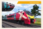
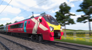
I think the red base with the big X logo looks quite good. I don't understand why they didn't simply use that design on all cars. The logo does a good job of filling in the large blank section of bodyside behind the cab, and it would do the same on the intermediate cars where the large vestibules are.
It would be further improved by using the grey for the doors instead of the blue/turquoise colour, which I think clashes a bit with the red.
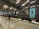
As it is, those big dark grey expanses of bodyside will look really grim, especially in environments which can already feel a bit dingy. Such as, perhaps, a station where all the platforms are built underground. Good job they don't serve any of those then (!!!)
I agree with the red base! I think the mock up looked excellent!!