
-
Our new ticketing site is now live! Using either this or the original site (both powered by TrainSplit) helps support the running of the forum with every ticket purchase! Find out more and ask any questions/give us feedback in this thread!
You are using an out of date browser. It may not display this or other websites correctly.
You should upgrade or use an alternative browser.
You should upgrade or use an alternative browser.
WMTrains livery and station branding
- Thread starter TT-ONR-NRN
- Start date
- Status
- Not open for further replies.
Sponsor Post - registered members do not see these adverts; click here to register, or click here to log in
R
RailUK Forums

TT-ONR-NRN
Veteran Member
An opinion I definitely disagree with. I like it.Im afraid the Green livery is awful.
Reminds me of Irish trains - sadly I haven’t been on any but I’ve seen many images of them.

TwinTurbostar
Member
OT, but promoted on the ad is The Electric Cinema. One of my favourite places in Birmingham and the oldest working cinema in the country. Highly recommended.
The Black Country Living Museum too, which is a good day out if you do what I did and get in free because of a college project and go on a sunny day!
Bletchleyite
Veteran Member
Yellow?
Bletchleyite
Veteran Member
Yeah yellow, you know that yellow coloured bit on the front that's in yellow!
Oh, sorry, forgot about the nose end controversy

Oh, sorry, forgot about the nose end controversy
That's ok, to be fair I'm not as bothered about it going as I thought I would on new stuff. But if it's there it would be nice for it to be designed in rather than looking like an after thought or in this case no thought at all!!

Bletchleyite
Veteran Member
Just seen it at MKC. Probably best described as “a bit rubbish”. Like what I’ve seen of the whole thing so far

Mordac
Established Member
Just boarded 350373 on 1Y70. Looks better in the flesh, IMO.
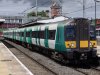

DanNCL
Established Member
That looks much better!Does anyone prefer this photoshopped variant of 350?
That looks much better!
Another user created it from a discription I gave. Inspired by the front of a class 360:

K.o.R
Member
- Joined
- 6 Dec 2017
- Messages
- 673
Another user created it from a discription I gave. Inspired by the front of a class 360:
I would keep the yellow bits going up the edges (as in the LM livery) as well, or at least have it rounded slightly.
As for the orange/purple livery, keeping the yellow on the bits that were always yellow would look fine. The *stars have the to-be-yellow area pretty much designed into the fronts.

XCTurbostar
Established Member
- Joined
- 13 Sep 2014
- Messages
- 2,602
Well that’s it, if you get rid of the yellow on the front but keep the ‘hood’ over the gangway.. what’s the point in getting rid of it?
I would keep the yellow bits going up the edges (as in the LM livery) as well, or at least have it rounded slightly.
It was inspired by the class 360, that's why it's not rounded. The 360 isn't rounded and looks all the better for it imho.
MatthewRead
On Moderation
Do you
Do you think they should go to West Midlands Trains seeing as they need additional rolling stock or would it be a waste because they are getting new EMU's.Another user created it from a discription I gave. Inspired by the front of a class 360:
TT-ONR-NRN
Veteran Member
Good photoshop, but IMO it makes it look too fat!Does anyone prefer this photoshopped variant of 350?

NSE
Established Member
- Joined
- 3 Mar 2010
- Messages
- 1,920
I liked the old LM livery, but one thing I particularly liked was the black and green branding on stations and timetables. I thought it looked very classy and professional.

LOL The Irony
Established Member
I noticed an error in the original picture while editing it

LOL The Irony
Established Member
I replaced the black mask with yellow. The problem isn't the green, it just needed a contrasing colour.
TT-ONR-NRN
Veteran Member
I replaced the black mask with yellow. The problem isn't the green, it just needed a contrasing colour.View attachment 40573
That makes me think of old SPT livery 334s!
JordyWM
Member
I liked the old LM livery, but one thing I particularly liked was the black and green branding on stations and timetables. I thought it looked very classy and professional.
Have to agree, it looked very classy. Especially the odd stations that had asphalted platforms with the green safety line.
LOL The Irony
Established Member
I did 2 more. 1st one is with the yellow removed from the roof. 2nd one is green cab with yellow gangway.

Although I do belive something like this bottom one has been done before.
Although I do belive something like this bottom one has been done before.
I replaced the black mask with yellow. The problem isn't the green, it just needed a contrasing colour.View attachment 40573
Looks much more loco like.
Are you able to adapt the top one, and put yellow under the windscreen aswell (to cover the remaining green on the front) as looks nice what you've done with these yellow windscreen surrounds and black seals.
I did 2 more. 1st one is with the yellow removed from the roof. 2nd one is green cab with yellow gangway.View attachment 40574 View attachment 40575
Although I do belive something like this bottom one has been done before.
Perhaps the top one of the two here would also look good with yellow covering the remaining green below the windscreen?
LOL The Irony
Established Member
I can do when I get home.Looks much more loco like.
Are you able to adapt the top one, and put yellow under the windscreen aswell (to cover the remaining green on the front) as looks nice what you've done with these yellow windscreen surrounds and black seals.
LOL The Irony
Established Member
Look forward to it.


E_Reeves
Established Member
Reminds me of the 230. No offense, but that doesn't look good IMO. Maybe if the green bit at the front side was yellow as well?
Or it could look better if the yellow bits above the numbers were grey/black
- Status
- Not open for further replies.