Ashley Hill
Established Member
Yes, Glasgow Electrics.
One I could never get my head around was the “flying crate” logo of BRs door to door container service. Below is a photo of a wagon with such a logo.


Yes, Glasgow Electrics.

Why not? A ‘flying crate’ symbolises goods travelling swiftly. (Just a pity that the actuality was typically the wagon being shunted from yard to yard and arriving the following day whereas a lorry could move a paltry load of up to 5 tons and deliver it the same day on many flows.)Yes, Glasgow Electrics.
One I could never get my head around was the “flying crate” logo of BRs door to door container service. Below is a photo of a wagon with such a logo.
View attachment 191340

I still think I see it! 9Esp on the old yellow Anniesland overbridge on Gt WesternRosd. I’m sure there was even a `TV campaign showing two trains crossing on adjacent tracks with the logo zooming out at the appropriate moment!How many remember this logo?
The Glasgow ‘Blue Train’ logo was intended to evoke the Firth of Clyde (in blue) and a ‘flash’ (in yellow).I still think I see it! 9Esp on the old yellow Anniesland overbridge on Gt WesternRosd. I’m sure there was even a `TV campaign showing two trains crossing on adjacent tracks with the logo zooming out at the appropriate moment!
The “flying crate “ was I believe a derogatory nickname used by rail staff because it looked like one. It probably had a proper name.Why not? A ‘flying crate’ symbolises goods travelling swiftly.


Interesting. I’ve always liked it but didn’t know that idea behind it.The Glasgow ‘Blue Train’ logo was intended to evoke the Firth of Clyde (in blue) and a ‘flash’ (in yellow).
I’d forgotten that! Thanks for the reminder as I do remember it.I grew up with the BR double-arrow logo - "there and back" was a motto I remember.
Who remembers the promotional material for the Victoria-Gatwick express back in the 1980s?
Attached image shows the variation of the BR double-arrow logo to promote getting the train to the airport (not my picture)View attachment 191359

I must say I've never seen a photo of anything other than a ship with the arrows applied the wrong way round (apart from photos taken in a mirror or where the negative has been reversed).I saw a photo of a class 20 like that too.
Of course Sealink ferries being the "wrong way" too, but that was intentional.
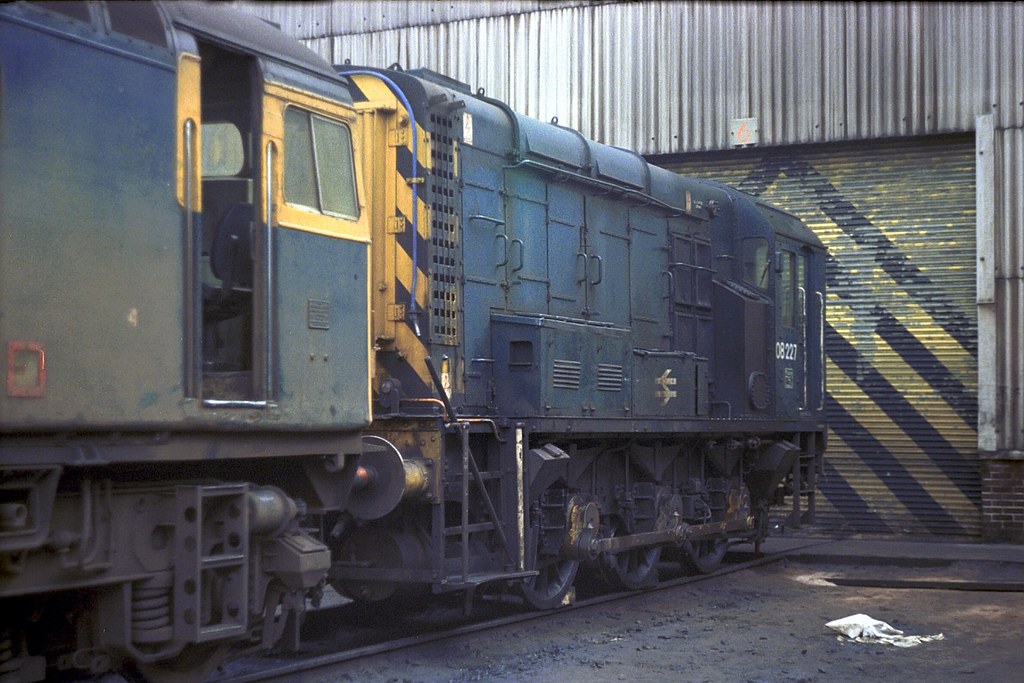 gb_790210_08227ED copy by KK 50423, on Flickr
But interestingly its applied "Sealink" style (ie with top arrow pointing forwards - wonder if it was correct on the other side?Not my image, but here's an 08 with the wrong way round arrow
I reckon that’s an urban myth - concocted after-the-event to imply PR infill. I’ve also heard that it was to reflect the colour of the trains (they were blue) and the yellow front. Of course, when the North Electrics started service there was no ‘yellow front’ as I believe this was implemented on the South Electrics later, then spread. The only one that made sense was the inspiration of crossing pantographs, as that was what the logo was promoting, not rail travel by DMUs.Interesting. I’ve always liked it but didn’t know that idea behind it.


I reckon that’s an urban myth - concocted after-the-event to imply PR infill. I’ve also heard that it was to reflect the colour of the trains (they were blue) and the yellow front. Of course, when the North Electrics started service there was no ‘yellow front’ as I believe this was implemented on the South Electrics later, then spread. The only one that made sense was the inspiration of crossing pantographs, as that was what the logo was promoting, not rail travel by DMUs.
Maybe its not a transfer, but a frame with the double arrow was used and was painted straight onto the 08 with some white paint?How can you apply a transfer the wrong way round?

A stencil and a paintbrush?Maybe its not a transfer, but a frame with the double arrow was used and was painted straight onto the 08 with some white paint?

I have at home in the UK a copy of George Blake's book "Glasgow Electric" - produced by BR in 1960 to commemorate the inauguration of the electric services - in which it is clearly stated the the blue arrow in the logo represents the converging banks of the Firth of Clyde....and the yellow represents a live pantograph.is definitely the "Glasgow Electrics" logo with the Yellow Zig-Zag signifying the electricity and the Blue the AM3 "Blue Trains". The earliest yellow ends would have appeared on the AM3's would have been 1965 and even then probably only on the bottom panels of each end. Warning Yellow application was done very quickly with most locomotives and multiple-units seeing the ends well before a double arrow.

There's an interesting statement on the linked page:The corporate logos on this page are here.
British Railways Board's Design Panel finally picked two: one incorporating two circles and an arrow, and one consisting of parallel lines and double arrows. After the first design had leaked out prematurely, the second one was selected.

The only one that made sense was the inspiration of crossing pantographs,
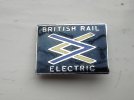
Picked this up way back, probably at an open day at St. Rollox, but can't remember for sure?It is definitely the "Glasgow Electrics" logo with the Yellow Zig-Zag signifying the electricity and the Blue the AM3 "Blue Trains"
I also have one of those....somewhere!Picked this up way back, probably at an open day at St. Rollox, but can't remember for sure?
As do I (If I could only find it!). Interesting if this was an unplanned alternative to the BR double arrow - (why state BR at the top, unless someone mis-interpreted the request for the double arrow logo?I also have one of those....somewhere!

The Glasgow Blue Train symbol pre-dates the BR double arrow by 3 or 4 years. It was never an alternative.As do I (If I could only find it!). Interesting if this was an unplanned alternative to the BR double arrow - (why state BR at the top, unless someone mis-interpreted the request for the double arrow logo?
Thanks for those insightsI reckon that’s an urban myth - concocted after-the-event to imply PR infill. I’ve also heard that it was to reflect the colour of the trains (they were blue) and the yellow front. Of course, when the North Electrics started service there was no ‘yellow front’ as I believe this was implemented on the South Electrics later, then spread. The only one that made sense was the inspiration of crossing pantographs, as that was what the logo was promoting, not rail travel by DMUs.
And thanks also for this. A contemporary sourceI have at home in the UK a copy of George Blake's book "Glasgow Electric" - produced by BR in 1960 to commemorate the inauguration of the electric services - in which it is clearly stated the the blue arrow in the logo represents the converging banks of the Firth of Clyde....and the yellow represents a live pantograph.
Is the plaque with this symbol on still at Queen Street Low Level? (i.e. the one from 1960 commemorating the start of electric services)
I don’t believe so. During the remodelling they did away with the dual gate lines at the main entrance, and you are channeled a different way to the stairs down to the low level. I’l go investigating at the weekend and try to find it!Is the plaque with this symbol on still at Queen Street Low Level? (i.e. the one from 1960 commemorating the start of electric services)
Much would have been learnt from the Glasgow Blue Trains project, possibly the earliest example of a "sparks effect". Other area of BR were much more muted. The launch of the WMCL electrics was high-profile but the conversion of the semi-fasts and locals from DMU's to EMU's was not.
I've found it and linked below, and it looks a bit of an SBB mash up with circles.There's an interesting statement on the linked page:
Does anyone have a link to the unsuccessful design, please? It will be interesting to see what might have been.

They do. I don't have a photo, but I saw it two weeks ago.Is the plaque with this symbol on still at Queen Street Low Level? (i.e. the one from 1960 commemorating the start of electric services)
It’s fair to say that the relatively ‘thin’ ac EMU services on electrified routes from Manchester, Liverpool and Birmingham with the miserable lurching and whining AM4 units on hourly frequencies hardly improved matters compared with the steam to electric transformation and higher frequencies in Glasgow with the lovely AM3s, especially on the sub-surface section. However the expansion of the Euston-Northampton line with lovely AM10s went from strength to strength from Day 1 in April 1966.Much would have been learnt from the Glasgow Blue Trains project, possibly the earliest example of a "sparks effect". Other area of BR were much more muted. The launch of the WMCL electrics was high-profile but the conversion of the semi-fasts and locals from DMU's to EMU's was not.
Interesting, thank you (and yes, the link works).I've found it and linked below, and it looks a bit of an SBB mash up with circles.
It's from a facebook page, so not sure if I can link here.