StephenHunter
Established Member
Instead of a logo incorporating the "BR" letters in it like most railways have over the last 200 years?

Instead of a logo incorporating the "BR" letters in it like most railways have over the last 200 years?

Very few people had a good word to say about it when it was introduced! Lots of scathing comments about barbed wire as I remember.If I remember correctly it was the result of a last minute change of mind. Luckily - they ended up with one of the most powerful and memorable logos of all time.

No doubt an unintended consequence, but the advantage of a word/letter-less logo is that it can survive a change of name (or in this case more upheavals than in an earthquake zone).I suspect because a symbol was felt to be modern and, because it lacked letters, completely divorced from the ‘old-fashioned’ heraldic designs. BR was desperately trying to project a modern, with-it image completely different from the old steam age one, so a complete change was probably felt necessary.
Explicitly to make a break with the past and present a new look for the railways.Instead of a logo incorporating the "BR" letters in it like most railways have over the last 200 years?
It was quick-ish....and the reduction in the locomotive and rolling stock fleet helped. The last BR loco in pre-corporate identity green (a class 40) never saw a rail blue paintbrush and whilst there were pre-nationalisation LMS and LNER coaches that received blue and grey in the 60's, there were a few BR Standard coaches that held onto BR Maroon or Southern Region Green until well into the 1970's.The new look included the double arrow, the new livery colours of monastral blue and pearl grey (with flame red), the name British Rail, and signage using Rail Alphabet and "continental" symbols. These elements would be used in a major campaign of visual redesign across the network, applying the new image over a short period.

I always likened it to a diagrammatic representation of the directions of travel on a 'standard' British double track (one UP, one DOWN) line. Easy to spot the odd loco with it applied in reverse (at least one class 08 ISTR?).Believe the BR double arrow may have been mocked as the "arrows of indecision"

Then there were the Sealink variations (the upper arrow always pointed forward - so was reversed on one side). Then there was the recent ’Iinnovation 200 Exhibition train’ - which carried a model of a modern station, complete with a reversed logo!I always likened it to a diagrammatic representation of the directions of travel on a 'standard' British double track (one UP, one DOWN) line. Easy to spot the odd loco with it applied in reverse (at least one class 08 ISTR?).


I saw a photo of a class 20 like that too.I always likened it to a diagrammatic representation of the directions of travel on a 'standard' British double track (one UP, one DOWN) line. Easy to spot the odd loco with it applied in reverse (at least one class 08 ISTR?).
Arguably the former Austrian one as well.And the Dutch and Irish logos, at least, appear to have been inspired by it.

The roundel for the Underground?Other than the white on green “S” on German S-Bahn systems what other current railway-logos pre-date the BR double arrow?
For the sake of clarity - “current” means “still being applied on a system-wide basis” (so no one-off applications for heritage or similar reasons)?
SNCB's is from the 1930sOther than the white on green “S” on German S-Bahn systems what other current railway-logos pre-date the BR double arrow?
For the sake of clarity - “current” means “still being applied on a system-wide basis” (so no one-off applications for heritage or similar reasons)?
Did that include the 'french gendarme' style of cap?There were also new uniforms, which certainly were mocked (but then they always are).
The London Underground roundel dates from 1908 according to the LT Museum.Other than the white on green “S” on German S-Bahn systems what other current railway-logos pre-date the BR double arrow?
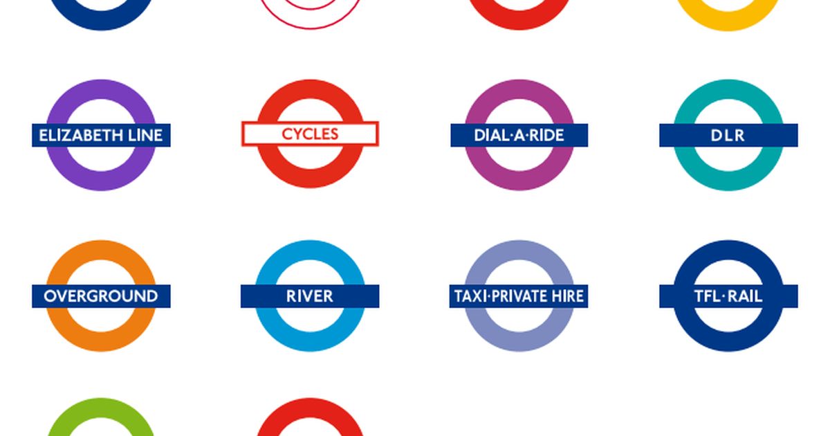
 www.ltmuseum.co.uk

Albeit with some minor tweaks (though fundamentally the same).The London Underground roundel dates from 1908 according to the LT Museum.
The evolution of the roundel | London Transport Museum
The roundel, the symbol of London's public transport and a powerful icon of the city, is over 100 years old. Discover its history, from humble beginnings to a unified corporate identity we know today.
Stupidly that one hadn’t even occurred to me!The London Underground roundel dates from 1908 according to the LT Museum.
The evolution of the roundel | London Transport Museum
The roundel, the symbol of London's public transport and a powerful icon of the city, is over 100 years old. Discover its history, from humble beginnings to a unified corporate identity we know today.
Israel as well.Arguably the former Austrian one as well.

Sign to Harlow Mill Station in 90's had it reversed , dont know if it still isI always likened it to a diagrammatic representation of the directions of travel on a 'standard' British double track (one UP, one DOWN) line. Easy to spot the odd loco with it applied in reverse (at least one class 08 ISTR?).


Yes - also called "faintly German style" in one report. The designs had been shown a year earlier, and production uniforms tried out in a few places later in 1964. They were in the exhibition as part of the new look.Did that include the 'french gendarme' style of cap?

Well, up to a point Lord Copper. The device in its current incarnation (a hollow circle and crossbar) dates from Edward Johnston’s work some ten years later. His design, squashed vertically, was also the basis for the BRB “sausage” totem (apparently because Lord Ashfield refused to let the nascent BTC adopt the bar and circle device for the nationalised mainline railways.)The London Underground roundel dates from 1908 according to the LT Museum.
