Well... Retro is definitely in atm...
View attachment 93243
Someone else did, ages ago, a non-DDA 377 in JaffaCake -
Here
Yes, seen that 377 before - awesome.
Great work there on the 700 - doesn't it just look like it's out of the 80s, even with the DDA doors?
Well, I'm almost sorry to say that I do now think that NSE white is more modern looking.
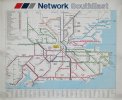
All this nostalgia is great, but I think what we might all searching for is a Corporate Identity that we can all get on board with. Something that is tied to improvements and marketing (maps, tickets, railcards, travelcards), and that encompasses the whole journey from the platform not just the train.
All of that happened with Network Southeast, and although perhaps Southern has been a good brand visually, it's starting to tire on station paintwork in many places.
A similar umbrella of head to toe marketing and corporate identity to NSE I think would be good thing, and maybe what's missing from the railway.
London Overground - if you look at the early line conversions, did a similar thing, with stations included in the conversion, and even seat moquette being part of the corporate design identity. That whole complete approach was part of it's success.
So in my opinion, that kind of thing needs to happen to the railways of the South East. Thameslink for example - it's a great brand name, but it's just another white train with different coloured doors to white trains elsewhere. Bland. But it's been made to be because whoever takes it over in years to come, just sticks a different vinyl on with their name on instead.
Someone with imagination needs to come along and stamp all over this DfT micromanaged blandness.



 ... With new DDA Compliant Doors!