
-
Our new ticketing site is now live! Using either this or the original site (both powered by TrainSplit) helps support the running of the forum with every ticket purchase! Find out more and ask any questions/give us feedback in this thread!
You are using an out of date browser. It may not display this or other websites correctly.
You should upgrade or use an alternative browser.
You should upgrade or use an alternative browser.
RailUK banners
- Thread starter P156KWJ
- Start date
- Status
- Not open for further replies.
Sponsor Post - registered members do not see these adverts; click here to register, or click here to log in
R
RailUK Forums

D306
Established Member
I prefer the standard text.
We need Tom Cairns back! He was great with graphics and everything.
agreed
D306
Established Member
which ones are they that are ugly?

961x134 FCC Banner.
I would use that!

P156KWJ
Established Member
D306
Established Member
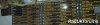
re-done the Sheffield departure one with better (and more professional specially for D306 and Gizmogle) text.
coughitaliccough
devon_metro
Established Member
Most of the recent photos in here aren't good enough quality. Don't see whats professional about Italic font anyway 156401 :?
I'll agree with Gizmogle that there is a limit on banners.
I'll agree with Gizmogle that there is a limit on banners.
P156KWJ
Established Member
coughitaliccough
so you're saying that standard straight regular boring white Arial san-serif straight seenitbefore text looks better? if so...
Italic is about as professional as you can get with MS Paint, right 156401?
I don't like the font used on the banners. What happened to the old RailUK font? Apparently TC gave you (Mojo and the admins I assume?) a copy. It was called "Eurostar" or something.
What happened to the themes that Tom Cairns made? They were great. I would have a different one every day cause I liked them all so much.
I don't like the font used on the banners. What happened to the old RailUK font? Apparently TC gave you (Mojo and the admins I assume?) a copy. It was called "Eurostar" or something.
What happened to the themes that Tom Cairns made? They were great. I would have a different one every day cause I liked them all so much.
P156KWJ
Established Member
Italic is about as professional as you can get with MS Paint, right 156401?
I don't like the font used on the banners. What happened to the old RailUK font? Apparently TC gave you (Mojo and the admins I assume?) a copy. It was called "Eurostar" or something.
What happened to the themes that Tom Cairns made? They were great. I would have a different one every day cause I liked them all so much.
I dont use bloody paint! I use Adobe Photoshop for the text and Microsoft picture manager for the cropping - and for some reason photoshop doesn't allow you to make it bold or italic etc on certain fonts. I use Tahoma usually, you can't get the eurostar font on XP


Mintona
Established Member
I'm using the CrossCountry one, but I also rather like the FGW HST at Cockwood Harbour and the green 47 at Rugeley Trent Valley.
I don't think any of the banners are bad per se, I just prefer some over others. But I think to say they're ugly is a bit harsh, because someone took that photo, and Mojo spent time creating them for your use.
I don't think any of the banners are bad per se, I just prefer some over others. But I think to say they're ugly is a bit harsh, because someone took that photo, and Mojo spent time creating them for your use.

westcoaster
Established Member
 like the shot tom.
Yeah, fair enough, that was a little harsh, but there are very few of these themes that I would use.
I'm still on the default theme.
Now, the CrossCountry one is good, but it's just the way the image is slightly too sharp and distorted that bothers me.
I'm still on the default theme.
Now, the CrossCountry one is good, but it's just the way the image is slightly too sharp and distorted that bothers me.
P156KWJ
Established Member
Mintona
Established Member
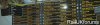
I was bored, how is this?

devon_metro
Established Member

Or if we use the true RUK font give or take a few minor details:

Something I quickly knocked up. Mojo I notice that the shadow on many of you 1600xXXX banners seems to end unusually?
devon_metro
Established Member
Ohh, I like that Liam, just a shame my res is too small to appreciate the best part of the picture!
It is actually flipped although I guessed most people would actually prefer the more clear part of the image...
P156KWJ
Established Member
Ohh, I like that Liam, just a shame my res is too small to appreciate the best part of the picture!
The first one is best.

Credit to Tom Cairns
it's quite blurry on the right
devon_metro
Established Member
Ohh, I like that Liam, just a shame my res is too small to appreciate the best part of the picture!
The first one is best.
Credit to Tom Cairns
Flipped version:

D306
Established Member
and most of your train pics don't even come out that well. they're all to dark and they're occasionally bluryit's quite blurry on the right
P156KWJ
Established Member
so after me listening to people's views and redoing a banner four times to get it right, no-one comments :roll:
devon_metro
Established Member
As mparsons says, the picture is grainy/blurry.

P156KWJ
Established Member
and most of your train pics don't even come out that well. they're all to dark and they're occasionally blury
that's cos I used to use 35mm film, as I am also interested in other aspects of photography. Video is more my thing really these days.
Also, on your banners of the choppers and the EWS 08, it looks like it's snowing, so you can't criticise me for my 'blury' pics - when yours aren't exactly superior either.also, if you knew that much about photography and understood about depth of field, you'd understand more, but obviously you don't. Also, I would like a decent digital camera as well as my camcorder, but unfortunately I cannot possibly afford it.
- Status
- Not open for further replies.