• Our new ticketing site is now live! Using either this or the original site (both powered by TrainSplit) helps support the running of the forum with every ticket purchase! Find out more and ask any questions/give us feedback in this thread!

Rail Symbol 2 (the double arrow logo)

Status
Not open for further replies.

RailWonderer

Established Member
Joined
25 Jul 2018
Messages
2,217
Location
All around the network
The symbol is enclosed in a circle on every paper ticket. And the colour is not red...
That's only in the last few years. As late as 2012/13 if you look at google images of UK train tickets (or have any old ones lying around) they did not use the circle previously. I was just surprised they 'disallow' the circle. What they are saying basically is be sensible and thoughtful when you use the rail symbol I don't think they would mind if it was used the way LM used it.
 
Sponsor Post - registered members do not see these adverts; click here to register, or click here to log in
R

RailUK Forums

mpthomson

Established Member
Joined
18 Feb 2016
Messages
1,380
Was the Sealink version officially an inverse of the BR logo, therefore indicating righthand running? I'm thinking of letterheads etc. Or was it only an inverted BR logo when used on flags or 'near-flag' circumstances such as when painted on funnels, therefore indicating hoist leading?

If always an inverse then it would resemble a proper BR logo in a hoist following situation when used on a flag, no doubt generating further complaints.

When watching TV news reports I'd often wondered why US military personnel would sport backwards Old Glories on their uniform sleeves. I suppose this 'hoist following' convention may have something to do with it. Rather than someone buying a job lot of mis-printed badges from the army surplus store.
When we've been on ops or exercises with US troops they always get asked this by the younger Brits, the answer is that this is how the flag would look from the right hand side (the reverse flag is worn on the right sleeve so that the stars are to the front) if being flown and that it also depicts the US 'going forwards'. Nothing to do with misprinted badges, it's been done for decades now. I've got a few of these patches over the years as part of exchanges for TRFs.

== Doublepost prevention - post automatically merged: ==

I'm fairly sure the American Cavalry regiments use the convention. not sure about infantry.
Used for both, and for some CS and CSS functions too.
 

QueensCurve

Established Member
Joined
22 Dec 2014
Messages
2,196
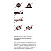
On page 20 it disallows the use of the symbol inside a circle, which I am surprised is not allowed. London Midland enclosed the NR logo into a red circle and it looked very modern and I would like to see more TOCs use it.
National Rail Enquiries are also in breach.
 

Attachments

  • Disallowed double arrows.jpg
    Disallowed double arrows.jpg
    66.8 KB · Views: 164

dosxuk

Established Member
Joined
2 Jan 2011
Messages
2,435
Very few (any?) style guidelines are applied retrospectively - existing uses of design elements continues without having to be immediately changed.

I would expect the existing uses of the rail symbol which are no longer permitted under the new style guidelines to only be changed when they are next worked on. They're unlikely to be requiring all totems and road signs containing the old symbol to be updated with the new symbol when 99.9% of people won't be able to tell the difference - the national rail use with a circle is no different.
 

jackot

Member
Joined
1 Aug 2021
Messages
343
Location
Surrey
National Rail Enquiries are also in breach.
It is funny how even the updated/beta version of the website still features the symbol in breach of the guidelines - you would think if their aim was for consistency then they would start by applying it to projects they are already working on...
 

zwk500

Veteran Member
Joined
20 Jan 2020
Messages
18,460
Location
Northampton
It is funny how even the updated/beta version of the website still features the symbol in breach of the guidelines - you would think if their aim was for consistency then they would start by applying it to projects they are already working on...
1. The document's only just been released, the brief for the website will not have been able to feature it and 2. I can't see anything in the document that says other entities are obligated to follow it. Network Rail and National Rail are completely separate organisations.
 

williamn

Established Member
Joined
22 May 2008
Messages
1,659
Can someone please show this to whoever placed the Double Arrows on Liverpool Central?
 

AdamWW

Established Member
Joined
6 Nov 2012
Messages
5,909
Was the Sealink version officially an inverse of the BR logo, therefore indicating righthand running? I'm thinking of letterheads etc. Or was it only an inverted BR logo when used on flags or 'near-flag' circumstances such as when painted on funnels, therefore indicating hoist leading?

Swapping the logo over for Sealink to denote boats "driving on the right" would be rather strange decision in my view just because the logo was derived from the idea of left hand running on double track.

And indeed the corporate identity manual makes it very clear that they did not do this - it is the correct way round.

I believe that it did appear in reverse on one side of the ships themselves, as for some reason that was treated as if it were on a flag.
 

ajrm

Member
Joined
1 Feb 2019
Messages
223
I believe that it did appear in reverse on one side of the ships themselves, as for some reason that was treated as if it were on a flag.

Correct. Sealink used the standard version of the symbol but reversed it on one side of ship funnels so that both symbols were facing the same way, according to maritime conventions.
 

zwk500

Veteran Member
Joined
20 Jan 2020
Messages
18,460
Location
Northampton
Correct. Sealink used the standard version of the symbol but reversed it on one side of ship funnels so that both symbols were facing the same way, according to maritime conventions.
I've seen it mentioned that there was actually a regulation that the top arrow had to point towards the bow to assist with navigating clear of the vessel in restricted visibility. Not sure of the provenance on that one!
 

AdamWW

Established Member
Joined
6 Nov 2012
Messages
5,909
I've seen it mentioned that there was actually a regulation that the top arrow had to point towards the bow to assist with navigating clear of the vessel in restricted visibility. Not sure of the provenance on that one!

Yes I've seen something similar but I'm not sure how much sense it makes.
 

Gaelan

Member
Joined
3 Apr 2023
Messages
997
Location
Edinburgh
When watching TV news reports I'd often wondered why US military personnel would sport backwards Old Glories on their uniform sleeves. I suppose this 'hoist following' convention may have something to do with it. Rather than someone buying a job lot of mis-printed badges from the army surplus store.
Many (all?) US passenger rail/tram vehicles have a flag somewhere on the livery (it's especially prominent on the NYC subway), and they likewise always have the stripes towards the back of the vehicle.

Not sure how that works on double-ended MUs!
 

Ediswan

Established Member
Joined
15 Nov 2012
Messages
3,418
Location
Stevenage
Correct. Sealink used the standard version of the symbol but reversed it on one side of ship funnels so that both symbols were facing the same way, according to maritime conventions.
I was wondering how P&O are going to handle their new double-enders. But they already appear always to show their flag with the blue segment to the left, whichever side it is on.
 

aavm

Member
Joined
29 Jul 2018
Messages
152
Location
London
Some updates.
I asked Network Rail for a SVG (a web image format) version of the logo.
They said the logo is now owned by the Great British Rail Transition team ( GBRTT, https://gbrtt.co.uk/ ), so ask them.
I asked the GBRTT for a version of the logo. Twice.
They haven't replied.
There is an image including the logo on their website, but it uses a different red #e6001e

Aside: Is it just me or is Great British Rail a really annoying name. Sure it can't be plain old BR as we don't want to disrespect our Thatcherite heritage, but even then. Even "UK Transport", or "Transport for Britain" (à la TFL) would be better (and would be inclusive of Northern Ireland).

 

Basil Jet

On Moderation
Joined
23 Apr 2022
Messages
1,090
Location
London
'Great British' anything is annoying. These days whatever 'it' is usually isn't great. Our railways are a prime example.
The phrase "Great Britain" came about in order to distinguish our island from Brittany, which has the same name in some other languages, eg in French "Bretagne" vs "Grande-Bretagne".
 

zwk500

Veteran Member
Joined
20 Jan 2020
Messages
18,460
Location
Northampton
Even "UK Transport", or "Transport for Britain" (à la TFL) would be better (and would be inclusive of Northern Ireland).
1. Transport for Britain is not inclusive of Northern Ireland, depending on who you ask.
2. Rail in Northern Ireland is devolved and the new GBR will have no direct contact or interaction with it, so why would you want to have a name inclusive of it?
 
Joined
29 Nov 2018
Messages
780
Almost certainly done in an attempt to avoid any sort of copyright claim.
I wouldn't have thought so, plus it looks dreadful to anyone familiar with using a railway station. In my experience of the property marketing profession I'd assume plain incompetence in all matters until proved otherwise (by someone with a different background).
But the subject of licensing or copyright is quite interesting. Does casual use of this logo get monitored or controlled in any way?
 

Pit_buzzer

Member
Joined
11 Oct 2020
Messages
315
Location
Bentley
There was a loco (70s early 80s?) that had a reversed double arrow logo, I think it was a class 31. Don't know how that happened or they were having a laugh!
There was at least one class 20 with a reversed logo. Also quite a few 08s in the Manchester area which had a number of strange variations from standard blue, as well as reversed logos they had a different shade of blue, different shade of yellow, older style number typeface and red buffer beams and side rods
 
Last edited:

nlogax

Established Member
Joined
29 May 2011
Messages
6,011
Location
Mostly Glasgow-ish. Mostly.
The phrase "Great Britain" came about in order to distinguish our island from Brittany, which has the same name in some other languages, eg in French "Bretagne" vs "Grande-Bretagne".
All well and good for the 12th century but obviously not anyone's reason for using it now.

I dunno... Bake-off's okay!!!
Fair point, that is one of my vices :D
 

Krokodil

Established Member
Joined
23 Jan 2023
Messages
6,532
Location
Wales
There was at least one class 20 with a reversed logo. Also quite a few 08s in the Manchester area which had a number of strange variations from standard blue, as well as reversed logos they had a different shade of blue, different shade of yellow, older style number typeface and red buffer beams and side rods
Ships had a flipped logo on one side
 
Status
Not open for further replies.

Top