• Our new ticketing site is now live! Using either this or the original site (both powered by TrainSplit) helps support the running of the forum with every ticket purchase! Find out more and ask any questions/give us feedback in this thread!

New Ticket Design Launched

Status
Not open for further replies.

Kite159

Veteran Member
Joined
27 Jan 2014
Messages
22,744
Location
West of Andover
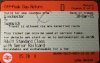
New ticket design is producing at the TVMs at Grateley & Basingstoke so has SWT gone over to the new design for all TVMs?

 
Sponsor Post - registered members do not see these adverts; click here to register, or click here to log in
R

RailUK Forums

TEW

Established Member
Joined
16 May 2008
Messages
6,226
All SWT TVMs will go over to the new style over the next couple of weeks.
 

Harlesden

Member
Joined
23 Jun 2010
Messages
968
Location
LONDON NW10
Have just purchased an Advance first class single London-Sheffield and there is no separate reservation coupon. All information is squeezed onto the ticket itself making it very hard to read. Is this a trial or is it permanent?
 

najaB

Veteran Member
Joined
28 Aug 2011
Messages
33,601
Location
Scotland
Have just purchased an Advance first class single London-Sheffield and there is no separate reservation coupon. All information is squeezed onto the ticket itself making it very hard to read. Is this a trial or is it permanent?
Permanent. The legibility is variable depending on the quality of the printer.
 

jon0844

Veteran Member
Joined
1 Feb 2009
Messages
30,865
Location
UK
Printing text over other text is still happening and it made it difficult for me to recognise which tickets I had were Two Together and which were Senior Railcards, when giving them out.

One member of staff said it didn't matter as the discounts were the same and all anyone cares about is the D at the top. I must remember to use that line with an RPI one day!!
 

bb21

Emeritus Moderator
Joined
4 Feb 2010
Messages
24,451
There is a solution for that problem implemented by some TVMs,


by omitting the second line of text completely.
 

LondonStatto

Member
Joined
27 Dec 2015
Messages
8
This thread was most interesting, glad I found it. I got a new style ticket for my Christmas trip to Canterbury - sadly my ticket wasn't checked at all in either direction so I couldn't ask the guard what he thought of it.

Edit: I hadn't heard anything about the new style of ticket so had to go to the ticket office to ask about it. It just doesn't look like a train ticket.

My thoughts:

There's too much information so the station names, even if they're in the same size font as the old style, are less readable.

Worse, the old OUT/RTN bold text has been reduced in size and put on the orange bar at the top. This is terrible for me as I invariably buy return tickets for at least two people, and it makes it much slower to see which are the right tickets for which bit of the journey.

Also, the "v" in valid has become separated from its "alid" (see attachment).

I do like having the restrictions URL listed.
 

Attachments

  • new ticket.PNG
    new ticket.PNG
    870.3 KB · Views: 181
Last edited:

jon0844

Veteran Member
Joined
1 Feb 2009
Messages
30,865
Location
UK
Strange to see text still cut off. Surely someone knows the character limit or else the text could have wrapped to a third line?

c67d6ea0d10b4dca9b005271be8884f5.jpg
 

embers25

Established Member
Joined
16 Jul 2009
Messages
2,159
Each time I have a new style ticket issued from the Woking ticket machines they don't work in the barriers for the tube and each time the barrier staff have taken one look at them and said "Ahh new ticket formats hardly ever work come on thru!".
 

najaB

Veteran Member
Joined
28 Aug 2011
Messages
33,601
Location
Scotland
Each time I have a new style ticket issued from the Woking ticket machines they don't work in the barriers for the tube and each time the barrier staff have taken one look at them and said "Ahh new ticket formats hardly ever work come on thru!".
That's interesting as I'm surprised what's printed on the front impacts what is coded on the back.
 

Hadders

Veteran Member
Associate Staff
Senior Fares Advisor
Joined
27 Apr 2011
Messages
18,114
That's an interesting routeing on that ticket. I thought it used to be 'Victoria Line North' (and this is still what Avantix Traveller says)/ I seem to remember a thread a couple of years back where we were discussing the validity of this routeing via Kings Cross.
 

jon0844

Veteran Member
Joined
1 Feb 2009
Messages
30,865
Location
UK
Yes, I think I was part of that discussion and it was suggested that you might be able to travel via King's Cross.

Clearly it's quicker to go via FPK so I've never needed to do it, the one exception being when the tube was shut due to an incident and I went to King's Cross and was let out without fuss, and allowed travel on the tube to Liverpool Street and back in. I think me pretty much saying I was going that way due to Victoria Line problems with total confidence helped, as nobody ever stopped to check or question me!

On the TVM itself it's shown as Victoria Line North (it says that even if you book the other way, when you'd expect it to say South?).
 

TEW

Established Member
Joined
16 May 2008
Messages
6,226
SWT's S&B machines are simply not encoding Advance tickets at all since they changed to the new format. You'll get the same error code if you put the ticket in upside down. Last week the machines at Haslemere were not encoding any tickets at all, and weren't printing them correctly in the new style, but something more akin to a season ticket or Travelcard from a machine printing the new style. The software update also caused some machines to go out of action for around a week leading up to Christmas, with S&B engineers completely baffled as to what the problem was.
 
Last edited:

swt_passenger

Veteran Member
Joined
7 Apr 2010
Messages
34,252
Have the diamond and circle to indicate discounts been binned now, I see D on all mine for Railcard? Is it C for child?

It does seem odd that they don't put the railcard info to the right of, and on the same line as the ticket type, there must always be room as they only really need the three letters, such as SNR or NSE etc, and it would give them another spare line or two?
 
Last edited:

trentside

Established Member
Joined
14 Aug 2010
Messages
3,390
Location
Messroom
Have the diamond and circle to indicate discounts been binned now, I see D on all mine for Railcard? Is it C for child?

It does seem odd that they don't put the railcard info to the right of, and on the same line as the ticket type, there must always be room as they only really need the three letters, such as SNR or NSE etc, and it would give them another spare line or two?

I'm seeing a mix of both. The problem with the 'D' for discount is that it also appears on Advance tickets where it used to show the percentage discount, so you have to check to see what discount is applied by looking at the text. In some cases this is also badly overprinted. You end up asking for railcards where none are required and vice versa.

Just another step in making this awful design even worse!
 

GodAtum

On Moderation
Joined
11 Dec 2009
Messages
2,684
I collected some tickets at Guildford TVM but they looked wierd so I went up to the counter to check. Apparently they are Ok and it's the new design!
 

CatfordCat

Member
Joined
23 Jan 2013
Messages
639
I had a similar hmm moment this week - don't often get a one-off return, but only working 2 days this week and am between season tickets.

first thought was i'd got a receipt and not a ticket.

does seem unhelpful - both for passengers and train / station staff who might want to look at them - to make the text smaller...
 

Silver Cobra

Member
Joined
4 Jun 2015
Messages
1,004
Location
Bedfordshire
It's interesting to see how there are variances with the new ticket design, depending on where they are issued from. Comparing the tickets posted on the previous page to one I received recently in the post from VTEC:

23urg4w.jpg


The most interesting difference is the inclusion of something resembling a QR code, but not quite the right layout for one. Something specific to VTEC perhaps?
 

najaB

Veteran Member
Joined
28 Aug 2011
Messages
33,601
Location
Scotland
The most interesting difference is the inclusion of something resembling a QR code, but not quite the right layout for one. Something specific to VTEC perhaps?
That's an Aztec code. VTEC and a few other TOCs print them, guards can scan it with their hand-held scanner.
 

Dent

Established Member
Joined
4 Feb 2015
Messages
1,200
Have the diamond and circle to indicate discounts been binned now, I see D on all mine for Railcard? Is it C for child?

It does seem odd that they don't put the railcard info to the right of, and on the same line as the ticket type, there must always be room as they only really need the three letters, such as SNR or NSE etc, and it would give them another spare line or two?

One of the main points of the new design is to make tickets more comprehensible, using cryptic three letter codes with no explanation would be a step backwards.
 

Bletchleyite

Veteran Member
Joined
20 Oct 2014
Messages
113,091
Location
"Marston Vale mafia"
One of the main points of the new design is to make tickets more comprehensible, using cryptic three letter codes with no explanation would be a step backwards.

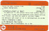
True, but equally every Railcard holder knows what their Railcard code is, it's not as if they don't see it on every ticket!

I think it could be made clear without the need to make it really wordy.
 

fairysdad

Member
Joined
27 Dec 2010
Messages
959
Location
London, Surrey... bit of a blur round here...
The most interesting difference is the inclusion of something resembling a QR code, but not quite the right layout for one. Something specific to VTEC perhaps?
It's not new to the new ticket design, I've seen it on an old-style ticket issued at King's Cross and not for a VTEC route (it was Exeter to Umberleigh! The lady behind the counter didn't bat an eyelid...), yet not seen it on a new-style one until your posted image. (I've only seen one new-style ticket in the flesh from a SWT TVM.)
 

jon0844

Veteran Member
Joined
1 Feb 2009
Messages
30,865
Location
UK
Aztec codes can be encrypted, which is the key difference over a QR code.
 

Camden

Established Member
Joined
30 Dec 2014
Messages
1,949
One of the main points of the new design is to make tickets more comprehensible

Then, having seen it, I think the new design is an unmitigated failure.

It seems neither easy for the passenger not railway staff to quickly determine ticket validity. Or indeed even that you have the right ticket at all.

The text is too small, it's badly placed, and it makes the train ticket look like a receipt.

I'm sure there are plenty of people out there that could design a very easy to understand ticket that contains more information. They don't appear to me to have been given the job to do so.
 
Last edited:

talldave

Established Member
Joined
24 Jan 2013
Messages
2,676
One of the main points of the new design is to make tickets more comprehensible, using cryptic three letter codes with no explanation would be a step backwards.

So the change from GOLDC to D makes things more comprehensible does it?!

I think the single letter code with no explanation is more cryptic. The validity of the ticket is affected by the type of railcard and yet that's not indicated on the ticket. That is not progress, that's a step backwards. I presume this decision was taken by a committee of idiots who don't buy tickets?
 

andrewkeith5

Member
Joined
2 Jun 2013
Messages
681
Location
West Sussex
So the change from GOLDC to D makes things more comprehensible does it?!


I think the single letter code with no explanation is more cryptic. The validity of the ticket is affected by the type of railcard and yet that's not indicated on the ticket. That is not progress, that's a step backwards. I presume this decision was taken by a committee of idiots who don't buy tickets?


I presume you haven't seen the part of the ticket where the railcard is referenced using its full name? The D exists to indicate that the ticket has been discounted in some way...
 

swt_passenger

Veteran Member
Joined
7 Apr 2010
Messages
34,252
One of the main points of the new design is to make tickets more comprehensible, using cryptic three letter codes with no explanation would be a step backwards.

The first version of my post, until I edited it, I suggested the whole wording be extended to the right, using the long 'railcard' name - until I remembered the space was there on the right for Aztec codes.

Perhaps they could use a short version such as 'Senior Card' or 'Network Card' (for examples) and still get the whole message across. Also would '&' be ok rather than 'with'?

So using my example photo below,
Adult Standard Class
with Senior Railcard

could become
Adult Standard Class & Senior Card

At least SWT seem to have avoided overwriting and they have missed the orange borders...
 

Attachments

  • IMG_0069.jpg
    IMG_0069.jpg
    19.9 KB · Views: 125
Status
Not open for further replies.

Top