Kite159
Veteran Member
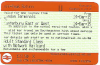
New ticket design is producing at the TVMs at Grateley & Basingstoke so has SWT gone over to the new design for all TVMs?


New ticket design is producing at the TVMs at Grateley & Basingstoke so has SWT gone over to the new design for all TVMs?

Permanent. The legibility is variable depending on the quality of the printer.Have just purchased an Advance first class single London-Sheffield and there is no separate reservation coupon. All information is squeezed onto the ticket itself making it very hard to read. Is this a trial or is it permanent?


That's interesting as I'm surprised what's printed on the front impacts what is coded on the back.Each time I have a new style ticket issued from the Woking ticket machines they don't work in the barriers for the tube and each time the barrier staff have taken one look at them and said "Ahh new ticket formats hardly ever work come on thru!".
That's interesting as I'm surprised what's printed on the front impacts what is coded on the back.
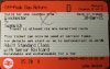
Have the diamond and circle to indicate discounts been binned now, I see D on all mine for Railcard? Is it C for child?
It does seem odd that they don't put the railcard info to the right of, and on the same line as the ticket type, there must always be room as they only really need the three letters, such as SNR or NSE etc, and it would give them another spare line or two?


That's an Aztec code. VTEC and a few other TOCs print them, guards can scan it with their hand-held scanner.The most interesting difference is the inclusion of something resembling a QR code, but not quite the right layout for one. Something specific to VTEC perhaps?
Have the diamond and circle to indicate discounts been binned now, I see D on all mine for Railcard? Is it C for child?
It does seem odd that they don't put the railcard info to the right of, and on the same line as the ticket type, there must always be room as they only really need the three letters, such as SNR or NSE etc, and it would give them another spare line or two?
One of the main points of the new design is to make tickets more comprehensible, using cryptic three letter codes with no explanation would be a step backwards.

It's not new to the new ticket design, I've seen it on an old-style ticket issued at King's Cross and not for a VTEC route (it was Exeter to Umberleigh! The lady behind the counter didn't bat an eyelid...), yet not seen it on a new-style one until your posted image. (I've only seen one new-style ticket in the flesh from a SWT TVM.)The most interesting difference is the inclusion of something resembling a QR code, but not quite the right layout for one. Something specific to VTEC perhaps?
One of the main points of the new design is to make tickets more comprehensible
One of the main points of the new design is to make tickets more comprehensible, using cryptic three letter codes with no explanation would be a step backwards.
So the change from GOLDC to D makes things more comprehensible does it?!
I think the single letter code with no explanation is more cryptic. The validity of the ticket is affected by the type of railcard and yet that's not indicated on the ticket. That is not progress, that's a step backwards. I presume this decision was taken by a committee of idiots who don't buy tickets?
One of the main points of the new design is to make tickets more comprehensible, using cryptic three letter codes with no explanation would be a step backwards.