
-
Our new ticketing site is now live! Using either this or the original site (both powered by TrainSplit) helps support the running of the forum with every ticket purchase! Find out more and ask any questions/give us feedback in this thread!
You are using an out of date browser. It may not display this or other websites correctly.
You should upgrade or use an alternative browser.
You should upgrade or use an alternative browser.
New Ticket Design Launched
- Thread starter Solent&Wessex
- Start date
- Status
- Not open for further replies.

Sponsor Post - registered members do not see these adverts; click here to register, or click here to log in
R
RailUK Forums

One I picked up last week (unfortunately swallowed at Leeds so cannot provide an image here) said "no specific seat reserved". Also, there surely could be a more intuitive way of representing where no particular seat reservation is issued (i.e. Arriva Trains Wales).
There are definitely a few bugs that still need ironing out with the printing of these new style tickets and reservations. Also, there surely could be a more intuitive way of representing where no particular seat reservation is issued (i.e. Arriva Trains Wales).
If there's no data to fill in the coach/seat, then it should surely be replaced with something like 'Free seating'.
Or..
One I picked up last week (unfortunately swallowed at Leeds so cannot provide an image here) said "no specific seat reserved"
- How can things like this still not be sorted. Paper tickets will be gone by the time they issue properly formatted tickets in the new style!
Nothing surprises me. My experience with the future of ticketing (in this case 'The Key') has revealed just how backwards things are.
These new tickets, just like when smartcards are extended to new areas, all have a feel of a public beta test. Actually, beta might be pushing it. Alpha test?!
These new tickets, just like when smartcards are extended to new areas, all have a feel of a public beta test. Actually, beta might be pushing it. Alpha test?!

Another variant I spotted on Twitter the other day (link to original Tweet)
Looks like the Merseyrail TVM at West Kirby is printing station names in capitals, which is different to any other new-format ticket I've seen.
Looks like the Merseyrail TVM at West Kirby is printing station names in capitals, which is different to any other new-format ticket I've seen.
Attachments
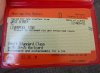
I also love that we have gone back from the month being written out in full, to using the silly old abbreviation but in mixed case, and now S&B are just using the old AUG again.
And look at that ridiculous D that is persisting. That looks nothing like the template in the first post of this thread.
I think we can now consider this rollout a bit of a disaster. What are you doing RSP!?
And look at that ridiculous D that is persisting. That looks nothing like the template in the first post of this thread.
I think we can now consider this rollout a bit of a disaster. What are you doing RSP!?

swapmeetpete
Member
- Joined
- 29 Dec 2013
- Messages
- 39


mbreckers
Member
- Joined
- 20 Jan 2015
- Messages
- 365
Going from feedback on Twitter ScotRail users do not approve of the new ticket design:
Jings! Scotrail are economising on ink. Writing on ticket so small that you can't make it out clearly. Why?
@ScotRail couldn't get past the barriers. Spoke to 4 staff members on journey. 3 agreed they are terrible and suggested I complaim
@ScotRail why did the train tickets change layout? They are much harder to read now. The ticket examiners seem to be struggling...
@ScotRail Here you, whit's all this aboot? Machines no accepting new fivers and stupid ticket layout? #ScotFail
I take it back @ScotRail Terrible design but happy to accept it's not your fault. Be nice to see user research on it
Congratulations @scotrail on the new, much harder to scan tickets. Where's OUT/RTN, STD/1ST and use of whitespace?

bb21
Emeritus Moderator
- Joined
- 4 Feb 2010
- Messages
- 24,452
S&B machines are the worst ticket machines I have ever seen anywhere in the world for legibility, by quite some mileage.
I think we can now consider this rollout a bit of a disaster. What are you doing RSP!?
I suspect it's not RSP at fault, but the TOCs / software developers who are unable to follow a basic standard.
I suspect it's not RSP at fault, but the TOCs / software developers who are unable to follow a basic standard.
RSP are contributing to the problem, however, by issuing accreditation certificates to the suppliers of the machines in question...
northwichcat
Veteran Member
Does anyone know what a GM Wayfarer looks like in the new style? In the old style it has "RAIL RANGER" in big letters at the bottom despite it being a rail, bus and tram ranger.

Paul Kelly
Verified Rep - BR Fares
Does anyone know what a GM Wayfarer looks like in the new style? In the old style it has "RAIL RANGER" in big letters at the bottom despite it being a rail, bus and tram ranger.
Isn't it only singles and returns (and even then, only those with public price and common railcard discounts) that are switching to the new format? I would expect no change for rangers.

How about this for legibility?
That one couldn't get much worse!
Nothing surprises me. My experience with the future of ticketing (in this case 'The Key') has revealed just how backwards things are.
These new tickets, just like when smartcards are extended to new areas, all have a feel of a public beta test. Actually, beta might be pushing it. Alpha test?!
Perhaps that's because in your area it hasn't been launched yet and is, most likely, in beta test.


button_boxer
Established Member
- Joined
- 12 Nov 2009
- Messages
- 1,271
It's really rubbish how they aren't able to show letters descending below the line.
Still hugely more legible than some of the other efforts we've seen on this thread...
swt_passenger
Veteran Member
- Joined
- 7 Apr 2010
- Messages
- 34,259
It's really rubbish how they aren't able to show letters descending below the line.
Wasn't lack of descenders (on the PIS displays) one of the 'massive problems', which led to the 458/0s being considered illegal under DDA or RVAR?
Surely it must be similarly wrong on a TVM?
gray1404
Established Member
The new style advances no longer omit the details from the "Route:" field of the old style tickets. This is annoying as it was useful for them not to have the TOC restriction details on them if in the event of a delay, staff would just direct you to the next service regardless of TOC. Here are some examples of the updated ones. These clearly now state it is Southern and London Midland only.
Attachments
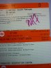
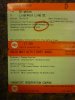
The new style advances no longer omit the details from the "Route:" field of the old style tickets. This is annoying as it was useful for them not to have the TOC restriction details on them if in the event of a delay, staff would just direct you to the next service regardless of TOC. Here are some examples of the updated ones. These clearly now state it is Southern and London Midland only.
Quite legible in my opinion which is good, although I do agree with starmill that they've missed a trick with the descending letters. It really shouldn't be that hard to programme in a suitable font.
The routing text makes no difference to the prevailing advance ticket T&Cs. However, its inclusion has pushed all the reservations on to the next coupon, which really defeats one of the stated advantages of these tickets. Part of the rationale for the new design was to eliminate the need to carry separate reservation coupons was it not (at least for journeys with one or two legs)?
I also note the railcard information is still slightly obscured (although not as bad as some previous examples).
Overall, getting gradually better, but still room for improvement.
Last edited:
swt_passenger
Veteran Member
- Joined
- 7 Apr 2010
- Messages
- 34,259
...However, its inclusion has pushed all the reservations on to the next coupon, which really defeats one of the stated advantages of these tickets. Part of the rationale for the new design was to eliminate the need to carry separate reservation coupons was it not (at least for journeys with one or two legs)?
ISTM that the three 'booked train' services cover whole the end to end journey - so they could safely leave out the words 'and suitable connecting Southern or London Midland services'.
That would probably give the space to put all three reserved trains on the ticket.
But we've had the debate about whether that fare actually uses 'connections' in a previous thread...
Still hugely more legible than some of the other efforts we've seen on this thread...
If we're going to start from scratch on a ticket design, I rather think we can deserve slightly higher standards than "legebility".
gray1404
Established Member
There was a 4th Southern train that is not printed on the ticket between Milton Keynes Central and Clapham Junction on the outward and Clapham Junction and Watford Junction on the return.
I've seen AP SWT ONLY tickets do that before. Indeed one of the first tickets I collected in new format was one such and it became "Valid only on the following service and suitable connectiong South West Trains services." - a little wollier than the original but that was one of the clearer ones.

I'm just gonna say it, but as someone who looks at these for a living, I hate the new style tickets. When your doing what could be known as a high speed ticket check (12 busy coaches in 15-25 mins) (Ecr-Gtw-HHe), your looking for 5 main things, class, destination, station from,date and type of ticket. On the old tickets these can be spotted in a glance. The new ones with their tiny writing, some all squished in a corner are just a pain. With the classic style, when someone is being a bit slow getting their ticket out, you can even glance over seats at other tickets, the new ones, nope. Great if you have time to walk through your train and stamp or clip each ticket checking each ticket in detail, not so good when time is not on your side.
But, as per usual, a change was made and no one asked train crew.:roll:
But, as per usual, a change was made and no one asked train crew.:roll:
Last edited:
- Status
- Not open for further replies.