Hello!
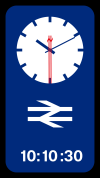
In the spirit of "I Reckon is could give it a shot" and to address a few major issues with regards to the design - I though I'd put a little effort into designing my own versions:-
- Both the Analogue and Digital variants are should together.
- flexible layout allows to deployment in different ratios/station environments
- Digital time shown in Rail Alphabet 2, (in line with Network Rail's Wayfinding Guidance documentation)
- deployment of the GBR color pallete in order maintain a consistent brand identity.
- clean, incomplex, easy to ready, while maintaining style and function.
Note:
- Double Arrow on the seconds hand counterweight.
Why I did this:
[1] I film believe that the design chosen, while iconic, and beautiful, doesn't satisfy the need for function, particularly in the railway environment, where time itself matters.
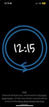
[2] The design itself is inaccessible - while the denomination of the seconds are clever, it's not intuitive to the human standards of reading time.
[3] The deployment of color (Red/Black) is not in keeping with the design standards of the GBR visual identity and/brand.
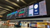
[4] opinion: it feels like a project of work that, in an wayfinding environment such at a railway station, would be somewhat out of place.
Caveat:
- I'm not particularly good at kerning type, as such, some of the number placements in the digital time code are out of place, and spacing is odd. I know this, but it's a skill I'm trying to get better at - nobody is perfect, of course!
I'm more than happy to take feedback, it only makes me better!
In the spirit of "I Reckon is could give it a shot" and to address a few major issues with regards to the design - I though I'd put a little effort into designing my own versions:-
- Both the Analogue and Digital variants are should together.
- flexible layout allows to deployment in different ratios/station environments
- Digital time shown in Rail Alphabet 2, (in line with Network Rail's Wayfinding Guidance documentation)
- deployment of the GBR color pallete in order maintain a consistent brand identity.
- clean, incomplex, easy to ready, while maintaining style and function.
Note:
- Double Arrow on the seconds hand counterweight.
Why I did this:
[1] I film believe that the design chosen, while iconic, and beautiful, doesn't satisfy the need for function, particularly in the railway environment, where time itself matters.
[2] The design itself is inaccessible - while the denomination of the seconds are clever, it's not intuitive to the human standards of reading time.
[3] The deployment of color (Red/Black) is not in keeping with the design standards of the GBR visual identity and/brand.
[4] opinion: it feels like a project of work that, in an wayfinding environment such at a railway station, would be somewhat out of place.
Caveat:
- I'm not particularly good at kerning type, as such, some of the number placements in the digital time code are out of place, and spacing is odd. I know this, but it's a skill I'm trying to get better at - nobody is perfect, of course!
I'm more than happy to take feedback, it only makes me better!