• Our new ticketing site is now live! Using either this or the original site (both powered by TrainSplit) helps support the running of the forum with every ticket purchase! Find out more and ask any questions/give us feedback in this thread!

New clock unveiled

lkbergen

Member
Joined
13 Dec 2025
Messages
12
Location
Edinburgh
Hello!

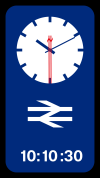
In the spirit of "I Reckon is could give it a shot" and to address a few major issues with regards to the design - I though I'd put a little effort into designing my own versions:-

- Both the Analogue and Digital variants are should together.
- flexible layout allows to deployment in different ratios/station environments
- Digital time shown in Rail Alphabet 2, (in line with Network Rail's Wayfinding Guidance documentation)
- deployment of the GBR color pallete in order maintain a consistent brand identity.
- clean, incomplex, easy to ready, while maintaining style and function.

Note:
- Double Arrow on the seconds hand counterweight.

Why I did this:
[1] I film believe that the design chosen, while iconic, and beautiful, doesn't satisfy the need for function, particularly in the railway environment, where time itself matters.
[2] The design itself is inaccessible - while the denomination of the seconds are clever, it's not intuitive to the human standards of reading time.
[3] The deployment of color (Red/Black) is not in keeping with the design standards of the GBR visual identity and/brand.
[4] opinion: it feels like a project of work that, in an wayfinding environment such at a railway station, would be somewhat out of place.

Caveat:
- I'm not particularly good at kerning type, as such, some of the number placements in the digital time code are out of place, and spacing is odd. I know this, but it's a skill I'm trying to get better at - nobody is perfect, of course!

I'm more than happy to take feedback, it only makes me better!
 

Attachments

  • BLACK_BASE_2.mp4
    2.2 MB
  • BLACK_BASE.00_40_30_0.Still001.png
    BLACK_BASE.00_40_30_0.Still001.png
    322.9 KB · Views: 269
  • Euston.jpg
    Euston.jpg
    1.3 MB · Views: 270
Sponsor Post - registered members do not see these adverts; click here to register, or click here to log in
R

RailUK Forums

The exile

Established Member
Joined
31 Mar 2010
Messages
9,307
Location
Somerset
Hello!

In the spirit of "I Reckon is could give it a shot" and to address a few major issues with regards to the design - I though I'd put a little effort into designing my own versions:-

- Both the Analogue and Digital variants are should together.
- flexible layout allows to deployment in different ratios/station environments
- Digital time shown in Rail Alphabet 2, (in line with Network Rail's Wayfinding Guidance documentation)
- deployment of the GBR color pallete in order maintain a consistent brand identity.
- clean, incomplex, easy to ready, while maintaining style and function.

Note:
- Double Arrow on the seconds hand counterweight.

Why I did this:
[1] I film believe that the design chosen, while iconic, and beautiful, doesn't satisfy the need for function, particularly in the railway environment, where time itself matters.
[2] The design itself is inaccessible - while the denomination of the seconds are clever, it's not intuitive to the human standards of reading time.
[3] The deployment of color (Red/Black) is not in keeping with the design standards of the GBR visual identity and/brand.
[4] opinion: it feels like a project of work that, in an wayfinding environment such at a railway station, would be somewhat out of place.

Caveat:
- I'm not particularly good at kerning type, as such, some of the number placements in the digital time code are out of place, and spacing is odd. I know this, but it's a skill I'm trying to get better at - nobody is perfect, of course!

I'm more than happy to take feedback, it only makes me better!
I like the brief change of colour on the full minute as it will catch the eye even if you’re not staring directly at it. I appreciate you’re trying to incorporate the double arrow into the second hand, but the double-line gives it too much “weight”. Definitely think having analogue and digital on the same display is good.
 

williamn

Established Member
Joined
22 May 2008
Messages
1,652
I’ve noticed that the seconds count on the new clock at London Victoria seems out of sync with digital clocks displayed elsewhere on the station!

== Doublepost prevention - post automatically merged: ==

I’ve noticed that the seconds count on the new clock at London Victoria seems out of sync with digital clocks displayed elsewhere on the station!
 

duffield

Established Member
Joined
31 Jul 2013
Messages
3,268
Location
East Midlands
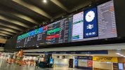
I've already got so used to seeing the new clock on the concourse board at Nottingham that it feels like "part of the furniture".
 

Steddenm

Established Member
Joined
2 Mar 2017
Messages
1,250
Location
Clane, Co. Kildare
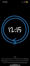
The clock that somebody had on here that was on a link and the Android Wear watchface have gone, apparently due to a copyright claim by Network Rail.
 

Leyland Bus

Member
Joined
20 May 2021
Messages
1,163
Location
York
The clock that somebody had on here that was on a link and the Android Wear watchface have gone, apparently due to a copyright claim by Network Rail.

Can't copy into here as its a PDF document but basically explains the above, pulled due to copyright.

My friends phone clock went all funny but mine is still working lovely :lol:
 

Attachments

  • IMG-20260122-WA0003.jpg
    IMG-20260122-WA0003.jpg
    58.9 KB · Views: 134

MrJeeves

Established Member
Associate Staff
Senior Fares Advisor
Joined
28 Aug 2015
Messages
4,611
Location
Burgess Hill
My friends phone clock went all funny but mine is still working lovely :lol:
There should have been no impact on existing users who downloaded the clock Android app or WearOS watch face I made.

The website would have changed for everyone.
 

DelW

Established Member
Joined
15 Jan 2015
Messages
5,934
I'm not really clear how making a simulation available (free) to Android devices is going to "cause significant damage to Network Rail", but maybe that's (one of the reasons) why I'm not a copyright lawyer.

I can confirm that the one on the home page of my tablet is still working. In case NR are worried, I have absolutely no intention of putting it up in the front window of my house and pretending to passers-by that it's a railway station.

The physical clock at London Bridge does look particularly impressive, but the departure board versions look good too.
 

jfowkes

Established Member
Joined
20 Jul 2017
Messages
1,266
I'm not really clear how making a simulation available (free) to Android devices is going to "cause significant damage to Network Rail", but maybe that's (one of the reasons) why I'm not a copyright lawyer.
I'm also not a copyright lawyer, but they're probably not worried about this specific app, they just don't want people to think "Network Rail are cool with copyright infringement". While this app/website itself isn't harmful, you can see that it sets a precedent for others to come along and either a) try and make money off it and/or b) write a low quality app or something that outright breaks the law (like installs phishing software or something).

I'm not sure that a legal attack is warranted (e.g. they could have worked with @MrJeeves to allow the use of their copyright maybe?), but it's probably easier from their POV to just do this and get it off their plate.
 

sh24

Established Member
Joined
28 Sep 2023
Messages
1,471
Location
London
Network Rail may also be hoping for future licensing revenue from the clock.
 

whoosh

Established Member
Joined
3 Sep 2008
Messages
1,884
Network Rail may also be hoping for future licensing revenue from the clock.
Yes, I thought there were plans to release an official smart watchface. This would be undermined by any free one that someone else made available.

The design, is Network Rail's intellectual property, and no one else has the right to distribute it, even for free.
 

duffield

Established Member
Joined
31 Jul 2013
Messages
3,268
Location
East Midlands
Yes, I thought there were plans to release an official smart watchface. This would be undermined by any free one that someone else made available.

The design, is Network Rail's intellectual property, and no one else has the right to distribute it, even for free.
Although it could be argued that as a public body funded by the taxpayer we should all be free to use the IP we have already paid for, in the same way it could be argued that we already paid for the Ordnance Survey maps and should get at least all its digital products for free (and yes, I know that's not the current legal situation).
 

dosxuk

Established Member
Joined
2 Jan 2011
Messages
2,428
And as we've paid for the tea and coffee facilities in the staff room at the local police station, we should also be allowed to go and help ourselves?
 

enginedin

Member
Joined
15 Dec 2020
Messages
473
Location
UK
we already paid for the Ordnance Survey maps and should get at least all its digital products for free
except we don't (sorry to let facts get in the way of a good rant)

Ordnance Survey is a Government Owned company - the products it makes available to consumers, and the tools enabling that access, are not funded by general taxation, and are instead funded by customers. (see also: Met Office, who sell met data to airlines; UK Hydrographic Office, who sell chart data to shipping company, etc etc etc).

The argument that we should get OS products for free because it is owned by the Government is no different to that we should travel on any Northern train for free because Northern is owned by the Government.
 

duffield

Established Member
Joined
31 Jul 2013
Messages
3,268
Location
East Midlands
except we don't (sorry to let facts get in the way of a good rant)

Ordnance Survey is a Government Owned company - the products it makes available to consumers, and the tools enabling that access, are not funded by general taxation, and are instead funded by customers. (see also: Met Office, who sell met data to airlines; UK Hydrographic Office, who sell chart data to shipping company, etc etc etc).

The argument that we should get OS products for free because it is owned by the Government is no different to that we should travel on any Northern train for free because Northern is owned by the Government.
Much of the data the OS maps are based on was taxpayer financed through the years. And it's a serious argument that freely available OS maps could be a net benefit to the economy; that's why *some* OS data is freely available already.

Of course I'm not trying to assert such benefits for the NR clock. However, I don't think comparing free train travel to free use of government IP is a valid comparison. A free-for-all on Northern trains (for example) would lead directly to real world consequences as trains became unusably overcrowded and people who needed them to get to work etc. would be crowded off; large amounts of extra rolling stock would be required at considerable expense. Meanwhile having a load of copies on the NR clock has no direct costs or consequences. It's arguable that having free copies or government IP is more like a freedom of information request than it is like free train travel.
 

enginedin

Member
Joined
15 Dec 2020
Messages
473
Location
UK
Much of the data the OS maps are based on was taxpayer financed through the years
Some of the data, yes - but not the tools required to access. £17 a year to access all the OS maps at 4 different scales online and via an app seems incredibly good value to money to me
 

joh

Member
Joined
7 Aug 2018
Messages
7
I think I've seen two or three unofficial copies of the new station clock on the web (before they had to be taken down). In one of them, both arrows moved clockwise for one minute at noon and midnight. Does the original actually run like this as well?
 

jfowkes

Established Member
Joined
20 Jul 2017
Messages
1,266
I think I've seen two or three unofficial copies of the new station clock on the web (before they had to be taken down). In one of them, both arrows moved clockwise for one minute at noon and midnight. Does the original actually run like this as well?
Yes, as per the Network Rail website: "The double arrows start as we know and love them before separating and making their way around the face of the clock every minute. Then, every twelve hours, the completed arrow takes a journey around the face."
 

joh

Member
Joined
7 Aug 2018
Messages
7
Yes, as per the Network Rail website: "The double arrows start as we know and love them before separating and making their way around the face of the clock every minute. Then, every twelve hours, the completed arrow takes a journey around the face."

So it's true - thank you for tracking down the reference!
 

Highview

Member
Joined
22 Aug 2023
Messages
75
Location
London
This new style departure board at Clapham Junction today is not using the new National Rail clock design - the second hand is back!

clock cj.jpg
 

Bletchleyite

Veteran Member
Joined
20 Oct 2014
Messages
112,941
Location
"Marston Vale mafia"
A much nicer clock. Make the second hand do the "Swiss jump" and it'll be perfect.

Much nicer font than RA2 too. Every time I see the GBR house style it serves to irritate to be honest.
 

jon0844

Veteran Member
Joined
1 Feb 2009
Messages
30,837
Location
UK
This new style departure board at Clapham Junction today is not using the new National Rail clock design - the second hand is back!

View attachment 202973

It would be easy to change to the new clock. I really like these new displays as you can easily change every aspect in the future to suit changing needs.

I'm not sure what the x is for the carriages bit. I assume it means it isn't getting the necessary data, but it does look odd.
 

Leyland Bus

Member
Joined
20 May 2021
Messages
1,163
Location
York
There should have been no impact on existing users who downloaded the clock Android app or WearOS watch face I made.

The website would have changed for everyone.
Just out of curiosity (and I genuinely have no idea what it takes to do these things so forgive me of this sounds way off the mark), given we have the Rail Clock on our phones, would it be possible to do a similar one for the NSE "Clacker" clock? I think that would look amazing on a homescreen! :D
 

thenorthern

Established Member
Joined
27 May 2013
Messages
4,710
I know this will be controversial but GBR should bring back the old NSE clock. A large number of millennials don't know how to tell the time from a standard 12-hour clock face.

While it was bulky the old NSE clock was easy to understand, easy to find and just worked.
 

Top