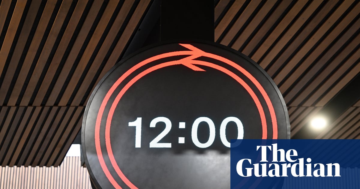
• Our new ticketing site is now live! Using either this or the original site (both powered by TrainSplit) helps support the running of the forum with every ticket purchase! Find out more and ask any questions/give us feedback in this thread!

New clock unveiled

jfowkes

Established Member
Joined
20 Jul 2017
Messages
1,266
If a particular clock needs to show seconds, presumably it's a simple configuration change to do it. (e.g. if there's a load of passenger complaints). Likewise, if a load of passengers complain that they can't read the time form a distance on a particular clock, the seconds could be removed.

I think it's a great design, personally.
 
Sponsor Post - registered members do not see these adverts; click here to register, or click here to log in
R

RailUK Forums

Notabene

Member
Joined
22 Oct 2023
Messages
63
Location
Selby
The LNER clock is rather good.
I hear it has cost £7.6 million to develop this new clock. Can this be right?

*Edit: Thankfully it's not right. It is not £7.6 million.

I suspect most of the concept will be discarded within two years.
 
Last edited:

Wynmills

Member
Joined
12 Feb 2024
Messages
9
Location
London
Counter-clockwise clocks do exist
The LNER clock is rather good.
I hear it has cost £7.6 million to develop this new clock. Can this be right?

I suspect most of the concept will be discarded within two years.
Absolute rubbish. Don't believe everything you hear.
 

Horizon22

Established Member
Associate Staff
Jobs & Careers
Joined
8 Sep 2019
Messages
10,942
Location
London
From the brand guidelines posted above, there IS a seconds version:
View attachment 190553

Although the branding description "it should only be used when replacing a clock that currently features and should contain seconds" is concerning. I would prefer it to be more clearly stated that platform clocks (in particular) should contain seconds.

I would say that the vast majority of clocks do contain seconds, however it doesn't state that a HH:MM SS currently, couldn't be replaced by just an HH:MM clock.
 
Last edited:

enginedin

Member
Joined
15 Dec 2020
Messages
473
Location
UK
For all the people complaining about the lack of seconds (special shoutouts to @nilvaj395 @Deepgreen @Michael.Y :) ), and to add legitimacy to everyone else who has already made this point via other sources, the Chief Executive of Network Rail (Andrew Haines) said yesterday:

There will be seconds displayed in full on platforms. As a railwayman, there was no way I was having a clock without seconds.


Wynmills

Member
Joined
12 Feb 2024
Messages
9
Location
London
I can agree with that second preference!

They haven't needed to plaster the SBB all over it; it communicates that through its great design. Germany also uses their own variant of the SBB clock, although in our case, I wonder how much Mondaine would want to license the clock across all of the UK rail network. In terms of this, though, I would much rather have a classic LED panel take on the NSE-style box clock with a GBR logo in place of the NSE logo, much easier to produce, nods to something arguably iconic, and yet still offers more function. This new clock is trying to both a analogue and digital clock at the same time, and is failing at both.


There's no disagreement that it is something that regular people will get a hold of, but should we really be having an object so simple as a clock require time to learn and analyse? What will someone who is not regular, or a tourist, think, as opposed to just using something close to a standard internationally recognised clock format? Would an average person or unfamiliar person, at a quick glance, be able to get all the information? People have seemed to dismiss these concerns with a 'just don't turn up too late' but it really does nothing to address the legitimate argument

It's not merely for scenarios such as 50 seconds remaining when the doors shut 40 seconds before departure, but for the other things, such as the difference between 2m59s and 2m01s, as @The exile pointed out in #42

To me, it just comes off as exceptionally tacky when placed in an otherwise really nice-looking station concourse in both classic and modern architectures. But it's not a surprise given the resurgence in plastering the GBR logo on everything, with an immense focus on the 'brand' and not the service. The best way you can build the GBR brand is in a way that actually demonstrates that things are new and different, which means providing a better service. It's so lovely of the higher-ups to be using the highest rail fares in Europe towards a clock which achieves neither style nor function at great cost. It will be undoubtedly costly to produce (non-standard bespoke parts), maintain and in the case of the ones on stands, likely to be vandalised very quickly.

Over one million minutes lost due signal failures have occurred since 2018/2019. Entire lines like the Brigg line get barely, if any, service, ticketing is a mess, accessibility is poor, and the UK is below average compared to the rest of Europe in rail electrification, but we are supposed to believe that a poorly designed clock is what should matter. To a normal customer, it's like "Oh well, the second train in a row might be cancelled for me, but at least we have a new (worse) clock to count down the time to the third!"

Much like the Euston screen trial, which had the underlying malicious motive of creating a giant, distracting and ugly advertising billboard, this a pointless PR exercise around something that's ultimately worse. Its status as a PR exercise is exacerbated by the fact that they cannot decide whether to call it a 'clock' or a 'timepiece' due to "conventions and connotations associated with referring to such instruments as 'clocks'".

I try not to be negative about the UK rail network or GBR, but starting from all of the GBR adverts from a few years ago painting the rail network as so much better than it is, I have just had a negative outlook on what GBR has actually done to make things better at the moment.

We really cannot be going on about such trivial things, such as 'clocks,' when entire swathes of the country still have to deal with a rail service that is straight out of the 1980s with a few licks of paint. Evidently, the criteria of striking the nostalgia in people is higher than actually improving things for the future first.

They've literally named it 'Rail Clock'. What are you on about?

As for the Rail adverts.. I'm afraid you are coming across as entirely joyless. Those adverts were about post-Covid attracting folk back to the railways...not GBR.
 

Sad Sprinter

Established Member
Joined
5 Jun 2017
Messages
3,186
Location
Way on down South London town
But at the moment it seems very clear that Great British Railways will utilise a red, white and blue colour scheme as part of it's branding. It would also be far from unreadable to use those colours on a clock as long as they're contrasting enough. I did a quick edit and managed to actually integrate the future GBR branding colours into the new timepiece without actually changing the design, and I actually believe it looks even better (others are welcome to disagree). It's not always going to translate this well in different weather and lighting conditions of course, but it's far from unreadable.

View attachment 190502

This looks better. A bit garish but better. I saw the new clock today and whilst I want to like it, I think it looks weird. I wonder if someone did a revamped NSE clock?

We were so quick to absolutely trash BR only to claw it back 30 years later. What in God’s name was the point…
 

KevinBrum12

Member
Joined
1 Aug 2025
Messages
115
Location
West Midlands
Seconds do count on the railway, but it makes more sense for passengers to be on the train 2 to 3 minutes before it is due to leave, rather than scrambling onto the platform 40 seconds before the train is due to leave and the guard/driver has pressed the button to close and lock the doors?
 
Last edited:

Lockwood

Established Member
Joined
4 Apr 2013
Messages
1,243

A picture of an old station clock without seconds.
 

Dr Strider

Member
Joined
15 Jan 2018
Messages
22
I like this a lot. In days gone by we had design classics like the big white circular analogue clocks and the NSE red-and-yellow digital clocks on platforms. Privatisation brought many improvements but they never really got clocks right. Tiny numerals buried somewhere on an led departures board are no substitute.

I don't think we can go back to all-analogue clocks. Folk should be able to cope with the arrow/seconds idea, but at least they've left it open for seconds to be introduced if needed. More than anything, I desperately hope that they don't succumb to the sponsors' ££££s with a KFC or Aviva logo or whatever flying in and out every minute.
 

nilvaj395

Member
Joined
11 Oct 2025
Messages
217
Location
They've literally named it 'Rail Clock'. What are you on about?

As for the Rail adverts.. I'm afraid you are coming across as entirely joyless. Those adverts were about post-Covid attracting folk back to the railways...not GBR.
Yeah, it is called the Rail Clock now. But its merely frustrating that from the get go Network Rail did not even want to call it a clock but rather a 'timepiece', due to some pointless reason about "connotations?. What connotations were Network Rail really trying to avoid? The whole design justification like "if you meet someone you could agree to meet at the clock" and stuff is just a bit extra, you didn't need an entirely new design for two people to agree to meet at a clock...

I accept I can be glum about things, but all every average person wants to be able to use the railway is a reliable, frequent and well connected service, none of which the current UK rail network does. Normal passengers do not think about what the clock looks like, they just want their train to run and not to be cancelled for the 3rd time in a row. I say it as I get countless times non enthusiasts will try the train and every time i proceed to hear about their delays, cancellations, etc and this always leads to them having a negative view of it and sometimes even preferring to pay more for an Uber in some extreme cases.

No amount of advertising about "the train will get you there" or "national timepieces" will change the reality that the network outside of London is horrible and in fact in most cases does not get you there. The message needs to be coupled with the genuine investment, not some expensive worse clock disguised as something "amazing and futuristic".
 
Last edited:

Tester

Established Member
Joined
5 Jul 2020
Messages
1,656
Location
Watford
Having looked at it a bit longer, I think the design works really well with a static logo at the top, and I think the break of the logo to only appear at 30 and 60 might be a bit of a detraction. Otherwise it looks really good.

If it was tweaked so that the Double-arrow stayed static at the top but a single arrow on the outer ring indicated the seconds I think it would be a much clearer statement of the branding and you could incorporate the swiss style 'jump' to the top of the minute.

Part of me misses the older style dot-matrix LED boards where the numbers rotated around the vertical axis as they changed, but that's just because I grew up with them at my local station. (these ones, or something very similar:
dot-matrix-train-indicator-board-440nw-377402cw.jpg
)
Aaahhh - Southern to Rugby :D
 

vic-rijrode

Member
Joined
31 Aug 2016
Messages
439
... No amount of advertising about "the train will get you there" or "timepieces" will change the reality that the network outside of London is horrible and in fact in most cases does not get you there...
That's nonsense. I take the train quite frequently and only in a handful of occasions recently (two or three trains out of maybe 80 or more) have been late enough to cause me any inconvenience. The vast majority of the time the train will "get you there".

As for the network outside London being "horrible", I would suggest that it is far from that. Sure it would benefit hugely from significant investment but then so much of our country's infrastructure would also. Sadly of course, own goals like Brexit and external factors like Covid (and our political response to it) mean that we simply haven't got the resources these days.

As for the clock - well, as has been stated above, it's a clock. Why make such a great fuss over it.
 

Tester

Established Member
Joined
5 Jul 2020
Messages
1,656
Location
Watford
Seconds do count on the railway, but it makes more sense for passengers to be on the train 2 to 3 minutes before it is due to leave, rather than scrambling onto the platform 40 seconds before the train is due to leave and the guard/driver has pressed the button to close and lock the doors?
It makes a lot more sense - now if the previous train can just arrive on time to make that possible..... :frown:
 

TRAX

Established Member
Joined
2 Dec 2015
Messages
1,810
Location
France
I really hope they go ahead with this.
I don’t even live in the UK but I’d use it just for its design and clarity.
IMG_8351.jpeg
 

enginedin

Member
Joined
15 Dec 2020
Messages
473
Location
UK
Yeah, it is called the Rail Clock now. But its merely frustrating that from the get go Network Rail did not even want to call it a clock but rather a 'timepiece', due to some pointless reason about "connotations?. What connotations were Network Rail really trying to avoid? The whole design justification like "if you meet someone you could agree to meet at the clock" and stuff is just a bit extra, you didn't need an entirely new design for two people to agree to meet at a clock...

I accept I can be glum about things, but all every average person wants to be able to use the railway is a reliable, frequent and well connected service, none of which the current UK rail network does. Normal passengers do not think about what the clock looks like, they just want their train to run and not to be cancelled for the 3rd time in a row. I say it as I get countless times non enthusiasts will try the train and every time i proceed to hear about their delays, cancellations, etc and this always leads to them having a negative view of it and sometimes even preferring to pay more for an Uber in some extreme cases.

No amount of advertising about "the train will get you there" or "national timepieces" will change the reality that the network outside of London is horrible and in fact in most cases does not get you there. The message needs to be coupled with the genuine investment, not some expensive worse clock disguised as something "amazing and futuristic".
I saw one of your previous iterations included a comment about replacing uncomfortable IET seats (to be fair, I know you're not the only one who's said that)... well, just to prove the point about people having preferences - I have absolutely no issue with the IET seats at all. To me, replacing them would be a total waste of money.
 

Carntyne

Member
Joined
8 Jul 2015
Messages
1,023
Yeah, it is called the Rail Clock now. But its merely frustrating that from the get go Network Rail did not even want to call it a clock but rather a 'timepiece', due to some pointless reason about "connotations?. What connotations were Network Rail really trying to avoid? The whole design justification like "if you meet someone you could agree to meet at the clock" and stuff is just a bit extra, you didn't need an entirely new design for two people to agree to meet at a clock...

I accept I can be glum about things, but all every average person wants to be able to use the railway is a reliable, frequent and well connected service, none of which the current UK rail network does. Normal passengers do not think about what the clock looks like, they just want their train to run and not to be cancelled for the 3rd time in a row. I say it as I get countless times non enthusiasts will try the train and every time i proceed to hear about their delays, cancellations, etc and this always leads to them having a negative view of it and sometimes even preferring to pay more for an Uber in some extreme cases.

No amount of advertising about "the train will get you there" or "national timepieces" will change the reality that the network outside of London is horrible and in fact in most cases does not get you there. The message needs to be coupled with the genuine investment, not some expensive worse clock disguised as something "amazing and futuristic".
It's literally been called Rail Clock by Network Rail.
 

nilvaj395

Member
Joined
11 Oct 2025
Messages
217
Location
I saw one of your previous iterations included a comment about replacing uncomfortable IET seats (to be fair, I know you're not the only one who's said that)... well, just to prove the point about people having preferences - I have absolutely no issue with the IET seats at all. To me, replacing them would be a total waste of money.
You are absolutely correct, it is one of those things that ought to be left to a midlife refurb now. I was merely trying to think of an example where an investment might have a more direct positive effect than something like this would. I had to trim things down due to brevity, as I do not want to sound too extreme. Personally, I would much rather the money that was used to buy this design and the further money to install and manufacture them be put into much better things. For example, we could inspire more unity by investing in starting up new community rail projects or supporting existing ones, if the goal was uniting people through a railway lens. It would have more of a positive effect on communities than a clock would, as that is what the PR team has wanted to think it would do. I would also love it if places like the Brigg line got the investment needed to have more than 2 trains per day. To me, the entire thing just comes off as a gimmick that will not last long. Seeing it on a phone or digital watch, it looks great, but it's different from what I actually would want at the train station itself.

That's nonsense. I take the train quite frequently and only in a handful of occasions recently (two or three trains out of maybe 80 or more) have been late enough to cause me any inconvenience. The vast majority of the time the train will "get you there".

As for the network outside London being "horrible", I would suggest that it is far from that. Sure it would benefit hugely from significant investment but then so much of our country's infrastructure would also. Sadly of course, own goals like Brexit and external factors like Covid (and our political response to it) mean that we simply haven't got the resources these days.

As for the clock - well, as has been stated above, it's a clock. Why make such a great fuss over it.
It does seem like some people are luckier than others, to be fair. I am tired as an enthusiast of encouraging people to take the train only for it to fail them when they try it. In the words of someone stuck on the platform for an hour, "We will just take the car next time". I do agree, though, investment is poor across the board, especially in the railways, and Brexit is a massive factor in that. This lack of investment, however, does mean that these things will be judged more harshly. There is much better that can be done for the railways, and I just dont think things like this are a good use of that constrained budget.
 

Naylor81

Member
Joined
3 Jul 2019
Messages
7
I think it’s a beautiful piece of design - clear, well thought through.

BUT - it looks great white on black with a splash of red. And yet we have RA2 standards for signage of black on white with red. Strikes me this just makes the case that white on black with red would look far classier for the main signage.
 

nilvaj395

Member
Joined
11 Oct 2025
Messages
217
Location
I think it’s a beautiful piece of design - clear, well thought through.

BUT - it looks great white on black with a splash of red. And yet we have RA2 standards for signage of black on white with red. Strikes me this just makes the case that white on black with red would look far classier for the main signage.
I agree with this, white on black with a bit of red is much better!

It may be kind of like an inverted TFW branding, although no complaint, as the TFW station branding is really good.
 
Last edited:

stuu

Established Member
Joined
2 Sep 2011
Messages
3,762
The LNER clock is rather good.
I hear it has cost £7.6 million to develop this new clock. Can this be right?

I suspect most of the concept will be discarded within two years.
I would believe that if it was the development and rolling out to major stations or something, there's no way that's the cost of the concept
 

MrJeeves

Established Member
Associate Staff
Senior Fares Advisor
Joined
28 Aug 2015
Messages
4,611
Location
Burgess Hill
I would believe that if it was the development and rolling out to major stations or something, there's no way that's the cost of the concept
Quite. The design competition stated up to 5 short-listed designs, each being awarded £7k+VAT each, with the successful entry being awarded £35k+VAT. A total of £70k+VAT.
 

MrJeeves

Established Member
Associate Staff
Senior Fares Advisor
Joined
28 Aug 2015
Messages
4,611
Location
Burgess Hill
I know they’ve said there’ll be something for android, but is there any way to get it on iPhone?
See post 139.
Neither iOS nor Android support widgets that update as frequently as would be required for a clock.

Apple Watches (watchOS) don't support custom watch faces at all.

The Android smartwatch equivalent (WearOS) does, and that has been the only thing announced as under development.
 

Top