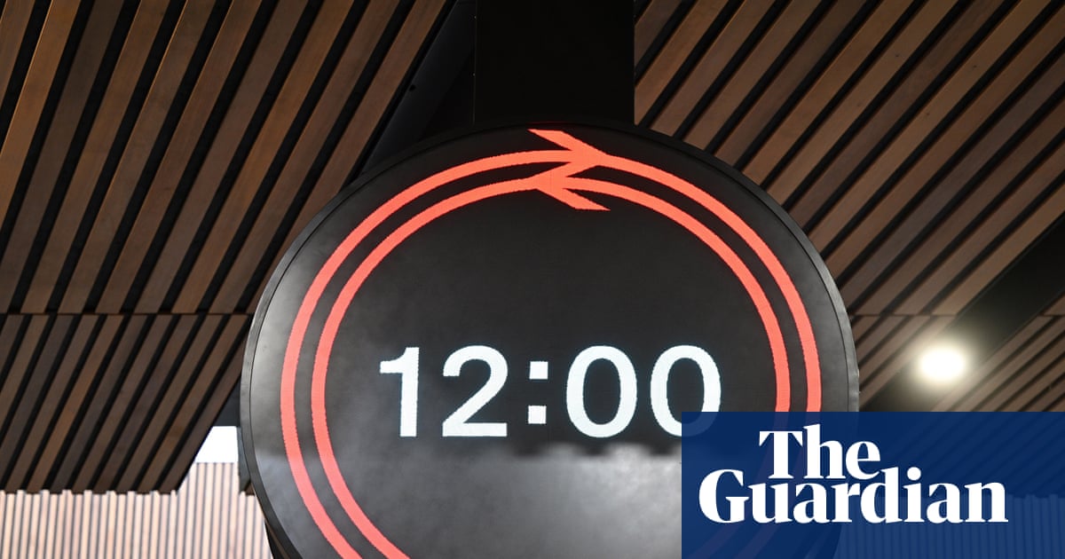
I can agree with that second preference!
They haven't needed to plaster the SBB all over it; it communicates that through its great design. Germany also uses their own variant of the SBB clock, although in our case, I wonder how much Mondaine would want to license the clock across all of the UK rail network. In terms of this, though, I would much rather have a classic LED panel take on the NSE-style box clock with a GBR logo in place of the NSE logo, much easier to produce, nods to something arguably iconic, and yet still offers more function. This new clock is trying to both a analogue and digital clock at the same time, and is failing at both.
There's no disagreement that it is something that
regular people will get a hold of, but should we really be having an object so simple as a clock require time to learn and analyse? What will someone who is not regular, or a tourist, think, as opposed to just using something close to a standard internationally recognised clock format? Would an average person or unfamiliar person, at a quick glance, be able to get all the information? People have seemed to dismiss these concerns with a 'just don't turn up too late' but it really does nothing to address the legitimate argument
It's not merely for scenarios such as 50 seconds remaining when the doors shut 40 seconds before departure, but for the other things, such as the difference between 2m59s and 2m01s, as
@The exile pointed out in #42
To me, it just comes off as exceptionally tacky when placed in an otherwise really nice-looking station concourse in both classic and modern architectures. But it's not a surprise given the resurgence in plastering the GBR logo on everything, with an immense focus on the 'brand' and not the service. The best way you can build the GBR brand is in a way that actually demonstrates that things are new and different, which means providing a better service. It's so lovely of the higher-ups to be using the highest rail fares in Europe towards a clock which achieves neither style nor function at great cost. It will be undoubtedly costly to produce (non-standard bespoke parts), maintain and in the case of the ones on stands, likely to be vandalised very quickly.
Over one million minutes lost due signal failures have occurred since 2018/2019. Entire lines like the Brigg line get barely, if any, service, ticketing is a mess, accessibility is poor, and the UK is below average compared to the rest of Europe in rail electrification, but we are supposed to believe that a poorly designed clock is what should matter. To a normal customer, it's like "Oh well, the second train in a row might be cancelled for me, but at least we have a new (worse) clock to count down the time to the third!"
Much like the Euston screen trial, which had the underlying malicious motive of creating a giant, distracting and ugly advertising billboard, this a pointless PR exercise around something that's ultimately worse. Its status as a PR exercise is exacerbated by the fact that they cannot decide whether to call it a 'clock' or a 'timepiece' due to
"conventions and connotations associated with referring to such instruments as 'clocks'".
I try not to be negative about the UK rail network or GBR, but starting from all of the GBR adverts from a few years ago painting the rail network as so much better than it is, I have just had a negative outlook on what GBR has actually done to make things better at the moment.
We really cannot be going on about such trivial things, such as 'clocks,' when entire swathes of the country still have to deal with a rail service that is straight out of the 1980s with a few licks of paint. Evidently, the criteria of striking the nostalgia in people is higher than actually improving things for the future first.



 ), and to add legitimacy to everyone else who has already made this point via other sources, the Chief Executive of Network Rail (Andrew Haines) said yesterday: