
-
Our new ticketing site is now live! Using either this or the original site (both powered by TrainSplit) helps support the running of the forum with every ticket purchase! Find out more and ask any questions/give us feedback in this thread!
You are using an out of date browser. It may not display this or other websites correctly.
You should upgrade or use an alternative browser.
You should upgrade or use an alternative browser.
Horrible liveries
- Thread starter backontrack
- Start date
- Status
- Not open for further replies.
Sponsor Post - registered members do not see these adverts; click here to register, or click here to log in
R
RailUK Forums
plastictaffy
Member
Could never stand the old EWS red/gold livery. Looked very boring, I thought. I wasn't keen on FGW's "Fag packet" livery, but the description for it (Fag packet) still makes me laugh. The original MML (tangerine and teal) was truly vile.
Mainline Freight aircraft blue was lovely. LM's livery (when clean) makes the 321's look much more modern than they are.
Mainline Freight aircraft blue was lovely. LM's livery (when clean) makes the 321's look much more modern than they are.
Last edited:

90sWereBetter
Member
National Express East Anglia's corporate livery was pretty awful, given that I actually quite liked the ONE livery. However, the full version only made it onto a couple of 156s, a couple of 90s, a single MK3 rake, about 9 or 10 321s and a vinyled 360 iirc, which wasn't too bad. What was appalling though was everything else being given the NXEA white stripe on the bodyside, including recently-repainted MK3s and 315s. This made the rest of the stock look tacky and messy, especially so on the WAGN livery 317/6s and FGE livery 321s that were still around in some numbers in 2008.
Last edited:
East Coast livery was utterly bland. Grey and purple?!

Not that that ever happened.. Seeing as Virgin came in and slapped viynl on top of it....
As is their choice. The vehicles needed painting then and so they were given a nice neutral colour that could act as an undercoat if necessary seeing as the East Coast operation was only ever going to be short term (though longer term than originally planned!).
Alistair G.
Member
i always liked the orange and black livery in scotland, still remember seeing my first 156 sprinter in that and thought it looked really nice
always liked the NSE livery but i dont many people that didnt!>
as for modern liveries i quite like the livery on the FTPE 350/4 units, but the 2 individual liveriries applied to 6671 and 66718 have to be my favourite. just some very different is nice to see !
but enough of nice liveries, cant stand virgin trains west coast, think it looks drab now, time for a rebrand!!. Also the wrexham & Shropshire coaches that tried going back to the blue and grey of BR days..... could never stand that livery and didnt get nostalgic when i sure it again!, thank god they are all being rebranded into chiltern colours (Or so i believe!)
always liked the NSE livery but i dont many people that didnt!>
as for modern liveries i quite like the livery on the FTPE 350/4 units, but the 2 individual liveriries applied to 6671 and 66718 have to be my favourite. just some very different is nice to see !
but enough of nice liveries, cant stand virgin trains west coast, think it looks drab now, time for a rebrand!!. Also the wrexham & Shropshire coaches that tried going back to the blue and grey of BR days..... could never stand that livery and didnt get nostalgic when i sure it again!, thank god they are all being rebranded into chiltern colours (Or so i believe!)
Last edited:

sprinterguy
Veteran Member
The combination of BR Brunswick green and maroon coaching stock is right up there for me. It’s so drab, especially when compared to how bright the combination of express passenger blue combined with carmine and cream coaching stock that preceded it looked.
In terms of post-privatisation liveries, I have never been keen on First Groups’ “Barbie bus” livery, and I absolutely cannot stand Dynamic Lines. Although strangely, I don’t find it quite as offensive in the way that it is “writ large” on Transpennine’s 350s , even if it does make them look distinctly like toothpaste tubes (which was also said of NSE livery back in the day, and that’s now commonly considered a classic!). First Capital Connect’s similar “City Lights” livery wasn’t great, either.
I’m not fond, either, of white based liveries. In this category I would like to name the National Express “Connections” corporate white and silver livery that has adorned Anglia and Essex Thameside stock, and the current Greater Anglia scheme. Any version of it. For similar reasons I would also include the original Connex South Central and South Eastern liveries, and the currnet tranche of SouthEastern white based liveries, which are not helped by the fact that there’s a few different schemes going on.
The Arriva Trains Northern and older Arriva Trains Wales turquoise and cream was, in my view, pretty lousy, too.
Midland Mainline’s second blue and grey based scheme managed to be look both bland and confused, and the East Coast livery, particularly in grey, lacked any sort of impact whatsoever.
In terms of post-privatisation liveries, I have never been keen on First Groups’ “Barbie bus” livery, and I absolutely cannot stand Dynamic Lines. Although strangely, I don’t find it quite as offensive in the way that it is “writ large” on Transpennine’s 350s , even if it does make them look distinctly like toothpaste tubes (which was also said of NSE livery back in the day, and that’s now commonly considered a classic!). First Capital Connect’s similar “City Lights” livery wasn’t great, either.
I’m not fond, either, of white based liveries. In this category I would like to name the National Express “Connections” corporate white and silver livery that has adorned Anglia and Essex Thameside stock, and the current Greater Anglia scheme. Any version of it. For similar reasons I would also include the original Connex South Central and South Eastern liveries, and the currnet tranche of SouthEastern white based liveries, which are not helped by the fact that there’s a few different schemes going on.
The Arriva Trains Northern and older Arriva Trains Wales turquoise and cream was, in my view, pretty lousy, too.
Midland Mainline’s second blue and grey based scheme managed to be look both bland and confused, and the East Coast livery, particularly in grey, lacked any sort of impact whatsoever.
Statto
Established Member
i always liked the orange and black livery in scotland, still remember seeing my first 156 sprinter in that and thought it looked really nice
always liked the NSE livery but i dont many people that didnt!>
as for modern liveries i quite like the livery on the FTPE 350/4 units, but the 2 individual liveriries applied to 6671 and 66718 have to be my favourite. just some very different is nice to see !
but enough of nice liveries, cant stand virgin trains west coast, think it looks drab now, time for a rebrand!!. Also the wrexham & Shropshire coaches that tried going back to the blue and grey of BR days..... could never stand that livery and didnt get nostalgic when i sure it again!, thank god they are all being rebranded into chiltern colours (Or so i believe!)
The Orange & Black was the old Strathclyde PTE livery which was quite nice, don't like the current SPT livery.
I dislike the current Merseyrail livery, the old White/Yellow/Black livery was a lot better, i'm not too keen on Northern & First Group liveries.
Any train with big expanses of white tends to look bad IMO.
Interestingly it seems to work on German trains
--- old post above --- --- new post below ---
Surprised those doors are even DDA compliant, they are similar colours to the rest of the paintjob.
They do stand out tho, which is the DDA requirement. I also really like them
I've seen quite a few now in the VTEC colour scheme. Looks good.
As is their choice. The vehicles needed painting then and so they were given a nice neutral colour that could act as an undercoat if necessary seeing as the East Coast operation was only ever going to be short term (though longer term than originally planned!).

Galvanize
Member
Thameslink "Graffiti" livery of the mid 1990s...
https://www.flickr.com/photos/michaelwadman/16797089632/in/pool-class319/
GW Merlin livery
https://www.flickr.com/photos/16412147@N08/14757506618/in/photolist-gdCoKR-qBxDZh-rM4H7Q-ou55zh
https://www.flickr.com/photos/michaelwadman/16797089632/in/pool-class319/
GW Merlin livery
https://www.flickr.com/photos/16412147@N08/14757506618/in/photolist-gdCoKR-qBxDZh-rM4H7Q-ou55zh
hairyhandedfool
Established Member
- Joined
- 14 Apr 2008
- Messages
- 8,837
Thameslink "Graffiti" livery of the mid 1990s...
https://www.flickr.com/photos/michaelwadman/16797089632/in/pool-class319/
I thought it was a nice idea badly executed, particularly the background colour.

61653 HTAFC
Veteran Member
Am I to assume that hybrid or transitional liveries are disqualified from this thread? In which case I won't traumatise anyone with a photo of the Northern Spirit/FTPE eyesore that appeared on the 158s. There was one or two that gave Central the same treatment, and the only advantage was that perhaps they reduced graffiti as they looked like they'd already been done!
I hated Virgin's livery as applied to "legacy" stock, though.
I hated Virgin's livery as applied to "legacy" stock, though.
sprinterguy
Veteran Member
That one was upmost in my mind when considering this thread, but I didn’t mention it due to it being a “transitional” livery. Those lower bodyside vinyls as applied to the 158s were very poorly thought out. What a mess!Am I to assume that hybrid or transitional liveries are disqualified from this thread? In which case I won't traumatise anyone with a photo of the Northern Spirit/FTPE eyesore that appeared on the 158s. There was one or two that gave Central the same treatment, and the only advantage was that perhaps they reduced graffiti as they looked like they'd already been done!
Now I thought that livery was superb – It’s the more recent red and silver scheme that I’m not too fussed about, though I don't outright dislike it.I hated Virgin's livery as applied to "legacy" stock, though.

Islineclear3_1
Established Member
The navy/dark blue on the 319's when they were first refurbished and renumbered into the 319/3 and 319/4 series

This thread has the theme if generally disliking most train liveries!
My favourite livery was large logo. Looked brilliant on the 50s, 86s and 37s and to a slightly lesser degree the 47s. I'm not sure how that would translate into a multiple unit livery though with huge carriage numbers and the franchise logo blown up on each carriage side!
My favourite livery was large logo. Looked brilliant on the 50s, 86s and 37s and to a slightly lesser degree the 47s. I'm not sure how that would translate into a multiple unit livery though with huge carriage numbers and the franchise logo blown up on each carriage side!

al.currie93
Member
- Joined
- 27 Jun 2013
- Messages
- 381
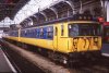
southern442
Established Member
This:
AGA trains would look a lot more interesting if they were in that livery.

hulabaloo
Member
- Joined
- 5 Apr 2015
- Messages
- 133

TheNewNo2
Member
Clear winner: the Greater Anglia white with red doors. It just looks lazy.

Bletchleyite
Veteran Member
Clear winner: the Greater Anglia white with red doors. It just looks lazy.
Agreed, it would look fine if they added a charcoal window band and some sort of skirt (grey?) though.
--- old post above --- --- new post below ---
This:
I thought Northern might have ended up in a livery like that when I first heard NS were involved.

Tommy1581
Member
Tyne and Wear Metro. Any livery that Nexus designs in the current day is dark grey and boring.
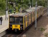
GrimsbyPacer
Established Member
Tyne and Wear Metro. Any livery that Nexus designs in the current day is dark grey and boring.
I think it was better before when there was red on it
sprinterguy
Veteran Member
The new scheme does seem somewhat...uninspired...when you compare it to the brightly coloured red, blue and green liveries which previously graced the Metrocars; and before that, everything TWPTE was cadmium yellow!Tyne and Wear Metro. Any livery that Nexus designs in the current day is dark grey and boring.

Tyne and Wear Metro. Any livery that Nexus designs in the current day is dark grey and boring.
View attachment 22713
Ah, but you should now by now that GREY is fashionable again. Yes, that delightful Grey. Grey interiors, Grey Cars, Grey Phones. Or White. And pointless bands (GTR / GWR) too. Lovely Lovely Grey... Needs a Red stripe or something...

Agreed, it would look fine if they added a charcoal window band and some sort of skirt (grey?) though.
--- old post above --- --- new post below ---
I thought Northern might have ended up in a livery like that when I first heard NS were involved.
Which is exactly what they did last year


Abellio Greater Anglia down Norwich service arrives at Colchester with 82136 up front, and 90011 at the rear. by Crewcastrian, on Flickr
Bletchleyite
Veteran Member
I do like that. It's a bit (a lot) like the Belgian IC livery:

Especially good to see the correct colours of cantrail stripe for First, and even more rarely for the buffet!
Especially good to see the correct colours of cantrail stripe for First, and even more rarely for the buffet!
- Status
- Not open for further replies.