• Our new ticketing site is now live! Using either this or the original site (both powered by TrainSplit) helps support the running of the forum with every ticket purchase! Find out more and ask any questions/give us feedback in this thread!

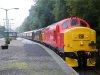
DB Repainted 37 (419, 670)

Status
Not open for further replies.

90019

Established Member
Joined
29 May 2008
Messages
6,890
Location
Featherstone, West Yorkshire
Read my above post.

37s don't hold any particular interest for me, although it's nice to see them still going. I am allowed to have my opinions about the liveries that are applied to trains, and in the case of DBS, i don't like the way they put the DB logo on the yellow on the front, as I feel it looks out of place and makes the front of it look crap.
IMO, their trains would look much better if they didn't insist on putting the logo on the front.
 
Sponsor Post - registered members do not see these adverts; click here to register, or click here to log in
R

RailUK Forums

Demps

Member
Joined
11 May 2006
Messages
692
Location
York
37s don't hold any particular interest for me, although it's nice to see them still going. I am allowed to have my opinions about the liveries that are applied to trains, and in the case of DBS, i don't like the way they put the DB logo on the yellow on the front, as I feel it looks out of place and makes the front of it look crap.
IMO, their trains would look much better if they didn't insist on putting the logo on the front.

Which is why i posted it in the first place, i have an oppinion on your oppinion, and that is that, maybe it was a little harsh, but i still favour my point.
 

507 001

Established Member
Joined
3 Dec 2008
Messages
2,173
Location
Huyton
forget the logo on the front, they would have looked better if they had just been left as EWS
 

Demps

Member
Joined
11 May 2006
Messages
692
Location
York
Bull, they are gorgeous. After 11 years of that boring drab red and yellow, im tired.
 

The_Stig

Member
Joined
20 Jan 2009
Messages
364
37-670 today on The Northern Belle. I can confirm that the paint is as bright as it is seen in the pictures!

This is approaching/at Dumbarton central.

001.jpg


002.jpg


003.jpg


004.jpg


This was her stopped at Arrochar and Tarbet station.

015.jpg

--- old post above --- --- new post below ---
Couple of videos as well:

http://www.youtube.com/watch?v=QAHf3LaHKkM

http://www.youtube.com/watch?v=JU40lVUj3Rk
 

Oswyntail

Established Member
Joined
23 May 2009
Messages
4,183
Location
Yorkshire
With such a large and uninteresting "slab" side, emphasised by the bull nose, you really need something more to break up the colour. Which is why EWS/Large Logo worked well, but all over blue/green and now this don't
 

Demps

Member
Joined
11 May 2006
Messages
692
Location
York
Oh my mother. The EWS looks completely disgusting in comparison, just look at them, even on a dull day, 670 brightens up the whole countryside. However, 419 would have looke dbetter behind 670, not that 401 in the old colours.

I think the major point is, people get in a trance, take the example from BR blue days; Quite a lot of people absolutely sware by it, and why? When you look at the larger picture, its this absolutely rancid drab blue colour. Its because people grew up with it, it was there for 20 years or so. The same with EWS, people got used to it, and people can't take change.

People have pure HATE for WCRC livery (yet its vaguely the same as EWS without s dark yellow stripe, nbut that isnt my point) and then when a really nice colourfull scheme comes out all you get is neds.
 

Daimler

Member
Joined
5 Feb 2009
Messages
1,197
Location
Hertfordshire
Oh my mother. The EWS looks completely disgusting in comparison, just look at them, even on a dull day, 670 brightens up the whole countryside. However, 419 would have looke dbetter behind 670, not that 401 in the old colours.

I think the major point is, people get in a trance, take the example from BR blue days; Quite a lot of people absolutely sware by it, and why? When you look at the larger picture, its this absolutely rancid drab blue colour. Its because people grew up with it, it was there for 20 years or so. The same with EWS, people got used to it, and people can't take change.

People have pure HATE for WCRC livery (yet its vaguely the same as EWS without s dark yellow stripe, nbut that isnt my point) and then when a really nice colourfull scheme comes out all you get is neds.

While I agree with you that the new DB livery looks nice and smart, I take issue with what you say about BR blue - I can't remember 'BR blue days' - I wasn't even born at the time, and yet seeing 87002 on blue 'n' grey Cargo-D stock (or indeed photos from the period) I think it looks fabulous. Classy, tasteful, restrained.
 

Demps

Member
Joined
11 May 2006
Messages
692
Location
York
and yet seeing 87002 on blue 'n' grey Cargo-D stock (or indeed photos from the period) I think it looks fabulous. Classy, tasteful, restrained.

Agreed As a Set it looks great, however, does the loco itself look nice (as a one off) or does the loco look nice if it is on a variation of other stock? Especially if the loco is in dull lighting, or has dirt on it?
 

jopsuk

Veteran Member
Joined
13 May 2008
Messages
12,774
So, I've been thinking about the logo, and I'm sure someone can do this better, but how about if looked like this?
(Hope it was OK to use your picture The_Stig)
attachment.php
 

Attachments

  • DB37blacklogo.jpg
    DB37blacklogo.jpg
    56.5 KB · Views: 42

jopsuk

Veteran Member
Joined
13 May 2008
Messages
12,774
true, but I was suggesting a solution within the silly restrictions dreamt up by BR that continue to be imposed by NR.
 

33056

Established Member
Joined
12 Nov 2007
Messages
2,424
Location
On a train somewhere in Europe
I agree with Gordonthemoron, it is brighter than normal DB red. I was lucky enough to get a close up view of 59206 within days of painting which confirmed my suspicions when first sighted at a distance that it was rather bright.

In fact some of the 66s operated by Railion Netherlands are the same colour, see this example .
 

Demps

Member
Joined
11 May 2006
Messages
692
Location
York
Are you having a laugh 33056???

That last photo is clearly photoshopped, that isnt the orignal colour. This is why you cant judge colour by images, them be film or digital, unless the Light balancing is the same + 100 otther factors as i said before...
 

33056

Established Member
Joined
12 Nov 2007
Messages
2,424
Location
On a train somewhere in Europe
That last photo is clearly photoshopped, that isnt the orignal colour.

OK, I will accept that the Railion 66 picture does look a little over-saturated, but other pictures I have seen of the same loco still look rather bright. Also, I have seen 59206 in the flesh and had time to look at it carefully (as well as plenty of freshly outshopped DB locos in real life) and I still maintain that the colour used over here is a touch brighter than the German version.
 

Phoenix

Established Member
Joined
11 Mar 2008
Messages
2,019
Location
birmingham
Personally I don't believe our locomotives should be exactly the same as the German counterparts as although the company is DB owned it is a separate branch which is subject to different requirements such as for instance the application of full yellow ends so until stuff like this is dropped our liveries can never be the same as in Europe.
Also as for the general appearance of any livery it is always best to form a final opinion once you have actually seen it.
 
Status
Not open for further replies.

Top