Jarrett Walker, the consultant who designed the new map previously discussed (and who led Dublin's bus network redesign in 2017-18), has shared some thoughts on Cambridgeshire buses on his blog.
 humantransit.org
Bus Service in England: The Need for Clearer Maps — Human Transit
It’s a time of rapid change for urban bus services in England.[1] Since Margaret Thatcher’s privatization reforms of 1985, these services have been subsidized but not really controlled by government. I wrote here about Thatcher’s vision for privatized public transport, including why it has...
humantransit.org
(This is not the full blog post but what I think are the most important sections.)It’s a time of rapid change for urban bus services in England. Since Margaret Thatcher’s privatization reforms of 1985, these services have been subsidized but not really controlled by government. I wrote here about Thatcher’s vision for privatized public transport, including why it has been teetering for some time and is now being swept away.
Now, all over England, governments at the county or shire level have been looking at whether and how to take control of their public transport, so that they can offer coherent networks and fares, integrate public transport planning with town planning, and ensure accountability to the public. Right now, most of these conversations are happening at a procedural level, but now it’s time to look at maps, and try to figure out what an improved and integrated network would actually look like geographically.
[...]
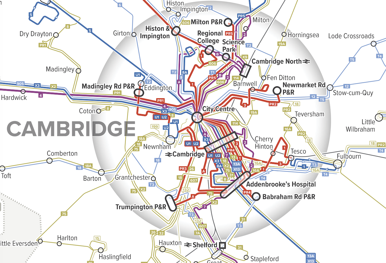
As we have wandered the transport websites of the UK, we’ve found maps by operating companies, showing only their services, but a shortage of good maps done by governments showing how all the services interact. So we drew one, as an example, and a lot can be learned about England’s challenge by staring at it for a bit.
On my tour of the UK last summer, I spent a day in Cambridge, site of one of the UK’s most elite universities. I was fortunate to be hosted by Andrew Highfield, an assistant director at the Cambridgeshire-Peterborough Combined Authority (CPCA), which manages transport for Cambridgeshire and its cities. If he hadn’t been showing me around, the service would have been incomprehensible. Many operating companies, trained to see each other as competitors, intersect here and cover different parts of the shire. They have their own signs and shelters, each advertising their own services, and each draw maps of just their own services, if they draw maps at all.
After my visit, the CPCA commissioned us to draft a map for them. Our mapping style focuses on what matters to the customer and not what matters to anyone else. Instead of highlighting operator brands, we highlight frequency, the single most important variable about a service that is not always shown on maps. We use hot colors for high frequencies so that these jump out visually against the background complexity of lower frequency services.
[...]
Since I’m now going to make some observations about the network, I should first announce my ignorance. I can’t claim to know Cambridge that well. I’ve spent a day there, and haven’t explored the shire around it at all, though of course I’ve poked around in aerial maps and Street View. So nothing I say here should be taken as a recommendation. Only at the end of long study of the network, and many conversations with local people, would we be in the position to do that.
However, this map should be useful for people in Cambridgeshire to understand what they have, and to think about how well it fits with the demands of the communities that they know well. So the most important point of this article is: Every local authority should have a map like this!
What can we see?
[...]
One of the first things I look for in a network is heavy overlap of low-frequency services, because this means there’s enough service to deliver a higher frequency if the service were organised differently. So looking at our map of Cambridge, my eye immediately went to Histon Road in the northwest part of the city, served by A, 8, 8A, and T2
There’s enough service here to deliver a frequency of every 10 minutes or better, but instead there are four blue or purple lines, indicating less frequent services overlapping. This means long gaps at some times and a pile of buses running together at other times, even when everything is running on time. These routes look like they were drawn separately, by different people at different times with different goals, which is not what you do when you’re trying to build an integrated and efficient network.
[...]
What Histon Rooad has now, in return for low frequency and uneven spacing of buses, is direct buses to lots of places. Is that better or worse? In most cases, higher frequency, even requiring connections, delivers better access to opportunity. But an actual network plan would be the chance for the community to consider these tradeoffs and figure out what they want.
Cambridge’s Park-and-Ride structure is also interesting. [...] What’s unusual is that the Park-and-Ride facilities have their own dedicated direct routes, with numbers starting with “PR” that run frequently all day. Other local routes may duplicate them for a long distance, such as Routes 3 and PR2. These routes can easily be described as being different services with different markets, but we usually get the best public transport for everyone by maximizing the diversity of people on any one vehicle. So it’s more common to serve Park-and-Rides with peak-hour services to provide high capacity where demand is high, but to provide a more basic service at other times, one that serves other markets along the way. (For example, should those intercity buses, 12 and T5, stop at the P&R to contribute to a total frequency product with less duplication? Maybe.) Again, I am not making a recommendation here! That would only come after much more study of demand and some public conversations about goals. But this may be an example of over-specialized service, one whose market is too narrowly targeted to justify being served with these nonstop links.
[...]
It’s rare to see 10-minute frequency on a long intercity link, but there’s one here, formed by A and B from St Ives into Cambridge, running in the Cambridgeshire Guided Busway.
But as it approaches Cambridge in the lower right corner of this map, it splits into two purple (every 20 minutes) branches, which later rejoin in the city centre. So there’s frequent service along the rural link, and to central Cambridge, but not to anywhere in northern Cambridge. This makes some sense from a commute perspective, since there are commute destinations on both branches, but when you’re trying to organise service within a city, the key is to build up simple patterns of high frequency rather than piles of different routes. So it’s awkward to have the frequency go down, because of the branching, right as the line from St Ives reaches the area of highest demand. Maybe this is the right pattern, but it deserves a closer look.



 I suppose I should take another look in the library sometime and see if there is anything there, though the last time I asked for a bus timetable in a library I was looked at as if I'd just landed from Mars! (admittedly that was a different library)