
-
Our new ticketing site is now live! Using either this or the original site (both powered by TrainSplit) helps support the running of the forum with every ticket purchase! Find out more and ask any questions/give us feedback in this thread!
You are using an out of date browser. It may not display this or other websites correctly.
You should upgrade or use an alternative browser.
You should upgrade or use an alternative browser.
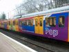
A nice livery?
- Thread starter valenta
- Start date
- Status
- Not open for further replies.

Sponsor Post - registered members do not see these adverts; click here to register, or click here to log in
R
RailUK Forums

sprinterguy
Veteran Member
It's no more garish than some of the other advertising liveries that have adorned the Metrocars: I like the way the advertising schemes add a splash of colour to the Metro system.
Although I wish they could be a little bit more creative with the DDA compliant doors, instead of just daubing them bright yellow whatever the livery! It really ruins the effect.
Although I wish they could be a little bit more creative with the DDA compliant doors, instead of just daubing them bright yellow whatever the livery! It really ruins the effect.
Although I wish they could be a little bit more creative with the DDA compliant doors, instead of just daubing them bright yellow whatever the livery! It really ruins the effect.
I believe they had to do this for safety, not a nice colour.
sprinterguy
Veteran Member
Yes, but what I mean that they could work this feature into the livery: I don't reckon there's anything saying that the contrasting colour has to be a warning yellow block of colour, just something that contrasts with the main livery.I believe they had to do this for safety, not a nice colour.
I'm not sure if DDA compliance regs are as strict over in France (With all those low platforms around Europe, I doubt it), but TGV pull off a suitable scheme, whether it's needed or not, very well that's in harmony with their livery and also serves to identify different areas of the train.
Yup its a decent and colourful livery, of course thats before it got suffered with a graffti attack and part of the vinyl is already smudged thanks to the stuff they remove it with. Also the other side has now unfortunately got Graffti etchings on it, advert ruined in a space of less than 4 months!
It would certainly be a very interesting livery to try and skin for Trainz/Railworks!
Yup, you would need a lot of spare time!!!!

Yup, you would need a lot of spare time!!!!
I'm already working on the truck for UKTS!
You may have an update sometime tommorow.


Yup its a decent and colourful livery, of course thats before it got suffered with a graffti attack and part of the vinyl is already smudged thanks to the stuff they remove it with. Also the other side has now unfortunately got Graffti etchings on it, advert ruined in a space of less than 4 months!
Looked like it had already happened in that picture!
WatcherZero
Established Member
- Joined
- 25 Feb 2010
- Messages
- 10,272
Original? I think not!


Perhaps we should email the T&W Metro.
Put the train on the left, the above picture on the right.
Pose one simple question.
Spot the difference!

Been on the metrocar today, and noticed that part of the livery had been removed, as mentioned earlier in the thread.
@GNER373, 4038 "Talk To Frank" is so outdated, and the most boring livery imagineable. Following close behind in 4049 - the solicitor livery, makes me depressed every time I see it!
@GNER373, 4038 "Talk To Frank" is so outdated, and the most boring livery imagineable. Following close behind in 4049 - the solicitor livery, makes me depressed every time I see it!
northwichcat
Veteran Member
Whoa. What's going on? Everyone appears to be sitting on that Tyne & Wear Metro service. I've never seen it like that.
Whoa. What's going on? Everyone appears to be sitting on that Tyne & Wear Metro service. I've never seen it like that.
Maybe the carriage slogan of 'a new revolution' has worked.
Been on the metrocar today, and noticed that part of the livery had been removed, as mentioned earlier in the thread.
@GNER373, 4038 "Talk To Frank" is so outdated, and the most boring livery imagineable. Following close behind in 4049 - the solicitor livery, makes me depressed every time I see it!
Oh I had forgot about that one! It's like looking at a grey sky!

Oh I had forgot about that one! It's like looking at a grey sky!
You're complementing it! It doesn't even look that nice!
There was a livery once around 10 years back which was perhaps the most boring livery ever, it was a plain grey livery with a vinyl on the side saying, to advertise on Metro contact this number or something. I believe it was unit 4055 that carried this before it got outshopped in its EU colours.
4049 livery has been on for around 11 years now(It got outshopped into that livery during its mid-life refurbishment) yet the vinyl/paintwork is not smudged(some of the vinyl is slightly faded but you expect that). That suggest to me they either changed the type of paint/vinyl to relivery the trains or they are using different graffti removal stuff because another more recent Livery(The Tyne & Wear council one with the faces on) was faded so badly they decided to remove the "faces" vinyl on one side and I've notice the other side has been smudged also.
4049 livery has been on for around 11 years now(It got outshopped into that livery during its mid-life refurbishment) yet the vinyl/paintwork is not smudged(some of the vinyl is slightly faded but you expect that). That suggest to me they either changed the type of paint/vinyl to relivery the trains or they are using different graffti removal stuff because another more recent Livery(The Tyne & Wear council one with the faces on) was faded so badly they decided to remove the "faces" vinyl on one side and I've notice the other side has been smudged also.
There was a livery once around 10 years back which was perhaps the most boring livery ever, it was a plain grey livery with a vinyl on the side saying, to advertise on Metro contact this number or something. I believe it was unit 4055 that carried this before it got outshopped in its EU colours.
4049 livery has been on for around 11 years now(It got outshopped into that livery during its mid-life refurbishment) yet the vinyl/paintwork is not smudged(some of the vinyl is slightly faded but you expect that). That suggest to me they either changed the type of paint/vinyl to relivery the trains or they are using different graffti removal stuff because another more recent Livery(The Tyne & Wear council one with the faces on) was faded so badly they decided to remove the "faces" vinyl on one side and I've notice the other side has been smudged also.
Some very interesting info. There have been a few wierd and wonderful liveries on the T+W metro.

tbtc
Veteran Member
Yes, but what I mean that they could work this feature into the livery: I don't reckon there's anything saying that the contrasting colour has to be a warning yellow block of colour, just something that contrasts with the main livery
Like the Virgin doors? Contrasting stripes suit the Virgin livery better than a "solid block" of one colour.
--- old post above --- --- new post below ---
I wouldn't mind seeing a Metro service in black and orange, like Grand Central HST's
It'd be a nice touch; I like the East Midlands Trains livery that one Supertram has in Sheffield.
I still think the originals are the best, but I wouldn't mind seeing a Metro service in black and orange, like Grand Central HST's.
Yes, that would be stunning. Wish that I was talented enough to make a mock-up of that on Photoshop!
Yes, that would be stunning. Wish that I was talented enough to make a mock-up of that on Photoshop!
Photoshop is a total nightmare. I can't stand it! Some people spend £3,000 buying the different packages!

Photoshop is a total nightmare. I can't stand it! Some people spend £3,000 buying the different packages!
Have bought some reasonably cheap packages for myself a while ago, but never spent longer that an hour on it!
Have bought some reasonably cheap packages for myself a while ago, but never spent longer that an hour on it!
A good programme to use is Google Sketchup. You can model and paint some fairly realistic stuff on there.

T163R
Member
A good programme to use is Google Sketchup. You can model and paint some fairly realistic stuff on there.
Blender is harder, but better

Xenophon PCDGS
Veteran Member
Yup its a decent and colourful livery, of course thats before it got suffered with a graffti attack and part of the vinyl is already smudged thanks to the stuff they remove it with. Also the other side has now unfortunately got Graffti etchings on it, advert ruined in a space of less than 4 months!
It was the very bright colour scheme that attracted the attention of the "socially unchallenged" to try to "improve" matters even further. Did no-one ever think that this was likely to happen?
tbtc
Veteran Member
It was the very bright colour scheme that attracted the attention of the "socially unchallenged" to try to "improve" matters even further. Did no-one ever think that this was likely to happen?
People graffiti things for various reasons. If you are suggesting that the colourful livery has attracted their attention and encouraged them to vandalise the train then are you suggesting that a bland liveried train never gets graffitied?
- Status
- Not open for further replies.