There was a livery once around 10 years back which was perhaps the most boring livery ever, it was a plain grey livery with a vinyl on the side saying, to advertise on Metro contact this number or something. I believe it was unit 4055 that carried this before it got outshopped in its EU colours.
4049 livery has been on for around 11 years now(It got outshopped into that livery during its mid-life refurbishment) yet the vinyl/paintwork is not smudged(some of the vinyl is slightly faded but you expect that). That suggest to me they either changed the type of paint/vinyl to relivery the trains or they are using different graffti removal stuff because another more recent Livery(The Tyne & Wear council one with the faces on) was faded so badly they decided to remove the "faces" vinyl on one side and I've notice the other side has been smudged also.
4055 was vinyled in full GNER livery (complete with crests!) prior to it carrying the EU colours, but it may have been the unit carrying the silver-grey livery before that.
As for 4049 I'm quite pleased that that unit has retained its' advertising livery for so long, as it is one of the last that harks back to my younger days, although I am less than pleased with the way those abominable bright yellow doors break up the formerly classy navy blue and gold scheme. Gold doors would have been much more suitable.
--- old post above --- --- new post below ---
Like the Virgin doors? Contrasting stripes suit the Virgin livery better than a "solid block" of one colour.
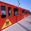
That's the sort of thing I'm getting at: For a start, even if TW Metro aren't willing to be more adventurous with their treatment of passenger doors: The Metro previously used a yellow triangle which encased the TW Metro "M" logo in the centre on the lower portion of the doors on the standard livery style introduced at the mid-life refurbishment; Therefore, with the new revised overall yellow covering of the doors to make them DDA compliant, they have a roughly square area of warning yellow: So why not put a door height "M" logo over each of the passenger doors, to help enforce the identity of the Tyne and Wear Metro?
Or even better, in 2002 Metrocar 4002 was turned out in a pleasant orange and black colour scheme advertising the TW Metro website (Or something similar) that utilises a number of angled bands of colour: Why not adopt that as thebasis for a new standard livery and use a wide angled black band (facing away from the cab ends towards the centre of each Metrocar) to mark out the doors?