• Our new ticketing site is now live! Using either this or the original site (both powered by TrainSplit) helps support the running of the forum with every ticket purchase! Find out more and ask any questions/give us feedback in this thread!

Great British Railways - First Train in New Livery

Zomboid

Established Member
Joined
2 Apr 2025
Messages
2,206
Location
Oxford
yes people have become acclimatised to a certain degree about trains having different liveries
Especially meaningful if there are fare differentials between "operators".

I'm not one to advocate bringing back sectorisation, but 3 or 4 schemes differentiated by service type would seem like a good idea to me.
 
Sponsor Post - registered members do not see these adverts; click here to register, or click here to log in
R

RailUK Forums

physics34

Established Member
Joined
1 Dec 2013
Messages
4,080
It always makes me laugh the amount of people on here that can't seem to comprehend the idea of Great Western services not being green, as though they weren't corporate blue, pink and purple for a good 15 years or so.
Plus also the fact that generally the public do not care. Im pretty sure theyd board any train regardless if it was green or not

== Doublepost prevention - post automatically merged: ==

Being all blue already (aside from the Networkers), you'd think Southeastern would have a field day GBR-fying their fleet.

Glad I'm not the only one! I really wish there was some way of filtering out generative AI *four letter word* on this forum.
I was thinking the exact same thing yesterday. Should be an easy transition.
 

vuzzeho

Member
Joined
11 Apr 2022
Messages
663
Location
London
Plus also the fact that generally the public do not care. Im pretty sure theyd board any train regardless if it was green or not
I have to agree. While I would love for the general public to be in awe at every livery revision, they sort of... don't care at all apart from a small 'oooh' as it pulls in. Like, the other day c2c passengers got a train in a completely different colour that didn't say c2c or anything like it, and they just got on. They'll notice - they aren't stupid - but they probably won't be bothered.
 

Mike Machin

Member
Joined
19 Aug 2017
Messages
376
As a graphic designer, I have to say that there’s far more to creating a proper corporate identity than just selecting a few colours and shapes.

It’s all about the consistency of the application of the key elements in precisely the same visual relationship in all situations. This means that the key elements must always appear to have the same apparent relationship to each other, even where this has to be adjusted in reality to create that visual illusion.

The cornerstone of the identity is the logo. Clear guidelines have to be established to govern how this is used. Consideration has to be given to its use in the core brand colour. Will it be used in colour with other colours, for example on a website, app and printed material? If not, can a ‘white-out’ protocol be established for consistency? Where is it appropriate to use the main brand colour? What accent colours can be used? What supplementary materials and substrates can be used to further enhance the brand and where are these appropriate?

I don’t dislike the new GBR branding, but somehow the application of the secondary supporting elements appear to be used randomly and without due consideration. Typography looks inconsistent so far, with the visual relationship between typographic elements not harmonising between the rolling stock and the new branding’s app,I ation in supporting graphics. It all needs a good sort out.

There have been some very nice identities and brands during the privatisation era, but few have been thoroughly-considered holistic identities in the truest sense of the word.

ScotRail works because of its well thought-out consistency, as did the rather clever Stagecoach branding which used the rather brash house colours to great effect to create separate sub-brands for local, regional and longer-distance services, all within the same branding regime.

The stand-out identity as a pure piece of design is GWR. Whether one likes the colour or not will always be highly subjective. But, as a piece of well-conceived, properly considered design, the use of an globally award-winning design consultancy shines through.

Pentagram’s visual identity for GWR has a thoroughness and completeness in concept not seen since Roundel’s equally well-conceived and beautiful design for BR’s re-launch of its Railfreight sector back in 1987.

Let’s hope that the DfT do take the opportunity to stand back, look at the broader picture and get some professional help from a leading design consultancy to enable them to make the most of this pivotal moment in our railways and allow something memorable and defining to be created.
 

co-tr-paul

Established Member
Joined
8 Mar 2016
Messages
1,251
Location
Helston, Cornwall
Back when IETs for GWR were being planned , some artist impressions showed them in allover chocolate with gold lining.
Then the nickname " pootube " started being bounded around .... !
Wish i kept some images now .
 

Magrar

On Moderation
Joined
20 Jun 2026
Messages
185
Location
Reading
I consider myself far more a part of the general public than a train afficionado, even though I have a ridiculous amount of useless knowledge about trains.

As such, you better believe the general public notices liveries.

They may not care from the perspective of...

1. is it a working train?
2. is it my train?
3. is it going where it's supposed to go?
4. Is it leaving at the time and platform I expected?
5. Can I get a seat?

And so if you are failing on any of those counts, sure, deprioritise liveries.

But if you are by some miracle starting to resemble a functional and usable railway, as we all hope GBR will, you better start paying attention to what you look like.

Just as there is a very good reason to have staff in proper uniforms, it’s only right and proper that you pay attention to what your train looks like.

An awful livery suggests you lack taste. Perhaps even class. As such, you perhaps view me not as the most precious thing in your world, but a mere number, maybe even a mug.

An inconsistent livery suggests you don't have the time or money to present yourself properly. Do you want my custom? Smarten yourself up.

A shabby, poorly maintained livery, suggests, well, you know. You're not really trying are you? Let yourself go. Got more pressing concerns perhaps than taking me where I want to go. Maybe using me as some kind of bridging loan. Maybe don't even care if I'm even on the train.

Stagecoach bus is hilarious at the minute. What on Earth are we supposed to make of a fleet consisting of three different standard corporate liveries, applied for such a long time in parallel now, I am now considering starting a bingo card, to see how many variations I can spot, since the bumps and scrapes team are now fitting panels, bumpers and even an emergency exit door in whatever livery they have to hand.

If I see a driver with a tie from one era, a shirt from another, and a jumper from a third, I will laugh my head off, and then with a whisper, ask him if he needs a proper job with a proper company, not this lunatic asylum.

 

thomalex

Member
Joined
25 Aug 2021
Messages
528
Location
Leeds
As a graphic designer, I have to say that there’s far more to creating a proper corporate identity than just selecting a few colours and shapes.

It’s all about the consistency of the application of the key elements in precisely the same visual relationship in all situations. This means that the key elements must always appear to have the same apparent relationship to each other, even where this has to be adjusted in reality to create that visual illusion.

The cornerstone of the identity is the logo. Clear guidelines have to be established to govern how this is used. Consideration has to be given to its use in the core brand colour. Will it be used in colour with other colours, for example on a website, app and printed material? If not, can a ‘white-out’ protocol be established for consistency? Where is it appropriate to use the main brand colour? What accent colours can be used? What supplementary materials and substrates can be used to further enhance the brand and where are these appropriate?

I don’t dislike the new GBR branding, but somehow the application of the secondary supporting elements appear to be used randomly and without due consideration. Typography looks inconsistent so far, with the visual relationship between typographic elements not harmonising between the rolling stock and the new branding’s app,I ation in supporting graphics. It all needs a good sort out.

There have been some very nice identities and brands during the privatisation era, but few have been thoroughly-considered holistic identities in the truest sense of the word.

ScotRail works because of its well thought-out consistency, as did the rather clever Stagecoach branding which used the rather brash house colours to great effect to create separate sub-brands for local, regional and longer-distance services, all within the same branding regime.

The stand-out identity as a pure piece of design is GWR. Whether one likes the colour or not will always be highly subjective. But, as a piece of well-conceived, properly considered design, the use of an globally award-winning design consultancy shines through.

Pentagram’s visual identity for GWR has a thoroughness and completeness in concept not seen since Roundel’s equally well-conceived and beautiful design for BR’s re-launch of its Railfreight sector back in 1987.

Let’s hope that the DfT do take the opportunity to stand back, look at the broader picture and get some professional help from a leading design consultancy to enable them to make the most of this pivotal moment in our railways and allow something memorable and defining to be created.

I fully expect that’s what we’ll get once GBR actually starts to operate. This is very much a transition phase from how I see it. GBR doesn’t even have a website yet
 

Mike Machin

Member
Joined
19 Aug 2017
Messages
376
I fully expect that’s what we’ll get once GBR actually starts to operate. This is very much a transition phase from how I see it. GBR doesn’t even have a website yet
I’m sure you’re right and we’ll have to wait to see how it develops.

But, this isn’t the way truly great corporate identity programmes are created, making it up as it goes along and developing solutions as situations arise is a recipe for a fragmented concept.

All of the best identities are designed in minutiae to the smallest possible component and situation before anything is applied anywhere. If one thinks of the really good rail identities, virtually everything, including stationery, printed materials, logos, colourways, fonts, uniforms, signage, merchandise, all customer touch-points etc and, in the case of GWR dummy websites and online media are finalised before any paint or vinyl gets anywhere near the rolling stock. Pentagram’s and Roundel’s initial launch documents for GWR and RailFreight respectively, both had all of the minute details considered and finalised before any attempt to start applying it in the real world.

Hopefully what we have seen so far is just to give the impression that something will be happening.

But the truth is that a scheme such as the design concept for a vast organisation such as GBR needs to be thought through in detail before the application to rolling stock begins.
 

Shaw S Hunter

Established Member
Joined
21 Apr 2016
Messages
3,482
Location
Over The Hill
But the truth is that a scheme such as the design concept for a vast organisation such as GBR needs to be thought through in detail before the application to rolling stock begins.
The problem is that although GBR is/will be a "vast organisaton" it is effectively an agency of a government department and one that is well down the priority list for public spending. It has neither the luxury of time nor money with the need to restore public confidence in reliability of rail services an extremely pressing concern. As such it's almost inevitable that the rebranding is being done in a bit of a hurry. Yes a stronger set of design rules would be nice but given current priorities they will probably have to wait a while. The only question is: how long? Or would you prefer they took the Do Nothing option?
 

vuzzeho

Member
Joined
11 Apr 2022
Messages
663
Location
London
I’m sure you’re right and we’ll have to wait to see how it develops.

But, this isn’t the way truly great corporate identity programmes are created, making it up as it goes along and developing solutions as situations arise is a recipe for a fragmented concept.

All of the best identities are designed in minutiae to the smallest possible component and situation before anything is applied anywhere. If one thinks of the really good rail identities, virtually everything, including stationery, printed materials, logos, colourways, fonts, uniforms, signage, merchandise, all customer touch-points etc and, in the case of GWR dummy websites and online media are finalised before any paint or vinyl gets anywhere near the rolling stock. Pentagram’s and Roundel’s initial launch documents for GWR and RailFreight respectively, both had all of the minute details considered and finalised before any attempt to start applying it in the real world.

Hopefully what we have seen so far is just to give the impression that something will be happening.

But the truth is that a scheme such as the design concept for a vast organisation such as GBR needs to be thought through in detail before the application to rolling stock begins.
I’m also a designer and I agree. GBR’s design approach has been so far mostly ‘take each day as it comes’ instead of a proper design system and language development. It’s probably down to yes, the fact that this is more for promo than actual branding so far, but also the fact that DFTO doesn’t have any designers (by trade), and GBR doesn’t exist yet. This just isn’t really a priority with them but more of a foundation for GBR to work with. GBR will need graphic, product, service, and interaction designers, so once it’s underway and hiring then we’ll likely see better design work and more of a strategy and language.
 

Davester50

Member
Joined
22 Feb 2021
Messages
1,049
Location
UK
All of the best identities are designed in minutiae to the smallest possible component and situation before anything is applied anywhere. If one thinks of the really good rail identities, virtually everything, including stationery, printed materials, logos, colourways, fonts, uniforms, signage, merchandise, all customer touch-points etc and, in the case of GWR dummy websites and online media are finalised before any paint or vinyl gets anywhere near the rolling stock. Pentagram’s and Roundel’s initial launch documents for GWR and RailFreight respectively, both had all of the minute details considered and finalised before any attempt to start applying it in the real world.
The Corporate Identity Manuals of the past show just how much thought have gone in to design. Fascinating to look at too!

Have GBR produced such a thing yet?
 

Russel

Established Member
Joined
30 Jun 2022
Messages
5,376
Location
Lichfield
It always makes me laugh the amount of people on here that can't seem to comprehend the idea of Great Western services not being green, as though they weren't corporate blue, pink and purple for a good 15 years or so.

Agreed.

Let's not forget, even BR liveries have been gone for almost 30 years, they mean nothing to the vast majority of normal passengers who the trains are actually ran for, even less know or care about Great Western steam locos being green 60 odd years ago.

Time moves on.
 

AndrewP

Member
Joined
5 Sep 2011
Messages
494
As a graphic designer, I have to say that there’s far more to creating a proper corporate identity than just selecting a few colours and shapes.

It’s all about the consistency of the application of the key elements in precisely the same visual relationship in all situations. This means that the key elements must always appear to have the same apparent relationship to each other, even where this has to be adjusted in reality to create that visual illusion.

The cornerstone of the identity is the logo. Clear guidelines have to be established to govern how this is used. Consideration has to be given to its use in the core brand colour. Will it be used in colour with other colours, for example on a website, app and printed material? If not, can a ‘white-out’ protocol be established for consistency? Where is it appropriate to use the main brand colour? What accent colours can be used? What supplementary materials and substrates can be used to further enhance the brand and where are these appropriate?

I don’t dislike the new GBR branding, but somehow the application of the secondary supporting elements appear to be used randomly and without due consideration. Typography looks inconsistent so far, with the visual relationship between typographic elements not harmonising between the rolling stock and the new branding’s app,I ation in supporting graphics. It all needs a good sort out.

There have been some very nice identities and brands during the privatisation era, but few have been thoroughly-considered holistic identities in the truest sense of the word.

ScotRail works because of its well thought-out consistency, as did the rather clever Stagecoach branding which used the rather brash house colours to great effect to create separate sub-brands for local, regional and longer-distance services, all within the same branding regime.

The stand-out identity as a pure piece of design is GWR. Whether one likes the colour or not will always be highly subjective. But, as a piece of well-conceived, properly considered design, the use of an globally award-winning design consultancy shines through.

Pentagram’s visual identity for GWR has a thoroughness and completeness in concept not seen since Roundel’s equally well-conceived and beautiful design for BR’s re-launch of its Railfreight sector back in 1987.

Let’s hope that the DfT do take the opportunity to stand back, look at the broader picture and get some professional help from a leading design consultancy to enable them to make the most of this pivotal moment in our railways and allow something memorable and defining to be created.
Well said - the brand is so much more than the livery
 

vuzzeho

Member
Joined
11 Apr 2022
Messages
663
Location
London
Not officially, but everyone knows it's coming and there is plenty of people working on it in the background...
Yeah, but a Corporate Identity Manual or brand guidelines is not there yet. They have a tiny design team (potentially of 1) and right now, they’re not seeing design as design, but through the lens of marketing. It’ll be a while before they start properly going for it, but let’s hope they can have a design legacy like BR.
 

Northerngirl

Member
Joined
16 Aug 2023
Messages
481
Location
Wirral
Its probably been said here before, but i suppose this initial livery could also be intentionally overly showwy, because it gets people to realise something is happening, even if its on another platform, the massive British flag train is going to be something of note.
 

Steddenm

Established Member
Joined
2 Mar 2017
Messages
1,250
Location
Clane, Co. Kildare
There is this video on Facebook as well from them (apologies if you don't have Facebook):

Video in attached Facebook link shows Greater Anglia trains in new GBR Anglia livery.
 

Mikey C

Established Member
Joined
11 Feb 2013
Messages
8,228
Never recall ‘every train looks the same’ being a problem in the 1970s with every train service provided by rolling stock in blue (‘suburban’) or blue-grey (main-line’ liveries ……….
So at time they weren't all the same - even if it was just a grey stripe, express trains had a separate livery to suburban ones. I wouldn't expect a completely different livery for express trains, but it seems bizarre that HS2 trains could have an identical livery to DMUs trundling around Cornwall.

Plus, having separate liveries and names does help differentiate different services. At the moment, passengers know an Avanti service from Milton Keynes Central to London Euston will be the fast one, and the LNWR one the slower one, just as previously they would have known that the Inter City service was the fast one, and the NSE one the slower one. I'm not sure how in the future this difference will be easily explained.
 

pokemonsuper9

Established Member
Joined
20 Dec 2022
Messages
4,583
Location
Greater Manchester
At the moment, passengers know an Avanti service from Milton Keynes Central to London Euston will be the fast one, and the LNWR one the slower one
Not always true, the Trent Valley LNWR runs fast between Euston and Milton Keynes, taking only a couple minutes longer than Avanti services do.
 

318266

Member
Joined
30 Sep 2017
Messages
874
Location
S&W of Alexander Dennis, N&E of Wrightbus
Thanks. Would be interesting to see a side view of this to see how it looks alongside the marked ones either side.
There's a good video basically showing it that was posted on Twitter by Railcam last night, for those objecting to Elon Musk I have attached a screenshot.

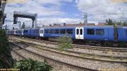
Photo description: A side view of the centre carriage of 720144 detailing the allover blue livery with white doors, and centred body vinyl Great British Railways | Anglia, copyright Railcam Ltd


Great British Railways | Anglia visits C2C

Reportedly being utilised for testing OHL monitoring equipment, Great British Railways liveried @greateranglia #Class720 720144 & 720501 visited our #Barking cameras today as part of a wider diagram of workings.

▫️ 5Z04 Fenchurch Street to Grays
▫️ 5Z05 Grays to Fenchurch Street

Sunday 26th July 2026
@c2c_Rail
 

Attachments

  • 1785180363990.png
    1785180363990.png
    3.2 MB · Views: 326

Russel

Established Member
Joined
30 Jun 2022
Messages
5,376
Location
Lichfield
There's a good video basically showing it that was posted on Twitter by Railcam last night, for those objecting to Elon Musk I have attached a screenshot.

Photo description: A side view of the centre carriage of 720144 detailing the allover blue livery with white doors, and centred body vinyl Great British Railways | Anglia, copyright Railcam Ltd


That looks so much better than the mess we saw in the renders of the IET centre car...
 
Joined
21 Feb 2009
Messages
41
Might be boring I actually think the centre car looks better, leaving the Red and white strips to the front and last carriages only.
 

Zomboid

Established Member
Joined
2 Apr 2025
Messages
2,206
Location
Oxford
I think the blank car really shows the design up... It's just blank, looks unfinished.

I don't live but not do I hate the flaggy pointy stuff on the end cars, but I'd have some kind of horizontal feature running along the "back" half of the end cars and any/all centre cars.
 

Mikey C

Established Member
Joined
11 Feb 2013
Messages
8,228
I think the Southeastern Livery looks nicer because the doors are light blue, rather than white.
 

Top