
-
Our new ticketing site is now live! Using either this or the original site (both powered by TrainSplit) helps support the running of the forum with every ticket purchase! Find out more and ask any questions/give us feedback in this thread!
You are using an out of date browser. It may not display this or other websites correctly.
You should upgrade or use an alternative browser.
You should upgrade or use an alternative browser.
Great British Railways: Station identity and livery unveiling (09/12/25)
- Thread starter skyhigh
- Start date
- Status
- Not open for further replies.

Sponsor Post - registered members do not see these adverts; click here to register, or click here to log in
R
RailUK Forums
I view it as the UK becoming more yank-ified, but thats just a personal opinion.What is this obsession with slapping flags on everything? Can’t anyone remember which country they live in?
Last edited:
haydenwilliams
Member
Honestly it could have been sooo much worseThat is beyond hideous.
is it wrong to say that I don’t mind it. It’s not too in your faceAn example of station branding:View attachment 193516
Text reads "GBR A railway owned by you"
I believe this image is Train SIM?

Omnidekkalover
Member
I just wish that the livery wasn't so focused on the Union Jack to be honest. It just looks a bit on the tacky side personally.

bramling
Veteran Member
Am I the only one who thinks that livery looks utterly repulsive?
== Doublepost prevention - post automatically merged: ==
An example of station branding:View attachment 193516
Text reads "GBR A railway owned by you"
So a meaningless political ideology statement. Most passengers would rather efforts were focussed on getting the railway running reliably - one speaks as a GTR user where virtually every journey in recent memory has been disrupted in some way.

sabanda
Member
Could have been worse, but equally there are so many irksome bits that I don't even know where to start unpicking it all!
haydenwilliams
Member
Yeah, it doesn’t look too bad to meI believe this image is Train SIM?
Bletchleyite
Veteran Member
That nicely shows a big design error. RA2 is a utilitarian font. It looks awful in a logotype like that (just like Avanti's "big A" in Helvetica at the vehicle ends) yet undeneath the unit number is there in a stylised, modern font.
Any publicity company worth its salt would be embarrassed at this amateuish mess, it's nothing on the superb TfW and ScotRail branding packages.
== Doublepost prevention - post automatically merged: ==
Could have been worse, but equally there are so many irksome bits that I don't even know where to start unpicking it all!
I don't think it could have been much worse to be honest.
Too loud. Stripes are the way to go on long moving straight things, i e Trains.

The front 3rd of the flag effect then transversing into straight lines throughout the rest of the train wouldve been better. May have been a bit 'NSE' but more pleasing on the eye.
Bletchleyite
Veteran Member
Am I the only one who thinks that livery looks utterly repulsive?
No, I think it is the most awful mess I have ever seen on any British train in my lifetime.

Farigiraf
Member
While not bad in my opinion, it goes against a lot of the minimalist train liveries used in recent times which have been very pleasant. I'd echo previous posters stating that it's too flashy - imagine this on every regional train in the country - in Looe, Whitby, Elton & Orston, Windermere and everywhere between. At bit much.
However if picking the lowest effort design means they can concentrate more time and money on running the service better than under privatisation, I'm all for it - though we know it doesn't work like that
However if picking the lowest effort design means they can concentrate more time and money on running the service better than under privatisation, I'm all for it - though we know it doesn't work like that
haydenwilliams
Member
No there could have been worse, could have been just a Union Jack flag elongated to fit the full lengthThat nicely shows a big design error. RA2 is a utilitarian font. It looks awful in a logotype like that (just like Avanti's "big A" in Helvetica at the vehicle ends) yet undeneath the unit number is there in a stylised, modern font.
Any publicity company worth its salt would be embarrassed at this amateuish mess, it's nothing on the superb TfW and ScotRail branding packages.
== Doublepost prevention - post automatically merged: ==
I don't think it could have been much worse to be honest.
It is kinda like when the people of Liverpool were told 'you own the 777s now', when literally most people couldn't care less or even know the benefits or such, if the service still is unreliable then the train ownership doesn't matter. I think it's important that trains are owned by the state of course, but delivering a compotent service should be the main part.So a meaningless political ideology statement. Most passengers would rather efforts were focussed on getting the railway running reliably - one speaks as a GTR user where virtually every journey in recent memory has been disrupted in some way.
People view it as even more of an issue when it's a government company who is not delivering as opposed to a private one. And just saying 'its publically owned now everything will be amazing' offers nothing of value, especially considering what the DfT is actually like.
It would be funny to see a livery like this on a 150/156, trains that have outlived privitisation and now will have to wear a (worse) livery if this is anything to go by.
Mainline421
Member
Funny you should mention that... https://bsky.app/profile/todaysrailwaysuk.bsky.social/post/3m7j3n5rr2s2qHow is it going to reflect onto other train designs? It may look fine on an IET but not on a Desiro, say.
The app icon is a massive own goal, pretty obviously would work better as just the double arrows
STINT47
Member
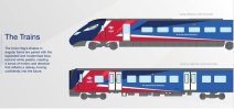

nlogax
Established Member
Maybe there's a bit too much going on up front with the return to yellow panels exacerbating what is already a busy design.
It hardly matters though. If it's consistently applied and gets the nationalised railway message across then job done. Passengers aren't going to be worrying about what their train looks like from the outside. They're far more concerned about getting from a to b on time and without incident.
It hardly matters though. If it's consistently applied and gets the nationalised railway message across then job done. Passengers aren't going to be worrying about what their train looks like from the outside. They're far more concerned about getting from a to b on time and without incident.
Indeed, it reminds me of the Swiss Railways SBB CFS FFS logo on some of their unitsIgnoring the actual livery, I'm a big fan of the simplicity of the logo itself, hope that is more representative of the overall branding style


XCTurbostar
Established Member
- Joined
- 13 Sep 2014
- Messages
- 2,554
I would be happy with the front but arrows on the intermediate coaches too?
Bletchleyite
Veteran Member
Indeed, it reminds me of the Swiss Railways SBB CFS FFS logo on some of their units
It doesn't fit with a brash livery like that, though. The SBB livery is basic, understated and professional. This, er, isn't.
I will admit I don't like RA2 at all, it's a clumsy and odd font compared to the original. But even so, brash and modern requires a brash and modern logotype, not a classic, utilitarian one that would suit classic Rail Blue but not this 5 year old and MS Paint job.

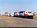
Upon seeing this, my mind went straight to the Trinity Railway Express livery on the Dallas to Fort Worth Commuter trains in Texas 
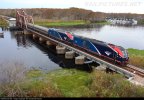
I also think it bears an uncanny resemblance to the Amtrak's latest paint scheme, the Phase VII livery, almost as if Amtrak decided to order an IET!
(Not my images, credit to the original photographers)
I also think it bears an uncanny resemblance to the Amtrak's latest paint scheme, the Phase VII livery, almost as if Amtrak decided to order an IET!
(Not my images, credit to the original photographers)
Attachments
Bletchleyite
Veteran Member
It clearly takes the basic principles from the TransPennine Express livery, but that works better because the colour scheme is less brash. If you have brasher colours you need a more understated design or it just looks too "in your face".
Exactly. Maybe its not too late for them to amend that.I would be happy with the front but arrows on the intermediate coaches too?
Seagull2006
Member
I like the idea of the union jack integrated on the front, but not overly a fan of it on the middle coaches. I'd prefer a simpler blue only scheme for those.


Am I the only one who thinks that livery looks utterly repulsive?
== Doublepost prevention - post automatically merged: ==
So a meaningless political ideology statement. Most passengers would rather efforts were focussed on getting the railway running reliably - one speaks as a GTR user where virtually every journey in recent memory has been disrupted in some way.
While not bad in my opinion, it goes against a lot of the minimalist train liveries used in recent times which have been very pleasant. I'd echo previous posters stating that it's too flashy - imagine this on every regional train in the country - in Looe, Whitby, Elton & Orston, Windermere and everywhere between. At bit much.
However if picking the lowest effort design means they can concentrate more time and money on running the service better than under privatisation, I'm all for it - though we know it doesn't work like that
No I’m with you both. It’s basically the colours of the Union Jack slapped over the base of TransPennine Express.
It really makes me rather sad that, whilst privatisation bought of a myriad of liveries and designs, we’ve had some utterly superb and classy ones ranging from the very beginning - eg GNER, Merlin, Southern, Central and South West Trains, to mid privatisation ones like London Midland, Dynamic Lines and Virgin Trains silver and red to more recent ones such as EMR and GWR.
And this, is what we’ve come up with. It’s bold, it’s brash, and it’s garish.
That's what Network Southeast livery used to do I think right? You might be on to something there, I think that would look very goodI like the idea of the union jack integrated on the front, but not overly a fan of it on the middle coaches. I'd prefer a simpler blue only scheme for those.
Agree. A step backwards. HorrificNo, I think it is the most awful mess I have ever seen on any British train in my liflifetime
- Status
- Not open for further replies.