
-
Our new ticketing site is now live! Using either this or the original site (both powered by TrainSplit) helps support the running of the forum with every ticket purchase! Find out more and ask any questions/give us feedback in this thread!
You are using an out of date browser. It may not display this or other websites correctly.
You should upgrade or use an alternative browser.
You should upgrade or use an alternative browser.
Great British Railways: Branding options?
- Thread starter Sad Sprinter
- Start date
- Status
- Not open for further replies.

Sponsor Post - registered members do not see these adverts; click here to register, or click here to log in
R
RailUK Forums
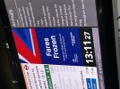
You beat me too it. Also saw this at london bridge.!Seems like GBR is popping its head out at mainline stations (taken at Euston yesterday) regarding the frozen fares. Also a new graphic with some more colours - I like it!
py_megapixel
Established Member
That sounds dreadfully clunky. The phrasing they've chosen is better in my opinion...on and of which Britain can rely and be proud.
martin butler
Member
- Joined
- 9 Oct 2018
- Messages
- 879
Why not just have one corporate livery, with GBR branding, I would favour something similar to the old NSE livery of Grey, Red with dark blue window edging,
Sorry it was just a joke.That sounds dreadfully clunky. The phrasing they've chosen is better in my opinion.

Smwrff
Member
Looks like a Reform poster.....Seems like GBR is popping its head out at mainline stations (taken at Euston yesterday) regarding the frozen fares. Also a new graphic with some more colours - I like it!

Let's just hope the livery isn't as horrendousLooks like a Reform poster.....
Bletchleyite
Veteran Member
Let's just hope the livery isn't as horrendous
Southeastern dark blue with some of that red and white accenting could look quite good and would fit with that poster...

HighlandStorm
Member
So the new 'Rail Clock' on departure boards lasted a long time then?Seems like GBR is popping its head out at mainline stations (taken at Euston yesterday) regarding the frozen fares. Also a new graphic with some more colours - I like it!
Hasn't made its way to all stations yet. For example Euston, where this was taken, has not gotten it yet. It will eventually.So the new 'Rail Clock' on departure boards lasted a long time then?

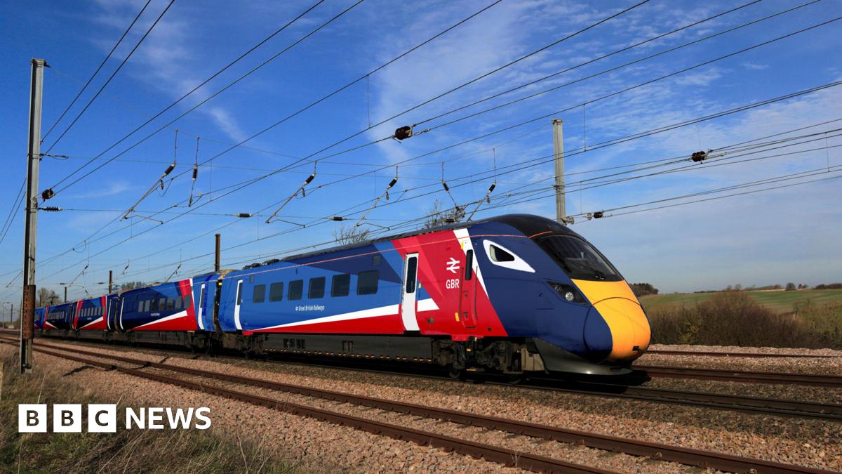
New: Within the past couple of hours, Heidi Alexander has teased a full GBR livery launch for tomorrow, likely with an LNER Azuma wearing the new colours...

"Something big is coming to our railways tomorrow "

Helvellyn
Established Member
- Joined
- 28 Aug 2009
- Messages
- 2,577
Well The Guardian reports it be officially unveiled at London Bridge tomorrow. Makes me suspect a Southeastern unit will be used, possibly one of the recently transferred 377/1s from Southern or maybe the first refurbished 376?
The press image though shows an Azuma, so I guess LNER might have one for the launch of their Veolcity timetable revamp next week (I'm sure the Government will want claim the credit of nationalisation for the capacity uplift).

https://www.railadvent.co.uk/wp-content/uploads/2025/12/GBR-Train-Livery.jpg
DfT press release also features the Azuma - https://www.gov.uk/government/news/...arrives-as-government-reforms-broken-railways
The press image though shows an Azuma, so I guess LNER might have one for the launch of their Veolcity timetable revamp next week (I'm sure the Government will want claim the credit of nationalisation for the capacity uplift).
https://www.railadvent.co.uk/wp-content/uploads/2025/12/GBR-Train-Livery.jpg
DfT press release also features the Azuma - https://www.gov.uk/government/news/...arrives-as-government-reforms-broken-railways

I assume there are going to be only a handful of liveried trains, akin to other special vinyls, as redoing every train is surely going to cost a fortune if done before they need doing. Likewise rebranding stations, with new paint (many things needing powder coating and not just a tin of Dulux slapped on something), signs (or vinyls over existing signs) and so on.
I would have thought for all the other trains, you just need something at each end - akin to the notices on the side of a London Bus as to who operates a service. Maybe a 'part of GB Railway' on each coast if you must.
People want to see actual improvements, not stuff that they'll associate with wasting money (as they would if a TOC did it).
I would have thought for all the other trains, you just need something at each end - akin to the notices on the side of a London Bus as to who operates a service. Maybe a 'part of GB Railway' on each coast if you must.
People want to see actual improvements, not stuff that they'll associate with wasting money (as they would if a TOC did it).
Bletchleyite
Veteran Member
This, this, and this - the new Chiltern livery is really good. I was also going to suggest the Northern Rail 200 livery (158903), with a splash of white or red (and with needless graphics removed), which might also work.
Add a red curved sweep up after the dark blue on the current Northern livery and it'd look quite decent to be honest (the blue is already about right for the flag). Simple shapes work with brash colours.
Absolutely, although I tend to preference a darker design much like ScotRail's with a bit of a flash. As much as TfW's branding package is awesome, there is just too much white for me but that is heavy personal opinion and I would much rather the train look ok and run reliabily and represent a new start than look horrible and run horrible.Add a red curved sweep up after the dark blue on the current Northern livery and it'd look quite decent to be honest (the blue is already about right for the flag). Simple shapes work with brash colours.
== Doublepost prevention - post automatically merged: ==
Going to put this in here, as I think putting a shade of red inbetween what is on 158903 would also be a good option, and it would look really nice to have the GBR text/logo as one line within the dark blue sections.I was curious, so I inserted a shade of red in between the 158903 livery, and it really does not look that bad...
View attachment 193527
== Doublepost prevention - post automatically merged: ==

I had a try at applying this to something, so here it is
Last edited:

Kite159
Veteran Member
Nah it will be done as a matter of urgency, regardless of cost. Because afterall Great English Railways is the 'railway owned by you'.I assume there are going to be only a handful of liveried trains, akin to other special vinyls, as redoing every train is surely going to cost a fortune if done before they need doing. Likewise rebranding stations, with new paint (many things needing powder coating and not just a tin of Dulux slapped on something), signs (or vinyls over existing signs) and so on.

More on branding at
 www.bbc.co.uk
Branding and logo for Great British Railways unveiled
The new red, white and blue branding mirrors the colours of the Union Flag, and will start to appear from next year.
www.bbc.co.uk

Also, for fun, I wrapped the windows in a white bar; it looks like the back half is reminiscent of BR, while the front half is new. Either way, it is really not bad for what it was, about I dont know 20 minutes of time?
I dont know about the whole 'separation between Intercity and Local', part of me would not mind a fully unified livery across all sectors like ScotRail, but I would be open to an idea of having two separate liveries. However, obviously, the DfT has not made any mention of there being separate ones thus far. I think a livery featuring a full-length stripe, like the good old intercity days, would much better suit an intercity service if there was to be a separation of sorts. Even then, it has already been made in the form of the LNER's 91 livery, just tweak that as far as I am concerned.
Last edited:

omnicity4659
Member
- Joined
- 25 Sep 2017
- Messages
- 234
The DfT have registered trademarks for Rail Symbol 2 in dark blue, orange, purple and yellow, in addition to the usual red...
(links to the trade mark registration pages)
Along with a few oddities, including a RS2 version of the "Britain Runs On Rail" logo from a few years ago...
(links to the trade mark registration pages)
Along with a few oddities, including a RS2 version of the "Britain Runs On Rail" logo from a few years ago...

Leyland Bus
Established Member
I hope that is to just cover the bases and not something they are planning to spring on us down the lineThe DfT have registered trademarks for Rail Symbol 2 in dark blue, orange, purple and yellow, in addition to the usual red...
(links to the trade mark registration pages)
Along with a few oddities, including a RS2 version of the "Britain Runs On Rail" logo from a few years ago...

And frankly that multicoloured one can go in the bin, RS2 or not...

Logically it would make sense for SE to be the first TOC to rebrand, being the first one that's intergrated fully with Network Rail. The blue livery can be adapted as simple as revinyling the doors red, as seen here:Makes me suspect a Southeastern unit will be used

Above: SE Blue
Both images: Pixel art rendition of a Class 375 DMSO vehicle
Below: GBR Transitional


Looks kinda like stagecoach or first group with that base blue with red doors. There'll probably be extra graphics or vinyls added.Logically it would make sense for SE to be the first TOC to rebrand, being the first one that's intergrated fully with Network Rail. The blue livery can be adapted as simple as revinyling the doors red, as seen here:
View attachment 198326
Above: SE Blue
Both images: Pixel art rendition of a Class 375 DMSO vehicle
Below: GBR Transitional
View attachment 198328
== Doublepost prevention - post automatically merged: ==
Yeah like that.Absolutely, although I tend to preference a darker design much like ScotRail's with a bit of a flash. As much as TfW's branding package is awesome, there is just too much white for me but that is heavy personal opinion and I would much rather the train look ok and run reliabily and represent a new start than look horrible and run horrible.
== Doublepost prevention - post automatically merged: ==
Going to put this in here, as I think putting a shade of red inbetween what is on 158903 would also be a good option, and it would look really nice to have the GBR text/logo as one line within the dark blue sections.
== Doublepost prevention - post automatically merged: ==
View attachment 193530
I had a try at applying this to something, so here it is
== Doublepost prevention - post automatically merged: ==
Even better actually!View attachment 193538
Also, for fun, I wrapped the windows in a white bar; it looks like the back half is reminiscent of BR, while the front half is new. Either way, it is really not bad for what it was, about I dont know 20 minutes of time?
I dont know about the whole 'separation between Intercity and Local', part of me would not mind a fully unified livery across all sectors like ScotRail, but I would be open to an idea of having two separate liveries. However, obviously, the DfT has not made any mention of there being separate ones thus far. I think a livery featuring a full-length stripe, like the good old intercity days, would much better suit an intercity service if there was to be a separation of sorts. Even then, it has already been made in the form of the LNER's 91 livery, just tweak that as far as I am concerned.
- Status
- Not open for further replies.