• Our new ticketing site is now live! Using either this or the original site (both powered by TrainSplit) helps support the running of the forum with every ticket purchase! Find out more and ask any questions/give us feedback in this thread!

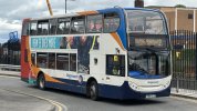
New Stagecoach bus livery

Status
Not open for further replies.

TheGrandWazoo

Veteran Member
Joined
18 Feb 2013
Messages
22,956
Location
Somerset with international travel (e.g. across th
I agree much better than local livery. What with rebranding of First, Stagecoach and Manchester Bee Network people should invest spare cash in by Spain ethers and suppliers.
I don't know how quickly the First rebrand will take. Remember that barbie took 12 years to be eradicated (though it actually still survives on an Eclipse used for training in Bristol) :lol:


I wonder if they picked blue just to be different from London or Manchester buses? It does look smart though and more easily maintainable. But that's the trouble with the wonderful liveries that Ray Stenning and others come up with that really make buses more "visible" and "desirable". If companies are not able or willing to put the effort and expense into maintaining those liveries then they become a lot less "desirable" than the bland liveries they replace.
Wasn't "beachball" a Best Impressions creation?

Ray gets both plaudits and brickbats - on here, usually the latter on the grounds that his liveries look samey, not withstanding that a) most people are not going to see similarities between liveries in Isle of Wight vs Cornwall and b) there are certain colour combinations on a colour wheel that work and some don't.

What the local livery debacle has shown is that Ray Stenning does understand about the practical application and usage of liveries in the real world. FWIW, I think the dark blue (almost black) is going to be difficult to keep clean. Now, if Stagecoach had something like the First Eastern Counties Coastal Cabriolet livery (current Stagecoach blue as main body, darker blue for the rear 1/3 portion and the current Stagecoach peach as an accent colour), that would be practical, bright and distinctive.
 
Sponsor Post - registered members do not see these adverts; click here to register, or click here to log in
R

RailUK Forums

Tetchytyke

Veteran Member
Joined
12 Sep 2013
Messages
17,594
Location
Isle of Man
That dark navy blue is just going to show up every single scratch and dent on a bus. Dark blues and blacks are as bad as white for showing up grime too. Awful choice for a bus livery.

Ray gets both plaudits and brickbats - on here, usually the latter on the grounds that his liveries look samey, not withstanding that a) most people are not going to see similarities between liveries in Isle of Wight vs Cornwall and b) there are certain colour combinations on a colour wheel that work and some don't.
Best Impressions generally get the colour palette correct for bus use. The Lakes livery is a Best Impressions livery and it just works.

Where I think things get a bit derivative is in others parts of the branding, every brand is always seemingly two words set out in the format sans:serif.
 

m79900

Member
Joined
28 May 2023
Messages
706
Location
North Derbyshire
I liked Beachball, it looked good on most buses and looked smart even on buses that were last painted years ago.

Stripes was good as well.

The new 'blue' one just looks boring.
 
Joined
7 Jan 2019
Messages
312
Location
West Midlands
What I will always find ironic about Beachball is that no matter how hard they try to eradicate it, it’ll be many years before the last traces are gone.

Considering its colour palette was used from 2002 until 2019 for both interiors and exteriors, many interiors remain unaltered - that’s something that can’t be said for its successors where the soulless grey and hints of blue don’t match the exterior livery. There’s also the logo itself engrained into assault screens etc.

Another point which always come to mind travelling on Beachball era vehicles is the consistency. Whether you like the colour combination or not, internally it’s difficult for the average customer to differentiate between say a 2002 Trident and a 2014 Enviro 400 MMC. That level of consistency is something I can never see being repeated, and personally I see that as a huge benefit in having a consistent perception of bus travel for the average passenger. You knew what to expect and knew it was a Stagecoach bus, since the 2020 rebrand they’ve really lost that image.
 

py_megapixel

Established Member
Joined
5 Nov 2018
Messages
7,491
Location
Northern England
Another point which always come to mind travelling on Beachball era vehicles is the consistency. Whether you like the colour combination or not, internally it’s difficult for the average customer to differentiate between say a 2002 Trident and a 2014 Enviro 400 MMC. That level of consistency is something I can never see being repeated, and personally I see that as a huge benefit in having a consistent perception of bus travel for the average passenger. You knew what to expect and knew it was a Stagecoach bus, since the 2020 rebrand they’ve really lost that image.
You're right, but there is a flip side. Stagecoach never really seems to bother with interior refits of their buses, and they don't generally reserve specific vehicles for specific routes. So in city centres you had buses that have spent over a decade being absolutely hammered on high-traffic services, with years of ingrained dirt, worn fabric and loose fixtures, sharing their routes with brand new buses just out of the factory. I can't help but feel that the passenger's negative perception of the old buses is more likely to transfer to the new ones if they get on board find that the interior design is identical between the two.

I do think that Stagecoach's strategy in that era meant passengers would never really have noticed a step-change in the quality of vehicles they were getting on the route, which I think was a missed opportunity.
 

TheGrandWazoo

Veteran Member
Joined
18 Feb 2013
Messages
22,956
Location
Somerset with international travel (e.g. across th
You're right, but there is a flip side. Stagecoach never really seems to bother with interior refits of their buses, and they don't generally reserve specific vehicles for specific routes. So in city centres you had buses that have spent over a decade being absolutely hammered on high-traffic services, with years of ingrained dirt, worn fabric and loose fixtures, sharing their routes with brand new buses just out of the factory. I can't help but feel that the passenger's negative perception of the old buses is more likely to transfer to the new ones if they get on board find that the interior design is identical between the two.

I do think that Stagecoach's strategy in that era meant passengers would never really have noticed a step-change in the quality of vehicles they were getting on the route, which I think was a missed opportunity.
I can't speak for Stagecoach Yorkshire, and I have experienced occasional rough interiors, but Stagecoach has usually been pretty decent in refurbing vehicles. Having a standard interior for many years helped avoid the problems that affect some firms where you have non-standard seat cushions.

Considering its colour palette was used from 2002 until 2019 for both interiors and exteriors, many interiors remain unaltered - that’s something that can’t be said for its successors where the soulless grey and hints of blue don’t match the exterior livery. There’s also the logo itself engrained into assault screens etc.
To be fair, it was generally ok until they introduced (c.2016) some of the vehicles with the "IrnBru" eLeather seating. That was pretty garish IMO.
 

cactustwirly

Established Member
Joined
10 Apr 2013
Messages
8,420
Location
UK
That dark navy blue is just going to show up every single scratch and dent on a bus. Dark blues and blacks are as bad as white for showing up grime too. Awful choice for a bus livery.


Best Impressions generally get the colour palette correct for bus use. The Lakes livery is a Best Impressions livery and it just works.

Where I think things get a bit derivative is in others parts of the branding, every brand is always seemingly two words set out in the format sans:serif.

Best impressions just churn out copy and paste designs.
You have First and Go-Ahead liveries that look almost identical
 

Bletchleyite

Veteran Member
Joined
20 Oct 2014
Messages
113,493
Location
"Marston Vale mafia"
Just do this but in the blue instead of the green. I'm sure one of our Photoshop wizards could create that? Would look much better than the overbright beachball.

St_Ives_-_Bus_Station_%28geograph_6891167%29.jpg

Image is of a Stagecoach Cambs Busway bus in green livery, Colin Smith/Creative Commons
 
Last edited by a moderator:

TheGrandWazoo

Veteran Member
Joined
18 Feb 2013
Messages
22,956
Location
Somerset with international travel (e.g. across th
Best impressions just churn out copy and paste designs.
You have First and Go-Ahead liveries that look almost identical
As I said above, what does it really matter if they are similar? Most people are not going to see similarities between liveries in disparate parts of the country. He's going to have a house style and @Tetchytyke does mention that on the promo material comment. There are colour combinations on a colour wheel that work and some don't. (As an aside, I do think and have said before, the multitude of Gilbert era liveries that were introduced into Go North East were unnecessary and yes, they were similar to some of the First ones)

I might add that there are some practical reasons in what is produced.... A livery that is recognisable and brighter at the front (where passengers can distinguish it. Darker towards the rear to cover up road dirt. Schemes that reflect the majority of vehicles being produced by Wright and ADL.

Bringing this back on topic, people should ask themselves... do you think that the Stagecoach liveries of 2020, this new Stagecoach livery (or indeed, the 2012 First Olympia or the 2017 Arriva liveries) are better than the stuff that Best Impressions produce?
 

Bletchleyite

Veteran Member
Joined
20 Oct 2014
Messages
113,493
Location
"Marston Vale mafia"
Bringing this back on topic, people should ask themselves... do you think that the Stagecoach liveries of 2020, this new Stagecoach livery (or indeed, the 2012 First Olympia or the 2017 Arriva liveries) are better than the stuff that Best Impressions produce?

Absolutely not. Indeed, I think the 2020 Stagecoach liveries are awful beyond belief. Whoever thought that painting premium, high quality coach services in school bus yellow made sense? Or who decided a quality urban bus operation should look like a Fisher Price toy? Even the new font on the logotype looks like a child's toy, not a quality, professional transport operation.

For me those liveries are, aside from slapdash stuff made up by small companies without a real designer, the worst bus liveries I've seen in a very long time. They make the whole thing just look utterly cheap.

The only one that to me looks good is the green Busway one I posted above.

Stenning's stuff can be samey but it does at least give, er, a good impression. But to be honest I think you'd struggle to find many nicer bus liveries than Beachball - it's getting on a bit now but it really does seem timeless.
 

signed

Established Member
Joined
13 May 2024
Messages
2,382
Location
ROI
Whoever thought that painting premium, high quality coach services in school bus yellow made sense?
It makes some sense in which you stand out as opposed to the bland white you see everywhere. And I quite enjoy that because it is distinctive.

Same as with the Flixbus green livery, Citylink Yellow and Blue, BlaBlaCar Bus Salmon, and many other examples...
 

Bletchleyite

Veteran Member
Joined
20 Oct 2014
Messages
113,493
Location
"Marston Vale mafia"
It makes some sense in which you stand out as opposed to the bland white you see everywhere. And I quite enjoy that because it is distinctive.

Same as with the Flixbus green livery, Citylink Yellow and Blue...

I think this:

Volvo_B11R_Plaxton_Elite_YX64_WCE_Oxford_StGiles.jpg

X5 coach in Oxford - by Motacilla / Wikimedia Commons

...does that a lot better. Now that is a premium look. I agree the "dealer white with a few decals" looks a bit plain, but the yellow I just dislike. Yellow means school bus, and school bus means cramped and cheap.

(That as an aside shows another option for how the rear "big beachball" could look good on the new livery)
 

signed

Established Member
Joined
13 May 2024
Messages
2,382
Location
ROI
Yellow means school bus, and school bus means cramped and cheap.
In North America, sure. But I don't think we have that strong of an association here in Europe

Now that is a premium look
Nothing does quite Premium as the Scottish citylink gold livery


That was a Premium livery, and I find the Stagecoach Yellow to be perfectly fine
 
Last edited by a moderator:

signed

Established Member
Joined
13 May 2024
Messages
2,382
Location
ROI
That (the new Stagecoach dark blue one) livery is bound to not stay in service very long, if it's like the Amazon grey vans, it will show any scratches
 

mangad

Member
Joined
20 Jun 2014
Messages
724
Location
Stockport
Was just looking at the original press release, wondering whether Specalist ever really got used in any substantial numbers, and realised on the local livery there's a great big orange panel at the front on the original version of the livery that was - presumably - swiftly abandoned
 

TheGrandWazoo

Veteran Member
Joined
18 Feb 2013
Messages
22,956
Location
Somerset with international travel (e.g. across th
Was just looking at the original press release, wondering whether Specialist ever really got used in any substantial numbers, and realised on the local livery there's a great big orange panel at the front on the original version of the livery that was - presumably - swiftly abandoned
The Specialist livery was/is pretty rare.

Locally to me, West had a few Tridents in it but I reckon that there were probably fewer than 50 vehicles nationally.
 

cactustwirly

Established Member
Joined
10 Apr 2013
Messages
8,420
Location
UK
Absolutely not. Indeed, I think the 2020 Stagecoach liveries are awful beyond belief. Whoever thought that painting premium, high quality coach services in school bus yellow made sense? Or who decided a quality urban bus operation should look like a Fisher Price toy? Even the new font on the logotype looks like a child's toy, not a quality, professional transport operation.

For me those liveries are, aside from slapdash stuff made up by small companies without a real designer, the worst bus liveries I've seen in a very long time. They make the whole thing just look utterly cheap.

The only one that to me looks good is the green Busway one I posted above.

Stenning's stuff can be samey but it does at least give, er, a good impression. But to be honest I think you'd struggle to find many nicer bus liveries than Beachball - it's getting on a bit now but it really does seem timeless.
Basically all of the local First and Go-Ahead liveries are better than the beachball.

The new electric livery First have brought out is very smart indeed
 

Trainman40083

Established Member
Joined
29 Jan 2024
Messages
4,620
Location
Derby
That (the new Stagecoach dark blue one) livery is bound to not stay in service very long, if it's like the Amazon grey vans, it will show any scratches
Stagecoach are saying it is a trial livery, not the new standard. Must have got a mention on this forum somewhere.
 

GusB

Established Member
Joined
9 Jul 2016
Messages
8,151
Location
Elginshire
Please bear the following in mind when including images within your posts:
  • They must be posted with permission of the photographer and if you have this, you must add a line of text crediting them
  • A descriptive caption should be added - this assists people with visual impairments who are unable to see the image
  • Please respect that not everyone has massive bandwidth - huge images take ages to load on slower connections, so consider reducing the size; by clicking on the thumbnail people will still be able to see the image as uploaded
Thanks :)
 

Russel

Established Member
Joined
30 Jun 2022
Messages
5,507
Location
Lichfield
Up in the Lake District, most of the vehicles now are in the Lakes Connection livery. But sometimes you get a local or beachball turn up. And it all feels a bit wrong. But not as wrong as something that dark is going to look in comparison to the bold green and blue of the Lakes Connection colours!

It really does feel the least Stagecoach livery they could have come up with too.

Stand in Keswick and you can see both Lakes and Local liveries, when an E400 in Local livery turns up on the X4/X5, it really does look poor compared to the native Lakes livery!
 

GoneSouth

Established Member
Joined
17 Dec 2018
Messages
1,489
Stagecoach gold still looks classy although many are now suffering the indignity of being painted white and look terrible.

It was a simple 2 colour livery made to look good by adding some fancy branding. I remember hearing people saying as they boarded the bus how posh it looked.

Wasn’t so keen on the gold plastic inside however!
 
Last edited:

hdennis13

Member
Joined
1 Nov 2023
Messages
49
Location
Cambridge
Just do this but in the blue instead of the green. I'm sure one of our Photoshop wizards could create that? Would look much better than the overbright beachball.

St_Ives_-_Bus_Station_%28geograph_6891167%29.jpg

Image is of a Stagecoach Cambs Busway bus in green livery, Colin Smith/Creative Commons
I think this would look really smart and could use the different colours, eg keep yellow for distance maybe
 

Russel

Established Member
Joined
30 Jun 2022
Messages
5,507
Location
Lichfield
Stagecoach gold still looks classy although many are now suffering the indignity of being painted white and look terrible.

It was a simple 2 colour livery made to look good by adding some fancy branding. I remember hearing people saying as they boarded the bus how posh it looked.

Wasn’t so keen on the gold plastic inside however!

The gold and blue interior looked awful from day 1.
 

mk1979

Member
Joined
27 Sep 2023
Messages
52
Location
Derbyshire
The two vehicles painted so far are trials painted at our Chesterfield paint shop. There have been several iterations of the logo position and style before releasing these vehicles into the wild.
The base colour is a dark slate blue, same as the driver uniform.
Let’s see what further tweaks are made based on customer feedback but vehicles will no longer be painted in white local livery.
 

Russel

Established Member
Joined
30 Jun 2022
Messages
5,507
Location
Lichfield
The two vehicles painted so far are trials painted at our Chesterfield paint shop. There have been several iterations of the logo position and style before releasing these vehicles into the wild.
The base colour is a dark slate blue, same as the driver uniform.
Let’s see what further tweaks are made based on customer feedback but vehicles will no longer be painted in white local livery.

I've seen something on social media about the wrong shade of blue being used, a shade too dark was applied... Is this the usual social media nonsense?
 

GusB

Established Member
Joined
9 Jul 2016
Messages
8,151
Location
Elginshire
Stay on topic, please. The discussion is about the new Stagecoach livery.
 
Status
Not open for further replies.

Top