• Our new ticketing site is now live! Using either this or the original site (both powered by TrainSplit) helps support the running of the forum with every ticket purchase! Find out more and ask any questions/give us feedback in this thread!

Euston departure board to be moved

Status
Not open for further replies.

skyhigh

Established Member
Joined
14 Sep 2014
Messages
6,881
Are these screens owned or leased? That is, if this is a failure have Network Rail spent £1.5m on a pup?
As I understand it, the existing orange LED boards are life expired and it's getting hard to find replacement parts given that type is no longer manufactured. So essentially they would have had to be replaced anyway and the 'cost' of this project is therefore £1.5m minus whatever the replacement would have cost.

Part of the appeal of the new screens too is that they are fully modular - if they choose to remove them, they can easily be reconfigured to go where the existing boards are. Buy a few more panels and the overall screen can be made bigger too. They are a lot more flexible than the older types and certainly will not be wasted if this trial isn't continued.
 
Sponsor Post - registered members do not see these adverts; click here to register, or click here to log in
R

RailUK Forums

Leisurefirst

Member
Joined
23 Apr 2013
Messages
466
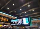
Yep, went to get the train this morning.
Despite my "interest" in the new screens, you can guess where I kept looking... ;)
 

Attachments

  • 20221130_093646.jpg
    20221130_093646.jpg
    3.9 MB · Views: 381

Bletchleyite

Veteran Member
Joined
20 Oct 2014
Messages
113,568
Location
"Marston Vale mafia"
However, people who use the station can only have insight into the existing layout. It's not possible for them to have knowledge of a flow for a layout that doesn't currently exist, only an opinion (which will invariably be one of either "well it can't be any worse than now" or "it all works fine now, no need to change things ever"). The computer models can of course see into the way things will work with any number of designs and layouts - it won't know that one of the options modelled will be what exists in reality.

Experienced rail travellers will have a decent insight too, and they'll also know what THEY find convenient/inconvenient, which may not be the same thing as what Network Rail wants to encourage.

Similar layouts exist elsewhere, e.g. Paddington, so people are in a position to compare options.

== Doublepost prevention - post automatically merged: ==

Part of the appeal of the new screens too is that they are fully modular - if they choose to remove them, they can easily be reconfigured to go where the existing boards are.

If that's the case then I think a good outcome is them being put in place of the existing board (plus maybe one outside, but I think they're too big for that - a few more in list format* dotted about would handle that just fine, e.g. you can see the one by one of the doors from Nando's, just make sure everyone can see one from any forecourt location). That's been done at Victoria and it's really quite good.

* List format is fine, because most LNR passengers know which one they want by time/destination as the vast majority of users are regulars in some form, and most Avanti passengers have booked in advance so only need the time/destination pair to find the right one.
 

Horizon22

Established Member
Associate Staff
Jobs & Careers
Joined
8 Sep 2019
Messages
11,006
Location
London
I have to say it's the wrong place for someone's little experiments. Perhaps trials that are close to a poor GCSE project should take place at somewhere like Sugar Loaf (Powys) where there is no impact on passengers in a major, class one station - trials which should occur before the rollout of an expensive system that probably will may not work in a major station.

But you won't have that level of customer information at a small station. Perhaps a London terminus isn't necessarily the right stop, but to get a good idea of usage and working in the real world, you need somewhere with a fairly large footfall. Waterloo has tried them and they are parralel to the main boards and they seem to work OK. User testing other options is a pretty accepted practice - if it doesn't work so be it, but you can't know everything until you try.

I do find it odd they didn't decide to just wholesale change the boards like at Victoria, but perhaps there are some longer term plans with the whole layout of Euston with HS2.
 

Horizon22

Established Member
Associate Staff
Jobs & Careers
Joined
8 Sep 2019
Messages
11,006
Location
London
They haven't removed the main board there, though. Do many people use the sideways ones? I'm not sure they do.

I've seen it pretty mixed as they are at a lower level so easier for where main people congregate. My point was it's a station with both like Euston is now. Obvious differences are a) Waterloo is parallel and b) Waterloo has had screens there for a longer amount of time. Assessing something this early will not give you a full picture. You probably need to trial it for 3+ months.
 

edwin_m

Veteran Member
Joined
21 Apr 2013
Messages
28,691
Location
Nottingham
Flow modelling is an established science - and generally gives accurate results - they haven't decided to do this on a whim.
Some busy stations have moved their departure boards/screens from above the gateline because the crowd of people that gathers to stare at them causes an obstruction. I expect the specific issue at Euston is when a platform is advised at short notice, those people who are in a far corner of the concourse and know where each platform is try to go there in a straight line, and those that don't know that go perpendicularly towards the gateline until they can see a platform number and then turn left or right. That would take many of them straight through the area in front of the previous screens.
 

Doctor Fegg

Established Member
Joined
9 Nov 2010
Messages
2,135
Location
Charlbury
Another observation is that the destination 'Avanti' appears in the 'next fastest train' section twice.
My guess is that there are two adjacent rows, one alternating between "Milton Keynes" and "Avanti", and another alternating between "Milton Keynes" and "London Northwestern", and the photograph happened to be taken at the time when it was showing the TOC names.
 

zwk500

Veteran Member
Joined
20 Jan 2020
Messages
18,602
Location
Northampton
My guess is that there are two adjacent rows, one alternating between "Milton Keynes" and "Avanti", and another alternating between "Milton Keynes" and "London Northwestern", and the photograph happened to be taken at the time when it was showing the TOC names.
A very logical explanation, especially with the times displayed, although it's yet more information bloat. Surely the point of a 'next fastest train' board is to put only the next fastest train?
 

zwk500

Veteran Member
Joined
20 Jan 2020
Messages
18,602
Location
Northampton
All of the information on that screen is provided to the left. If you go down that route just drop it entirely.
The fastest train board is useful, as it means you can look for specifically your station and don't need to be mentally jotting down times across 2 or 3 tables. However including TOC-specific departures obscures the fact of what is the actual 'fastest' train - in this case, from the Fastest train board it is not clear which train for MKC actually arrives first between the two TOCs (as the LNWR trains is the Crewe service, it'll be the train listed second, counterintuitively). If you have an open ticket, this defeats the purpose of the board. If you have a restricted ticket, upon seeing the next fastest train is the 1709, it is not difficult to check if the operator matches. It is harder to find MKC in the 2 different lists and compare the times, especially if you have to wait for the page to scroll through.
 

Bletchleyite

Veteran Member
Joined
20 Oct 2014
Messages
113,568
Location
"Marston Vale mafia"
The fastest train board is useful, as it means you can look for specifically your station and don't need to be mentally jotting down times across 2 or 3 tables. However including TOC-specific departures obscures the fact of what is the actual 'fastest' train - in this case, from the Fastest train board it is not clear which train for MKC actually arrives first between the two TOCs (as the LNWR trains is the Crewe service, it'll be the train listed second, counterintuitively). If you have an open ticket, this defeats the purpose of the board. If you have a restricted ticket, upon seeing the next fastest train is the 1709, it is not difficult to check if the operator matches. It is harder to find MKC in the 2 different lists and compare the times, especially if you have to wait for the page to scroll through.

Again, the vast majority of people travelling between MKC and Euston have a TOC specific ticket. It is an unusual situation almost identical to Gatwick Airport where there are dedicated tickets for both TOCs including the faresetter (WMT) and so very few of the rather higher priced non-dedicated tickets are sold other than at peak times, and peak regulars know their train time and platform anyway, and know full well that Avanti is significantly faster* than LNR unless the LNR train is the Crewe one.

Just like the way Manchester Piccadilly's board shows one of each TOC for Sheffield etc for the same reason, this does make sense. It would be a lot less useful if it did not do this.

These things need to be designed based on how the actual users use them, not based on some ideal of TOC not mattering.

* Rough times: Avanti 30 mins or 35 with a Watford stop, LNR Crewe 35, LNR semifast about 45, LNR stopper over an hour. Thus, if you hold an interavailable ticket, LNR is only of interest if it's the Crewe, otherwise you definitely want Avanti.
 

Llanigraham

On Moderation
Joined
23 Mar 2013
Messages
6,488
Location
Powys
Having spent an hour in the food area last week waiting for my train home the one comment I would make as that the new screens are not visible from up there, whereas the old one is.
 

zwk500

Veteran Member
Joined
20 Jan 2020
Messages
18,602
Location
Northampton
Again, the vast majority of people travelling between MKC and Euston have a TOC specific ticket. It is an unusual situation almost identical to Gatwick Airport where there are dedicated tickets for both TOCs including the faresetter (WMT) and so very few of the rather higher priced non-dedicated tickets are sold other than at peak times, and peak regulars know their train time and platform anyway, and know full well that Avanti is significantly faster* than LNR unless the LNR train is the Crewe one.

Just like the way Manchester Piccadilly's board shows one of each TOC for Sheffield etc for the same reason, this does make sense. It would be a lot less useful if it did not do this.
I've clearly touched a nerve here, but have the fares changed substantially then? When I lived in MK the difference between TOC-Specific and open was about 50p. Unless e-tickets have changed the game. Also aren't tickets to connecting stations like Wolverton and Long Buckby (not an insubstantial part of Euston-MK travel) open-TOC by default?
These things need to be designed based on how the actual users use them, not based on some ideal of TOC not mattering.
Obviously I'm an atypical user, by expecting a board with 'next fastest train' to list the next fastest train!
* Rough times: Avanti 30 mins or 35 with a Watford stop, LNR Crewe 35, LNR semifast about 45, LNR stopper over an hour. Thus, if you hold an interavailable ticket, LNR is only of interest if it's the Crewe, otherwise you definitely want Avanti.
I'm well aware of the travel times. I lived in MK for 5 years. I appreciate these may have been for others' benefit.
 

Bletchleyite

Veteran Member
Joined
20 Oct 2014
Messages
113,568
Location
"Marston Vale mafia"
I've clearly touched a nerve here, but have the fares changed substantially then? When I lived in MK the difference between TOC-Specific and open was about 50p. Unless e-tickets have changed the game.

For the Off Peaks there isn't a WMT Only one (because they can't add new fares as they're now the faresetter) and the Avanti one is only a small discount.

However, for Super Off Peak (which are still pretty usable, particularly on Sundays) there's no interavailable one, so you're comparing interavailable Off Peak Day at £22.10 with Super Off Peaks at £16.60 (LNR) and £16.40 (Avanti - yes cheaper!) - unlike other LNR Super Off Peaks these are unrestricted on Saturdays, again for historical reasons.

So you're talking a discount of over £5 a head. So yes, people do normally buy those for a day out.

Also aren't tickets to connecting stations like Wolverton and Long Buckby (not an insubstantial part of Euston-MK travel) open-TOC by default?

Basically nobody changes at MKC for those stations. People use direct trains, because by changing you save very little time and it's a faff.

Some super-rushed commuters might (like there are some that go from slow to fast going to/from Bletchley at Leighton, though the need for this disappears in December as almost all standard pattern fasts will call at Bletchley as well). They know what they're doing, and will either know their platform off by heart or be using the likes of Realtime Trains. (It's amazing what high proportion of people are queueing by trains long before they've gone up on the board at peak times!)

Obviously I'm an atypical user, by expecting a board with 'next fastest train' to list the next fastest train!

Yes, you're atypical. The majority of users on this route use the dedicated fares above. Most often the LNR one because it's more frequent and finishes later, even though it's slower, and probably also out of habit.

Plus, pretty much all of these boards are, where it might be relevant, split by TOC, including the very first one of this type at Manchester Piccadilly.

I'm well aware of the travel times. I lived in MK for 5 years. I appreciate these may have been for others' benefit.

Obviously things on a thread are for the benefit of everyone; were they just for you I'd have PMed them :)
 

py_megapixel

Established Member
Joined
5 Nov 2018
Messages
7,494
Location
Northern England
The main problem I have with these is the huge bright colour bands. Firstly they are ugly. Secondly the use of the "fire exit" icon is just silly, though I hope the fact it's on a screen will avoid confusion with actual fire exits. "Wait" seems overly bossy, even slightly rude.
Maybe someone at TfL has noticed this, as the Overground section uses the slightly more polite "please wait" instead, but it would be friendlier to phrase as a piece of information rather than an imperative (I'd probably go for "Not ready for boarding" and "Ready for boarding at platform X").

I also don't like the font. It looks like a default which nobody's bothered changing. What happened to Rail Alphabet 2 being used as standard for Network Rail stations?

The overall look does not look suitable for the departure board at a busy station. It's almost like some sort of internal monitoring interface which has accidentally been displayed to the public. And fittingly, based on where people appear to be looking in those photos, the public are ignoring them and looking at the old boards instead!
 
Last edited:

Bletchleyite

Veteran Member
Joined
20 Oct 2014
Messages
113,568
Location
"Marston Vale mafia"
The main problem I have with these is the huge bright colour bands which say "wait" and "go". It's ugly, and it seems overly bossy, even slightly rude. Maybe someone at TfL has noticed this, as the Overground section uses the slightly more polite "please wait" instead, but it would be friendlier to phrase as a piece of information rather than an imperative (I'd probably go for "Not ready for boarding" and "Ready for boarding at platform X")

I'd have gone for "Please wait" and "Boarding". People are already familiar with these at airports.

(Actually what would really be nice would be "Please wait", "Go to platform", "Boarding" and "Final call" per an airport, with Boarding only coming up when the doors have been released)

The overall look does not look suitable for the departure board at a busy station. It's almost like some sort of internal monitoring interface which has accidentally been displayed to the public.

Agreed. I genuinely do think a row of 10 to 15 standard-sized (as per New St's LED ones) LED TV style monitors would possibly have worked, ideally with whatever system LNER uses as that's by far the superior one, but this is both expensive and not really fit for purpose.

== Doublepost prevention - post automatically merged: ==

FWIW on the colours I'd go for green=boarding, yellow=please wait, red = cancelled - people already know that! (Or is yellow for delayed hence the blue?)
 

nlogax

Established Member
Joined
29 May 2011
Messages
6,037
Location
Mostly Glasgow-ish. Mostly.
I first saw these on Sunday morning before they were activated. Position-wise they're ridiculous. There's nothing wrong with the main board location. It's a natural focus for passengers and really makes sense in a relatively compact and square terminus space like Euston where board visibility isn't a problem and where the mezzanine level is mostly forward facing.

By all means change the life-expired panels on the main board with the new ones but if there's any common sense the display location should stay exactly where it is. Additional panels that are deemed necessary shouldn't be in the way of that.
 

Sheridan

Member
Joined
11 Jan 2012
Messages
631
Whilst it’s probably not high on most people’s list of concerns, these screens really detract from the open feel of the main concourse (which I will accept doesn’t feel all that ‘open’ when thronged with hundreds of passengers awaiting their platform!). Aside from the horrible pale cladding on the upper level, in recent years the central section of the concourse at Euston has largely been allowed to stand unmolested, but these large banks of screens just make it feel smaller and more cramped, to me anyway. I’m aware that not many people are fans of the architecture of the current station, but that’s no reason to actively worsen it.
 

mr_jrt

Established Member
Joined
30 May 2011
Messages
1,575
Location
Brighton
FWIW on the colours I'd go for green=boarding, yellow=please wait, red = cancelled - people already know that! (Or is yellow for delayed hence the blue?)
Don't forget relying on colours can be problematic. Aside from the issue of different forms of colour blindness, colours have different associations for different cultures.
 

Bletchleyite

Veteran Member
Joined
20 Oct 2014
Messages
113,568
Location
"Marston Vale mafia"
Don't forget relying on colours can be problematic.

It's already using colours. I'm suggesting using slightly different ones.

Aside from the issue of different forms of colour blindness, colours have different associations for different cultures.

This is the UK; colours can be chosen according to UK cultural norms. If visiting the UK or migrating here, it's on you to learn them.

(Does any country NOT use red, amber and green for traffic lights? This strikes me as one of the most spurious of the classic RUK non-objections I've seen in a while!)

And if you're colourblind read the text!
 
Last edited:

mr_jrt

Established Member
Joined
30 May 2011
Messages
1,575
Location
Brighton
I work in IT, and accessibility guidelines are an important consideration when designing user interfaces. Traffic lights are quite likely a grandfather rights situation given they've existed for decades upon decades so aren't going to change anytime soon. They also have positional aspects, which presumably red-green colour blind individuals can use to identify the commands from.
 

Bletchleyite

Veteran Member
Joined
20 Oct 2014
Messages
113,568
Location
"Marston Vale mafia"
I work in IT, and accessibility guidelines are an important consideration when designing user interfaces. Traffic lights are quite likely a grandfather rights situation given they've existed for decades upon decades so aren't going to change anytime soon. They also have positional aspects, which presumably red-green colour blind individuals can use to identify the commands from.

Colourblind people can read the text. The colours are additional guidance. This only applies where colours are the only thing involved rather than them being additional guidance.

In any case if you look you'll see red and green ARE being used, it's just a question of blue vs. yellow.
 

Baxenden Bank

Established Member
Joined
23 Oct 2013
Messages
4,749
As I benefit from specialist colour vision (red/green - the most common, others exist) I must say it depends very much on the specific reds and greens chosen and their context. Also the colour of the background material (eg screen colour / paper colour), the surrounding light, the solidness/pixellation of the colours and the amount of colour available to compare/contrast.

Some examples:
Woodland / building shading on OS maps - faint and pixellated, is that a terrace of houses or a roadside shelter belt of trees? My only clue is the context and shape - buildings tend not to have wiggly edges.
Thin lines on transport maps where you need to refer to a key elsewhere on the map. Other than cutting the line out (of a paper copy, or having two physical copies) and moving it next to the key you often can't tell which is which. Fatter lines and/or solid colours are easier. Putting the route number next to the line means I can identify a 'colour' (different than others may see it but still discernable to me) and follow that colour. Highways Agency (now Roads England?) are especially bad in their choice of colours on consultation leaflets.
Highlighting 'level of service' against a colour on a calendar and timetable, as heritage railways seem keen on - nope, not unless it says 'Red Timetable' in addition.
Magazines, which definitely includes railway ones, printing text over background pictures instead of plain paper. Oh so clever, but often illegible.

Computer viewing has its issues due to screens displaying things differently than the document creator saw it.

Obviously I can ignore red flags on firing ranges, because they are green and don't have 'Red' or 'Green' written on them! The presence, or absence, of a flag should be the warning rather than its colour.

In simple, beyond traffic lights why use red and green when you could use something else?
 

Bletchleyite

Veteran Member
Joined
20 Oct 2014
Messages
113,568
Location
"Marston Vale mafia"
In simple, beyond traffic lights why use red and green when you could use something else?

Because red and green are well understood, and colourblind people can read other things e.g. the word "cancelled" or the arrow showing which way to go. It's just an additional feature.

It does use red and green by the way. The question under discussion is what to use for delayed vs. please wait.
 

Baxenden Bank

Established Member
Joined
23 Oct 2013
Messages
4,749
Because red and green are well understood, and colourblind people can read other things e.g. the word "cancelled" or the arrow showing which way to go. It's just an additional feature.

It does use red and green by the way. The question under discussion is what to use for delayed vs. please wait.
Green for boarding (go), amber for boarding imminent (wait), red for delayed (stop). Delayed being a significant delay which will result in the train departing after it's scheduled time. No colour needed for future trains running as scheduled but boarding not imminent. Some indication / standard of when you will normally be allowed to board would be helpful. The opposite to 'doors will close 1 minute before departure', so 'doors will open for boarding x minutes before departure'.
 

zwk500

Veteran Member
Joined
20 Jan 2020
Messages
18,602
Location
Northampton
Green for boarding (go), amber for boarding imminent (wait), red for delayed (stop). Delayed being a significant delay which will result in the train departing after it's scheduled time. No colour needed for future trains running as scheduled but boarding not imminent. Some indication / standard of when you will normally be allowed to board would be helpful. The opposite to 'doors will close 1 minute before departure', so 'doors will open for boarding x minutes before departure'.
I'd personally reserve Yellow/Amber for delays, with Red for cancellations. Please wait would be Blue or even just no highlight. (And yes, I'd agree with @Bletchleyite that 'Please Wait' is better than just 'Wait'). The 'Boarding expected at XX.xx' works fairly well imho.
 
Status
Not open for further replies.

Top