Peter Mugridge
Veteran Member

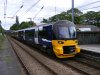
I like that. I wonder if you could tweak it a bit further to show us what it would look like in the traditional GWR Deep Bronze Green...?



I've always preferred full yellow ends - but WOAH!
The whole re-branding exercise was meant to evoke the 'golden age' of rail travel, rather like the GNER brand in the late 1990's.Makes it look really old fashioned.


I really like that actually.I made this:

Sorry...! :P

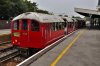
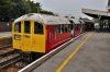
Been a while since I've done anything like this in Photoshop so it's a little bit rough around the edges, but, how about fitting the Class 483's with modern headlights


Very good indeed!

Heres two more i've made
An oyster card livery 158!This is more than just a slight.
Clever interpretation of the new Arriva corporate livery.This is more than just a slight.

What about the Northern Class 333's and Class 321's (Pre-Full blue livery) would look like without the red base, but instead the standard blue.
The 333 certainly looks better with no red!
It's funny how that doesn't look "wrong" because that was their original design. Their current style has been very smartly done though. A thrown-in-there-to-make-it-compliant panel almost always looks worse than one where they've designed the front pattern around it, or where there's a clear "place" for it (see: the 700s; the 707s look weird with it going up around the windows as well).
Now how about a full yellow front...
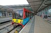
(Almost) Mainline compliant DLR