• Our new ticketing site is now live! Using either this or the original site (both powered by TrainSplit) helps support the running of the forum with every ticket purchase! Find out more and ask any questions/give us feedback in this thread!

Slight changes you would make to liveries to make them nicer

Status
Not open for further replies.

Bletchleyite

Veteran Member
Joined
20 Oct 2014
Messages
113,832
Location
"Marston Vale mafia"
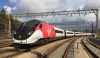
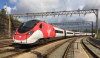
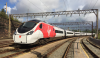
Of the Pendolino ones I think the wider black one looks nicer. The narrowing Azuma style one makes the "friendly smile" of the Pendolino nose end look more like an evil grin.

 
Sponsor Post - registered members do not see these adverts; click here to register, or click here to log in
R

RailUK Forums

Up_Tilt_390

Member
Joined
10 Oct 2015
Messages
923

Attachments

  • Virgin Trains White (black front).png
    Virgin Trains White (black front).png
    1.3 MB · Views: 270
  • Virgin Trains White (red front).png
    Virgin Trains White (red front).png
    1 MB · Views: 271
  • Virgin Trains White (white front).png
    Virgin Trains White (white front).png
    1 MB · Views: 259

class387

Established Member
Joined
9 Oct 2015
Messages
1,580
The red one reminds me of an SBB train:

sbb-icn-johanna-spyri-666836.jpg
 

43096

On Moderation
Joined
23 Nov 2015
Messages
18,889
Indeed. It was where I got my inspiration for the original image I made. In fact, I reckon I could get the whole Pendolino train to look like the ICN. ;)
ICN is what Class 390 should have been. Dressing dross like a 390 up in SBB colours is just an insult to the Swiss.
 

Goldfish62

Veteran Member
Joined
14 Feb 2010
Messages
13,227
I don't think The First group debrandings were DfT mandated. More that the group realised (about 10 years after everyone else in the country!) that (a) their colours were hideous, and (b) the name "First" had become toxic.
Yep, I'd agree with that!
 

Bletchleyite

Veteran Member
Joined
20 Oct 2014
Messages
113,832
Location
"Marston Vale mafia"
ICN is what Class 390 should have been. Dressing dross like a 390 up in SBB colours is just an insult to the Swiss.

Having been on quite a few ICNs, other than the seating layout (which is very easily altered with an afternoon with a spanner per couple of coaches), they really aren't dissimilar to a slightly vertically stretched Pendolino. And the seats are really quite narrow. And there aren't full size tables.

SBB are quite good at a lot of things, but passenger comfort/friendliness really isn't one of them. They are essentially run as a piece of infrastructure.
 

318259

Member
Joined
11 Jun 2011
Messages
176
Honesly, I'd get rid of corporate-based liveries entirely and introduce a set livery that doesn't change when the franchise does, like ScotRail have. SouthEastern would obviously be renamed Network SouthEast and get its blue, red and grey colour scheme back.

But if I'm following the rules of this thread, I'd change the old SPT livery on the 334s and make it look like the SPT class 170 livery. The placement of the teal band on the 334s just annoyed me.
 

43096

On Moderation
Joined
23 Nov 2015
Messages
18,889
Makes you wonder why they are as they are - I'd not noticed until your post, and now I can't un-see it, and it annoys me :lol:
Presume it is to follow the headlight cluster? The original GWT Merlin livery shows how it should be done.
 

BurtonM

Member
Joined
3 Feb 2014
Messages
983
Location
Manchester
Northern.
Remove the coloured Ns from the blue ends.
Remove the web address and App Store links that have no place at all on a train...
The livery isn't good anyway, and needs a complete rethink (it's far too close to the old one), but short of re-engineering that's what I'd do.
 

xc170

Member
Joined
9 Feb 2008
Messages
815
Remove the web address and App Store links that have no place at all on a train...

What? You do know the internet and apps are a huge part of ticketing and journey planning, don't you?
 

sprinterguy

Veteran Member
Joined
4 Mar 2010
Messages
11,579
Location
Macclesfield
Northern.
The livery isn't good anyway, and needs a complete rethink (it's far too close to the old one)
I rather think that was much of the thinking behind it, to provide continuity between the old and new Northern identities. The franchise launch certainly occurred with the minimum of fanfare to give an impression of "business as usual".
 

mushroomchow

Member
Joined
14 Feb 2017
Messages
455
Location
Where HSTs Still Scream. Kind of.
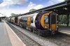
A slight change I would make to the proposed new WM Trains franchise would be to take a sander to it, shave off all the paint, fire whichever art school maniac designed it on their Mac during their lunch break, start again and make it not look like a jaundiced tellytubby thrown into a black hole.

That's within the parameters of this conversation, right? Right?
 

Attachments

  • Class_172_Stourbridge_Jn_RT_v6-1_west_midlands_rail.jpg
    Class_172_Stourbridge_Jn_RT_v6-1_west_midlands_rail.jpg
    602.9 KB · Views: 231

Domh245

Established Member
Joined
6 Apr 2013
Messages
8,426
Location
nowhere
Thankfully the actual version that is being applied isn't quite as hideous as the initial proposal
 

Domh245

Established Member
Joined
6 Apr 2013
Messages
8,426
Location
nowhere
I think the top one would be the more likely, the moorgate fleet is due to have all white fronts. That said, the black front does look smart.
 

43096

On Moderation
Joined
23 Nov 2015
Messages
18,889
I think the top one would be the more likely, the moorgate fleet is due to have all white fronts. That said, the black front does look smart.
I think it would be interesting to see it with the same blue as the doors.
 

K.o.R

Member
Joined
6 Dec 2017
Messages
673
I prefer BR multiple units to have black Wipac lights View attachment 39964

Yes! I always thought they looked odd with those modules painted in yellow, like they forgot to masking tape them before doing the fronts :D


I would keep the yellow only above the line between the headlights but otherwise spot on.

My image editing skills are non-existent unfortunately, else I'd love to see a 444 or 442 in that LSWR dark red that they used when bidding, maybe with cream-coloured doors? Basically the GWR livery but swap green for red and silver for cream (or even gold).

I also wish the Crossrail trains had the "standard" TfL livery with the Crossrail lilac as an accent. And if they must do away with the yellow, then have the front all in lilac. No black fronts!
 

AY1975

Established Member
Joined
14 Dec 2016
Messages
2,186
This is not so much about making liveries nicer, but more about consistency: I think the DfT ought to insist that whatever colour schemes train operators use, where First Class accommodation is provided it must have a yellow stripe above the windows, and where trains have a catering area it must have a red stripe (as in BR days).

At present, some train operators, including Great Western, Southeastern, Southern and Thameslink use the yellow stripe, but some (such as Virgin) have no stripe at all, and the now defunct South West Trains used blue dots above the windows to denote First Class.

AFAIK the only TOC that still uses a red stripe to denote the buffet area is Greater Anglia on its Mark 3 coaches. Southeastern uses a red stripe on its new all-over purple livery to denote the disabled toilet and adjacent area for wheelchairs and bikes. I like the new SE livery, and I think it's good that they do have a stripe above this area so cyclists and disabled passengers know where to get on, but surely they should use some other distinctive colour such as green or turquoise?

SE did away with refreshment trolleys a few years ago, and BR dispensed with full buffet car facilities on the then South Eastern Division at least 35 years ago, but even so, some passengers will recall that a red stripe used to mean a buffet area, and might think SE had reintroduced buffet cars (and not bother to buy a cuppa before boarding!).
 
Status
Not open for further replies.

Top