• Our new ticketing site is now live! Using either this or the original site (both powered by TrainSplit) helps support the running of the forum with every ticket purchase! Find out more and ask any questions/give us feedback in this thread!

Best and worse bus liveries

Status
Not open for further replies.

Tomonthetrain

Established Member
Joined
12 Jul 2011
Messages
1,290
Just to see what people's favourite liveries (and ones they hate in both the WM area and UK wide

My opinion

Best:
(WM) My vote goes to this livery of Central Buses http://tomonthebuses.smugmug.com/In...5446_9TkvFn#!i=2589164961&k=w8W8CxX&lb=1&s=XL - The reason being its more stylish than NXWM red and white, or Diamond Black! Plus the way the curves are on the E200s bodywork make their livery look stylish!
(UK) Trent Barton i4 livery http://tomonthebuses.smugmug.com/We...5979_gq8nPq#!i=2158313291&k=c5Hxj5v&lb=1&s=XL - The way it curves around the side of the bus to make it look smart and it suits the body of the Tempo SR

Worst:
(WM) The black blandness of Diamond Bus http://tomonthebuses.smugmug.com/Ro...8398_dSCCtf#!i=2143505862&k=txnv9vV&lb=1&s=XL - It shows up all the dirt, and looks really wrong
(UK) I never knew NX livery could look so wrong until I saw this... http://tomonthebuses.smugmug.com/NXBusandCoach/National-Express-Alexander-2/22071442_KM3KmC#!i=2180006583&k=T42vTmd&lb=1&s=XL - Yes, loads of grey...a depressing amount in fact!

Honourable mention:
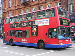
London gets the last word with its annoyingly stupid obsession with red. Just when I thought Diamond could do bad with Black, TfL take the biscuit with 100% insistence on red...


...anyway, over to you
 
Sponsor Post - registered members do not see these adverts; click here to register, or click here to log in
R

RailUK Forums

ian1944

Member
Joined
13 Dec 2012
Messages
691
Location
North Berwick
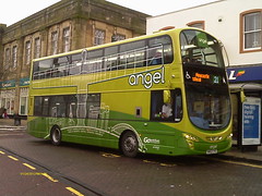
I do really like the Get There Greener livery that's on a few Pointers (53-59).

Pity about the Palace of Numpties in the background.

I think that Preston Bus (pre-Stagecoach snatch and subsequent sale to Rotala) was about the best, reminiscent of Ashton under Lyne Corpy, IMO top of the old municipal operators.
 

90019

Established Member
Joined
29 May 2008
Messages
6,891
Location
Featherstone, West Yorkshire
Pity about the Palace of Numpties in the background.

I wanted to get it facing towards Dynamic Earth, but the light was the wrong way, so had to settle for that instead.
The 36 doesn't normally terminate there, just when the bit outside the Parliament is closed. That's the only time I've had to terminate there so far.
 

Rhydgaled

Established Member
Joined
25 Nov 2010
Messages
4,861
Best
YN53ELH (Richards Bros Optare Excel) It is branded for route 412, so I like to call it 'The Optare 412'. Richards Bros' livery is great in theroy but they really nailed it with this one (it follows the lines of the bodywork nicely).

Close (Joint) Second
YJ55BKE (Richards Bros Optare Tempo) The TrawsCambria variation of Richards Bro's smart colour scheme, marred only by the join of the blue and silver not matching the lines of the bodywork (and latterly by incorrect replacement of the TrawsCambria logo on one side and addition of Richards' coach logo on the windscreen). The colours of Stagecoach's version of TrawsCambria, sadly now extinct, may not have been quite as smart of Richards' blue and silver but they did follow the lines of the bodywork. The only drawback is the extra 'Traws Waves' on the front, to the left and right of the central logo.

Worst
Probably Arriva (the standard variation, as seen on class 153 and 175 DMUs (and Pacers and most ATW 150s, although the latter are being repainted into a different livery)). It's just sssssooooo drab. Also awful though is the new TrawsCymru livery. The green is too light, the route-lines are messy, the silver looks utterly WRONG and the green doesn't follow the lines of the bodywork.

(UK) Trent Barton i4 livery http://tomonthebuses.smugmug.com/We...5979_gq8nPq#!i=2158313291&k=c5Hxj5v&lb=1&s=XL - The way it curves around the side of the bus to make it look smart and it suits the body of the Tempo SR
The livery is a nice colour but I don't like the Tempo SR. Not as ruined as the new Solo (now hump-backed like the equally awful Versa) but still not as smart or as elegant as the orriginal Tempo.
 

christopher

Member
Joined
22 Aug 2006
Messages
410
Location
Over there
I've got to favourites, Ensignbus is my number one because it works on literally anything! And for some reason I love the new Preston Bus livery.

Worst without a doubt is First's new livery - What the hell were the designers on when doing that?!?! :roll:
 

High Dyke

Established Member
Joined
1 Jan 2013
Messages
5,019
Location
Yellabelly Country
Best:
Tilling Green. (i am biased) ;)

Worst:
Found this First Manchester livery recently. Makes it look like a cast-off from Dunn-Line.
 

Attachments

  • Best.jpg
    Best.jpg
    18.3 KB · Views: 63
  • Worst.JPG
    Worst.JPG
    56 KB · Views: 96

tbtc

Veteran Member
Joined
16 Dec 2008
Messages
18,060
Location
Reston City Centre
It's sometimes hard to separate the livery from the view you have of the operator (or your opinion of the vehicle).

Having grown up in central Scotland in the '80s I was used to bus liveries being one dark colour with white bands (virtually every central belt SBG company, LRT, Tayside...), so the Kelvin Scottish livery seemed very striking:

http://www.flickr.com/photos/ruglen/4612380583/

However the Kelvin livery (three different colours and bold diagonal lines) looked rubbish on a Routemaster (which tends to suit old fashioned liveries). The worst livery in Scotland at that time was on the Strathtay Routemasters however:

http://www.flickr.com/photos/ruglen/4612380583/

I do like a livery that acknowledges the bulk of modern windows like the Bluebird livery in Manchester (as was!):

http://www.flickr.com/photos/dwbphotos/7954461930/

The worst modern liveries are generally those which are designed to look good on a blank page but can't cope with the big block windows (I'm sure the new First livery looks fine on an artist's drawing board, but the thin diagonals at the rear of the vehicle are far too subtle and are broken up by the windows).
 

F Great Eastern

Established Member
Joined
2 Apr 2009
Messages
3,851
Location
UK
The new First livery looks far more awful in photos than it does in real life in my opinion.
 

VTPreston_Tez

Member
Joined
26 Jan 2012
Messages
1,159
Location
Preston
Preston Bus' old livery is now only present on the 31215 Lynx. I mean, it's not like I don't take it to school every morning ;)
I don't like the new livery. I'd take the old one back anyday, on the Optare Solos (20762 please) and that would be perfect.
 

transmanche

Established Member
Joined
27 Feb 2011
Messages
6,021
London gets the last word with its annoyingly stupid obsession with red. Just when I thought Diamond could do bad with Black, TfL take the biscuit with 100% insistence on red...
Well, as I grew up in London, to me a bus isn't a bus unless it's red! :D

I really liked the simplicity of both the original Arriva London livery...:


Arriva London North DLP93 LF52 URU by Ingy The Wingy, on Flickr

... and the Metroline livery:


Metroline: VPL583 LK04NME Volvo B7TL/Transbus President by emdjt42, on Flickr

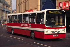
Historically (well 20 years back) an honourable mention (again for simplicity) for the Northern 'proud of our routes' livery:


Go-Ahead Northern Dennis Dart / Wright 8034 (J634KCU) by Ned Basher, on Flickr

But IMHO the best two liveries at the moment are Citylink Gold...:


Park HSK648 by Wigan Airways, on Flickr

... and Green Line:


New Green Line by peagreenbus, on Flickr
 

TheGrandWazoo

Veteran Member
Joined
18 Feb 2013
Messages
23,004
Location
Somerset with international travel (e.g. across th
The new First livery looks far more awful in photos than it does in real life in my opinion.

I agree with you. See it in the flesh, and it doesn't look bad. In fact, the corporate liveries of the big 3 are all reasonably acceptable

My personal favourites were the "independent" Wilts and Dorset livery which seemingly looked good on any vehicle, from a VR to a Metrorider. I also liked the Badgerline livery immediately before FirstBus was created, with the big Badger and the all green minibuses.

Some that were partial hits were Northumbria - looked great on some vehicles (Deltas, Mk2 Nationals) but bizarre on VRs

Worst ones - the North Western livery after they simplified it, and then added yellow to it (ugh). The Midland Red North all red livery - dulled almost immediately yet they replaced it with a really good version of the livery they'd ditched 5+ years earlier! Also, the RoadCar grey RoadRunner minibus livery - eek :-?
 

trentside

Established Member
Joined
14 Aug 2010
Messages
3,391
Location
Messroom
For great liveries of current operators, it's hard to beat Delaine

http://www.delainebuses.com/Fleet/Gallery/2010s/images/153-2.jpg

I'm a big fan of traditional liveries - so another vote for Delaine from me.

On the same front, I'm a big fan of Marshall's of Sutton on Trent;
http://www.flickr.com/photos/trentsidetraveller/6334278607/

For something a little more modern, I like Brylaine Travel's livery - seems to suit both single and double deck vehicles well. Far better than their previous two tone blue and white colour scheme;
http://www.flickr.com/photos/hhhumber/3432451134/in/photostream/
http://www.flickr.com/photos/33650137@N05/8505309168/in/set-72157626216876805/

When it comes to coach operates, I've always loved the Coopers livery;
http://www.flickr.com/photos/mrbbus/5799909451/in/photostream/
 

TheGrandWazoo

Veteran Member
Joined
18 Feb 2013
Messages
23,004
Location
Somerset with international travel (e.g. across th

W-on-Sea

Established Member
Joined
18 Dec 2009
Messages
1,449
I think the Boro'line Maidstone was both eyecatching and attractive, and worked pretty well on a range of vehicles
http://www.flickr.com/photos/65506543@N06/6059038606/

Am also quite a fan of this version of the Sovereign livery
http://www.flickr.com/photos/21611052@N02/6619222051/

and this version of Midland Red West: simple but elegant
http://www.flickr.com/photos/6228_leeds/6917656890/

I'd also put in a good word for Ensignbus's livery too: there can't be many liveries that have remained essentially unchanged now for the best part of 30 years (even with a couple of period when they were not operating public bus services in that)
http://londonbuses.co.uk/051-100_images/062_Ensignbus_Dec88_pd.jpg

The original Roundabout (Orpington Buses) livery was elegant, too, especially on the Optares
http://www.flickr.com/photos/46341292@N05/8421349230/

Also special mention, of current liveries, for East Yorkshire and Lothian

As for liveries that I think don't work...

Sampsons
(Red and blue: should never be seen together)
http://www.flickr.com/photos/johnmightycat/5729910676/

Also not a fan of the old Strathtay Scottish colours
http://commons.wikimedia.org/wiki/File:Strathtay_Leyland_Olympian_917_D817EES.jpg
(or indeed the similar orange/blue clash of present-day Centrebus)

I think this version of Eastern Scottish was pretty undistinguished
http://www.flickr.com/photos/beepee...ses_ltd__lowland_scottish_omnibus_|beepee2004

Also unimpressed with (Ensignbus's first successor) Capital Citybus, especially their original livery
http://www.flickr.com/photos/markamis/5448876597/

While pretty much everything about London Suburban Bus, most certainly including their livery, was dire
http://www.flickr.com/photos/46341292@N05/6589799275/

I'd have to put the old Greater Glasgow colours in the "hideous" box
http://www.flickr.com/photos/markamis/4620187256/

While the final Town & Country livery also does little for me
http://www.thurrocktransport.co.uk/assets/images/db_images/db_Town_54.jpg
 

tbtc

Veteran Member
Joined
16 Dec 2008
Messages
18,060
Location
Reston City Centre
I do like a livery that acknowledges the bulk of modern windows like the Bluebird livery in Manchester (as was!):

http://www.flickr.com/photos/dwbphotos/7954461930/

The worst modern liveries are generally those which are designed to look good on a blank page but can't cope with the big block windows (I'm sure the new First livery looks fine on an artist's drawing board, but the thin diagonals at the rear of the vehicle are far too subtle and are broken up by the windows).


The Green Line livery is exactly what I was talking about - it's clearly been designed to look good on a bus (e.g. accommodating the big dark space taken up by the windows) and not just something that looks good on paper.

This is why a lot of old liveries fail to work on modern buses - you can't be as subtle these days due to the way that modern windows look.
 

johnnychips

Established Member
Joined
19 Nov 2011
Messages
3,826
Location
Leeds
Best and worst?

Was there a bus company based near Caernarfon called White(something) once? Buses looked terrible, but it certainly did what it said on the tin.
 

Ivo

Established Member
Joined
8 Jan 2010
Messages
7,307
Location
Bath (or Southend)
Best: New First livery, when on a vehicle it suits well (e.g. Pointer SLFs).
Worst: New First livery, when messed around with (e.g. Bath artics).

Being serious...

I think the Brighton & Hove livery looks good, whereas the corporate Arriva livery is boring and somewhat out-of-proportion. Special mentions for anyone lazy enough to go plain white.
 

Alistair G.

Member
Joined
16 Jun 2013
Messages
355
Location
Leicester

ValleyLines142

Established Member
Joined
25 Jul 2011
Messages
7,037
Location
Gloucester
For me, my favourites have to be the buses in Reading. They are so colourful!

I also do like National Express Coventry's buses too.

The worst livery has got to be this, Stagecoach 22755 in Scunthorpe!! I absolute despise orange!!
 

GatwickDepress

Established Member
Joined
14 Jan 2013
Messages
2,588
Location
Leeds
The final blue and yellow of the Hastings & District livery is very simple, but rather effective I think. As seen in 1994 on a Bristol RELL6S and a Bristol VRT. It looks quite pretty on those buses but it wouldn't hold up very well on any of Stagecoaches' current Hastings fleet.

The worst for me is Arriva's. It's functional but the colours are sterile and boring in every way! A runner up is the pink North East Volvo B7TL, but that elicited amusement rather than disgust.
 

Eagle

Established Member
Joined
20 Feb 2011
Messages
7,106
Location
Leamingrad / Blanfrancisco
A runner up is the pink North East Volvo B7TL, but that elicited amusement rather than disgust.

Not quite as horrible as the shade of pink formerly used by Stagecoach Warwickshire Unibus. Sort of the colour you'd associate with a 10-year-old toilet mat.

Luckily it was replaced with a much smarter-looking version of the Stagecoach red livery (not dissimilar to that on SWT's 455s). Looks better on the new Enviros as they've incorporated the blue fascia on the interior into the livery very well.
 

tbone

Member
Joined
19 May 2011
Messages
323
Location
Derbyshire
Must say I'm a big fan of all of Trent Barton's 2012 onward liveries, the Allestree and the Mango spare buses jostle for second but my favorite has to be the centenary bus, 724:

http://www.flickr.com/photos/397009...Gcx-9SaiUY-9ZsjHt-9vSSfn-bVLdfy-bueEA6-9isoYj

I'm also quite fond of Transdev Blazefield's more recent liveries, particularly York:

http://www.flickr.com/photos/604480...3nV-aeMxJS-9rg3MR-bo6PyW-bo6J5s-ebwPWT-9GEhg1

And Lancashire United, in particular the way that these two have a nostalgic twist with both having the relevant rose on the side:

http://www.flickr.com/photos/647956...ahj-eFygTS-eFyd39-eFs9yv-eFybQY-eFs8NV-eFs562

The worst has to go to the late Premiere travel. I think a combination of blandness and poor upkeep meant their buses looked shabby, particularly in contrast to the often immaculate fleet of Trent Barton that they were often competing against. The various 'red' routes also had rather poor branding applied:

http://www.flickr.com/photos/ryanbus/8551096219/
 
Status
Not open for further replies.

Top