...tell me about it, the liveries the same. even with limited budget they could have come up with something at least reminiscent of this decade...I can't stand the Northern logo. It's like something out an 80s electricity showroom.

-
Our new ticketing site is now live! Using either this or the original site (both powered by TrainSplit) helps support the running of the forum with every ticket purchase! Find out more and ask any questions/give us feedback in this thread!
You are using an out of date browser. It may not display this or other websites correctly.
You should upgrade or use an alternative browser.
You should upgrade or use an alternative browser.
Your Favourite TOC logo?
- Thread starter monkey
- Start date
- Status
- Not open for further replies.
Sponsor Post - registered members do not see these adverts; click here to register, or click here to log in
R
RailUK Forums


http://members.madasafish.com/~dysgraphyk/156/photo/DJC_156425_Northern-white_logo_Liverpool_290105.jpg
I quite like it on there.
EDIT 1 -
I also found this

Artist rendition yes, but it looks very smart.
Last edited:
WillPS
Established Member
Central Trains' branding was the best for me. Cleverly, it could be applied to any livery to transform it in to a Central Train, with just some large (( emphasis )) brackets either end. Just look at those ex-TPE 158s EMT now have, they look a lot more Central than EMT!

Aictos
Established Member
- Joined
- 28 Apr 2009
- Messages
- 10,403
I can't pick any specific BR logo as to me they are all great designs but with regards to current operations, I quite like these ones below...
First Barbie Livery:

First Dynamic Lines:

First Capital Connect:

And not just because I work for First but because I think they're really good liveries.
First Barbie Livery:
First Dynamic Lines:
First Capital Connect:
And not just because I work for First but because I think they're really good liveries.

SouthEastern-465
Established Member
The southern livery look really good on a CIG. I think it is one of the best liveries they have had.
I like the southern logo.
Altogether "Southern" is my favorite TOC and I like its livery very much but not on a CIG.
The only livery which a CIG looks nice in is BR blue and grey or NSE and old SWT livery but Southern Livery on them is not very nice but thats my opinion.
Regards

I can't pick any specific BR logo as to me they are all great designs but with regards to current operations, I quite like these ones below...
First Barbie Livery:
First Dynamic Lines:
First Capital Connect:
And not just because I work for First but because I think they're really good liveries.
Wholly Agree 1000% Barbie Livery wasnt too bad but when it became dirty... it did look abit on the tacky side...Unlike....
The Dynamic Lines...The Local Lines...And The Capital Lights..
One thing i used to love about going to the west country was the old Wales & West / Wessex Trains advertising liveries on both the 150's & 153's - they were very smartly done yet still made a nice livery...Then admitedly when FGW took over i was abit on the sceptical side...until they looked at there dynamic lines, looked at where the units will run and came up with the Local Lines livery...
Also - noticed how even when the HST's do become dirty, it almost forms part of the livery - with the dirt brown forming a small curved line around the cab door...
Another livery i Liked was Central Trains - and now London Midland...Also Virgins old and new liveries - which particualy look the best on the Mk3's & 57's...
And as for Freight Liveries...got to ay the GBRF & DRS liveries both look smart...
...tell me about it, the liveries the same. even with limited budget they could have come up with something at least reminiscent of this decade...
Ha Ha Ha
 Love the 1980's electrical Shop logo - couldnt stop laughing at that and to which i 100% agree becasue...sorry...but i find Northern as one of the worst current liveries...Aswell as the to be frank, absolutely cheap and tacky National Express brandings - Nat Ex, One, C2C...and sorry...but count me out on Grand Central...I personnaly hate the whole Mock American thing going on there...
Oh and Notice something on this website - noticed it at Livingston North...
http://www.nixonhire.co.uk/homepage/homepage_index.wow
Attachments
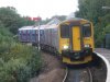
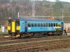
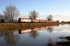
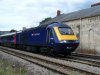
Last edited:
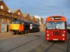
![P1060143 [Desktop Resolution].JPG](/data/attachments/1/1287-a1813d8bea37dc366481ca3e1b4b5770.jpg)
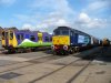
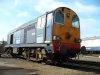
And on the HST's...Smart yet simple...yet brilliant...and even when dirty......yeah I love the first dynamic lines - it's realy 21st century design - hated the barbie though...
emoaconr
Member
I quite liked the colour scheme that went with the logotype of one (hate NXEA scheme).
Northern's is quite nice, its just a shame the livery isn't so good! LondonMidland is very iconic and simple.
Nothing beats the BR logo!
Northern's is quite nice, its just a shame the livery isn't so good! LondonMidland is very iconic and simple.
Nothing beats the BR logo!
Aictos
Established Member
- Joined
- 28 Apr 2009
- Messages
- 10,403
Would have been nice to have seen Dynamic Lines on the 377s, now that would have worth seeing, 
Anyone good enough on paintshop to do a mockup then?
Especially as most of the traction operated by First carries that livery except for a few FSR and the stuff around Wessex which uses the Local Lines version.
Anyone good enough on paintshop to do a mockup then?
Especially as most of the traction operated by First carries that livery except for a few FSR and the stuff around Wessex which uses the Local Lines version.
Aictos
Established Member
- Joined
- 28 Apr 2009
- Messages
- 10,403
^^what's the local lines livery? not sure I seen that before...
It's basically the Dynamic Lines livery but with the 'Dynamic Lines' are replaced by names of local attractions forming the shape of 'Dynamic Lines'.


37401
Established Member
Totally agree with ajax103`s choices, all good  FGW Fag Packet was good
FGW Fag Packet was good 
krus_aragon
Established Member
It's basically the Dynamic Lines livery but with the 'Dynamic Lines' are replaced by names of local attractions forming the shape of 'Dynamic Lines'.
Ooh. I like that picture. Having never been to Bristol, I thought it was Cardiff at first. The "tol" lettering looks identical to the lettering put up by the GWR in Cardiff in the 1930s. Is there similar tiled lettering directing customers to platforms?
Last edited:
Aictos
Established Member
- Joined
- 28 Apr 2009
- Messages
- 10,403
Thanks Guys,
By the way, is anyone willing to take on my challenge?
By the way, is anyone willing to take on my challenge?

Daimler
Member
Would have been nice to have seen Dynamic Lines on the 377s, now that would have worth seeing,
What is it that the 377s have, then?
I thought it was 'dynamic lines' when I saw it :? ...

Fincra5
Established Member
- Joined
- 6 Jun 2009
- Messages
- 2,636
What is it that the 377s have, then?
I thought it was 'dynamic lines' when I saw it :? ...
Most of the 377's are unbranded at the moment, which i quite like. They will be done in First Capital Connect livery like the 319s.
The best 3 liveries (in my opinion) are
London Midland, Southern and South West Trains (SWT express livery not suburban or metro).
Attachments
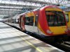
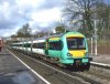
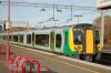
Most of the 377's are unbranded at the moment, which i quite like. They will be done in First Capital Connect livery like the 319s.
The best 3 liveries (in my opinion) are
London Midland, Southern and South West Trains (SWT express livery not suburban or metro).
I agree with you on the south west trains simply because it's colourful and eye catching and London Midland, simple and stylish!
I agree with you on the south west trains simply because it's colourful and eye catching and London Midland, simple and stylish!
I echo your words. Those are my two favourite liveries also.
Thanks Guys,
By the way, is anyone willing to take on my challenge?
Dont worry...already done that a while ago...
shall reveal it soon...aswell as a massive load of other reliveries etc...
And as for the FGW local Lines, if you want to see pretty much how smart it is...heres some fairly close up side shots - http://ukrailwaypics.fotopic.net/c950488.html
rich
Last edited:
Thanks Guys,
By the way, is anyone willing to take on my challenge?
Like This ?
And whilst i was on the theme...How about these?...
What If the Midland Mainline was fully electrified? Or what if any of those TOC's took the 442's on...And something for London Midland!!! Need 444's, Dont need more 350's!
Reminds me i really must update my fotopic, becasue i pretty much have lots more in store, and credit to the original artist on wikipedia - i have reliveried these ones...others i have made pretty much myself...
rich
***Edit*** sorry for the drastily reduced size...i shall definatly restart work on my fotopic and put them up on there...
Attachments
-
 First_Dynamic Lines_Class_377_Diagram.jpg21.1 KB · Views: 38
 -
 MML_Class_375_Diagram_5_Car.jpg18.3 KB · Views: 28
 -
 MML_Class_377_Diagram.jpg22.7 KB · Views: 22
 -
 Class_442_First_.jpg17.9 KB · Views: 29
 -
 Class_442_South_Eastern.jpg17 KB · Views: 27
 -
 Class_442_Southeastern.jpg17.6 KB · Views: 27
 -
 Class_442_Southern_442.2.jpg17.4 KB · Views: 25
 -
 Class_442_Southern_442.jpg17.7 KB · Views: 25
 -
 Class_444_London_Midland_Diagram.jpg18.3 KB · Views: 24
Last edited:
Aictos
Established Member
- Joined
- 28 Apr 2009
- Messages
- 10,403
What is it that the 377s have, then?
I thought it was 'dynamic lines' when I saw it :? ...
No, they're being reliveried with the Capital Lines livery as do all other FCC rolling stock.
Like This ?
And whilst i was on the theme...How about these?...
What If the Midland Mainline was fully electrified? Or what if any of those TOC's took the 442's on...And something for London Midland!!! Need 444's, Dont need more 350's!
Reminds me i really must update my fotopic, becasue i pretty much have lots more in store, and credit to the original artist on wikipedia - i have reliveried these ones...others i have made pretty much myself...
rich
***Edit*** sorry for the drastily reduced size...i shall definatly restart work on my fotopic and put them up on there...
WOW, I really do like the 377s/442s in Dynamic Lines livery!
Shows what First really ought to have done - how about finishing the FCC stuff as I would like to see how that livery would have looked on the Class 313/317/319/321/365 not to mention our Class 03.
And something for London Midland!!! Need 444's, Dont need more 350's!
Last time I looked, the WCML was electrified with OHL rather than third rail.

In all serious though, I have to agree and it wouldn't be too hard to add pantos to 444s, or have some new '344s' perhaps, especially since some 350s are due to be transferred to FTPE for the Manchester - Glasgow/Edinburgh route once phase 1 of the Liverpool to Manchester electrification is complete.
Daimler
Member
No, they're being reliveried with the Capital Lines livery as do all other FCC rolling stock.
Oh, I see! I had never noticed the difference between that and 'dynamic lines'!
Last time I looked, the WCML was electrified with OHL rather than third rail.
In all serious though, I have to agree and it wouldn't be too hard to add pantos to 444s, or have some new '344s' perhaps, especially since some 350s are due to be transferred to FTPE for the Manchester - Glasgow/Edinburgh route once phase 1 of the Liverpool to Manchester electrification is complete.
Lol i know...just London Midland really could do with a more Express designed unit than a outer suburban for longer distance services...
No, they're being reliveried with the Capital Lines livery as do all other FCC rolling stock.
WOW, I really do like the 377s/442s in Dynamic Lines livery!
Shows what First really ought to have done - how about finishing the FCC stuff as I would like to see how that livery would have looked on the Class 313/317/319/321/365 not to mention our Class 03.
someones keeping me busy...shall see what i can do - but ive got to say i must have done at least 30 odd already...but if you like the Dynamic Lines just like me, Wonder what would happen if First Group took on the potentialy soon to be ex Gat Ex Junipers...

Oh and ive got to say...this is pretty much proberley my favourate looking actually...
And a HST...
and theres more to come alright...or while i think of it...how about something in or around london ?
Or if Virgin took over the semi fast services on the West Coast...
rich
Attachments
-
 Class_43_MK3_First_Great_Western_Barbie.jpg12.5 KB · Views: 26
 -
 Class_43_MK3_First_Great_Western_Dynamic_Lines.jpg12.2 KB · Views: 25
 -
 Class_170_First_Great_Western_Diagram.jpg22.4 KB · Views: 24
 -
 Class_460_Gatwick_Express_First_Group_Diagram4.jpg13.5 KB · Views: 24
 -
 Class_460_Gatwick_Express_First_Group_Diagram2.jpg13.5 KB · Views: 25
 -
 Class_313_New_London_Overground_Diagram.jpg29.2 KB · Views: 25
 -
 Class_313_New_London_Overground_Diagram_v2.jpg30.5 KB · Views: 24
 -
 Tramlink_Bombardier_Flexity_London Overground.jpg36 KB · Views: 28
 -
 DLR_New_Train_London Overground v2.jpg33.7 KB · Views: 27
 -
 Class_395_Virgin.jpg19 KB · Views: 29
Aictos
Established Member
- Joined
- 28 Apr 2009
- Messages
- 10,403
Good work!
I wouldn't mind us taking on some dual voltage 444s together with dual voltage 350s (in 2+2 seating) which means the capability to run 8 or 12 cars as well as 10 car trains or a mix of the two resulting in a 9 car at times.
The only issue I can see, is these units tend to have guards or can they run in DOO mode?
If we did go with Siemens however, we probably would have got the new units on time as well!
Still, apart from keeping you busy I'm looking at a few larger versions for my own collection with 350s/444s joining the collection.
I wouldn't mind us taking on some dual voltage 444s together with dual voltage 350s (in 2+2 seating) which means the capability to run 8 or 12 cars as well as 10 car trains or a mix of the two resulting in a 9 car at times.
The only issue I can see, is these units tend to have guards or can they run in DOO mode?
If we did go with Siemens however, we probably would have got the new units on time as well!
Still, apart from keeping you busy
I'm looking at a few larger versions for my own collection with 350s/444s joining the collection.Electrostar
Member
- Joined
- 18 May 2009
- Messages
- 315
fgwrich: Could you mock up a DLR train in the Tramlink/LO/LU livery but with the turquoise of the DLR logo as the base colour. I'm surprised that the newest units haven't been outshopped in this livery to be honest.
- Status
- Not open for further replies.