Our new ticketing site is now live! Using either this or the original site (both powered by TrainSplit) helps support the running of the forum with every ticket purchase! Find out more and ask any questions/give us feedback in this thread!
Seems to me that the industry's favourite livery must be Brighton & Hove's BH3 livery - cream with red swooping from the rear top down past the rear wheel, then up and over the front wheels - judging by the number who copied it (I think I've counted 4 over the years).
I will make a special mention for Midland Fox. It might not be my favourite and without wishing to sound condescending, it might be difficult for those younger than 45/50 to really appreciate how ground-breaking this was. In a world still dominated by rather staid NBC and PTE liveries (even if the coaching colours were getting more experimental), it was a real departure and as the photo by David Beardmore shows, it suited deckers and minibuses equally.
I began to appreciate the Midland Fox livery when Arriva repainted their 4752 into the said livery. It would still look good today.
I also like the Travel West Midlands livery as seen below: another simple, yet distinctive livery that brings back memories of some videos taken in Birmingham that I used to watch when I was little.
(Photo courtesy of Transport Museum Wythall)
Kinchbus also gets an honourable mention for keeping their simple two-tone livery almost the same for nearly twenty years, yet still keeping it looking up-to-date.
Yes, I liked "beachball", pretty timeless and easy to adapt to "family" liveries by changing the colours but keeping the recognisable shapes. Even the Lakes livery does it quite well by turning the "swoops" into a hill! I didn't see any reason to get rid, really, they could have just refreshed the logo and tweaked with the shapes slightly to make it feel fresh.
The short lived "Fisher Price" livery is in my view awful, while the overall blue looks OK but has a slogan that basically shouts "we caught you out" rather than anything positive (though I think it'd look better if the rear large beachball was an outline as it is on the Cambs Busway green livery). And whoever thought painting premium long distance buses/coaches in school bus yellow was a good idea should be kept well away from livery design in future!
The original Stagecoach logo is quite clever though when you see that the logo can either be the UK and Ireland or a pair of horses on a road - I assume that's intentional but I bet many haven't noticed! It also (I just noticed having Googled it) says SH i.e. Stagecoach Holdings! I wonder who designed it?
(This sort of 1980s multiple meaning logo seems to be making a slight resurgence, e.g. with the West Midlands "diamond" logo which also contains the letters WM)
== Doublepost prevention - post automatically merged: ==
The original Stagecoach logo is quite clever though when you see that the logo can either be the UK and Ireland or a pair of horses on a road - I assume that's intentional but I bet many haven't noticed! It also (I just noticed having Googled it) says SH i.e. Stagecoach Holdings! I wonder who designed it?
It's like one of these weird assessment tests you do... when I looked at it on buses/paperwork back in my days with them, it looked like a chicken to me.. orange bits were combs and wattles (according to Google, that is what they are called) and the white dot - which was Perth HQ - was the eye. I assume done in-house as Stagecoach at that time was still doing everything in-house at Perth/Charlotte St HQ.
The Edinburgh Harlequin livery was to highlight the low-floor vehicles from the step entrance ones in an eye-catching and probably slightly modern twist, which is also why they went back to a more traditional style once they were fully low-floor. Other than being obviously different to the traditional madder & white whilst not moving too far from that traditional colour palette I'm not sure there was a deep source of inspiration.
I tend to quite like the more traditional looks, like Delaine, as long as the application does match and work with the lines of the vehicle it is on. Whatever style it is, the application without regard to the vehicle it is applied to will turn a reasonable livery into a bad one and ubiquity will also pull down an otherwise nice livery which is why the big groups rarely feature (I quite like the latest First Ultraviolet application at a base but not sure the idea of it being everywhere is that appealing).
Historically some of the municipal fleets had liveries which displayed civic pride in the presentation of their vehicles. Birmingham Huddersfield and Salford spring to mind though Halifax was a Favourite
No doubt local bias here but I grew up with East Yorkshire red and later their maroon so have a strong liking of them both, plus their 'old' dark blue colours....this anniversary special bus shows all three on one vehicle.
I also like 'traditional' liveries with history, such as the now defunct Reliance.
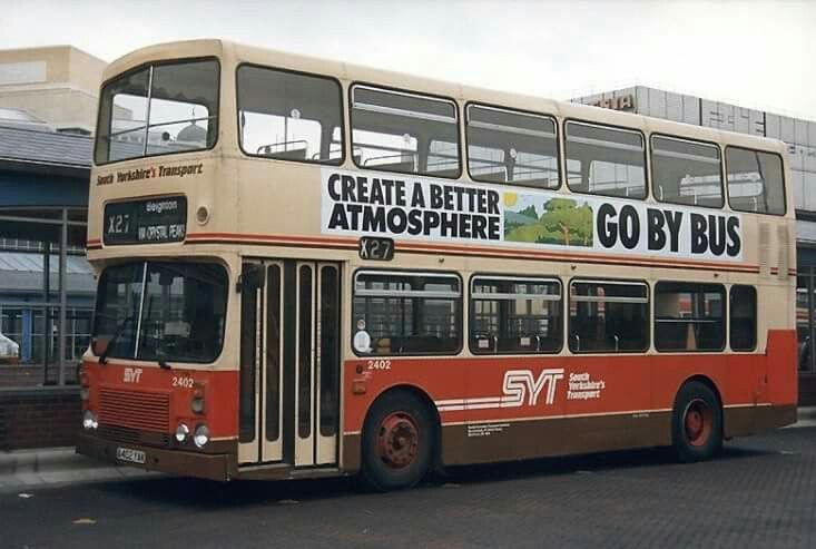
I also always loved seeing the SYT red/brown/cream livery when I visited family, though it's certainly a product of it's time!
Sorry to say I really don't like the modern trend for curvy lines, vinyl over windows or tokenism like pride liveries. I'd rather keep it smart, simple and consistent.
Sorry to say I really don't like the modern trend for curvy lines, vinyl over windows or tokenism like pride liveries. I'd rather keep it smart, simple and consistent.
There has been many images posted of some really good liveries. Not mentioned, AFAIK, so far are some of the many, many route branded liveries. Some are truly horrendous (including TfL's attempts in East London) - despite being introduced around 2020 it looked like something produced during the 80's:
Some attractive examples here, thanks. I also like Reading's smart and multi-coloured approach. It's fine as long as the buses don't start wandering onto other routes!
It was only a one-off, sadly, but I really liked the livery that was applied to Stagecoach's Bluebird's 53334 (SV09EFZ/448GWL) to mark the company's 50th anniversary. It was reminiscent of the livery that the M-type Leopards carried in the 1970s.
Volvo B7R/Plaxton Profile new as SV09EFZ in July 2009. It received this Northern Scottish livery in 2011 and was still looking well here in April 2014. It has recently gained a Stagecoach fleetname on the front following accident damage repair.
We are aware of an issue with emails from the Forum to Microsoft-based email accounts (hotmail/outlook/live.com email addresses). This is being looked into currently, thanks for your patience meanwhile.