• Our new ticketing site is now live! Using either this or the original site (both powered by TrainSplit) helps support the running of the forum with every ticket purchase! Find out more and ask any questions/give us feedback in this thread!

Worst network diagram?

Status
Not open for further replies.

TUC

Established Member
Joined
11 Nov 2010
Messages
5,021
My favourite thing about this map is that Hull is both north and south of York; and that York is both north and south of Hull.

Also that you can make a journey from Warrington to Warrington via Warrington.
Well, York has long been regarded as the South in the North :)
 
Sponsor Post - registered members do not see these adverts; click here to register, or click here to log in
R

RailUK Forums

BeijingDave

Member
Joined
26 Jul 2019
Messages
804
I agree. If you know nothing of the area, could you use it to plan a journey from point A to point B? If the answer is 'yes', it's done its job. Then you get into stuff about how easy that planning is (zig-zag lines vs smooth ones, for example).

Comments about place X being too close to place Y are flawed. Maybe that's 'correct' and other parts are incorrect! The point of a schematic is to show what connects with what.
I think there could be some middle ground.

The London Underground and Beijing Subway map are both pretty effective because they at least get cardinal positions roughly correct. That integrates well with wayfinding in the stations, such as on the tube where stations have platform signs for 'x Line Northbound' and 'Southbound'.
 

Mogz

On Moderation
Joined
20 May 2019
Messages
635
As a regular user of the Borderlands Line (Bidston-Wrexham) I remember in the late 90s/early 2000s finding it rather amusing that the Merseyrail timetable map depicted the Wirral peninsula as pointing up, with the line running vertically, whereas the North Western Trains/ First North Western timetable map depicted the Wirral as pointing sideways, with the line running horizontally.IMG_4359.jpegIMG_4357.jpeg

Of course, this early BR map was much more accurate…

IMG_4360.jpeg
 
Last edited:

blimmo

Member
Joined
30 Jul 2025
Messages
632
Location
West Mids

frediculous

Member
Joined
23 May 2017
Messages
125
This TFL map https://content.tfl.gov.uk/large-print-tube-map.pdf just seems to do too much. Underground, overground and zones. I will not mention the distance between Covent Garden and Leicester Square. I suppose this is just the London equivalent of a tourist tax.
The area around Woolwich is spectacularly bad. The DLR could easily be moved closer to the river, with the labels on the right. That gives enough room to place the DLR & Thameslink Woolwich Arsenals next to each other, put a bend in the Elizabeth line to move Abbey Wood slightly to the right. At the moment the gap between the connected Woolwich Arsenals is enormous.

And don't mention that right angle turn at a station blob at Elephant & Castle, which is one of Beck's golden rules totally ignored
 

Old Yard Dog

Established Member
Joined
21 Aug 2011
Messages
1,823
Metrolink's map really grinds my gears. The East Didsbury branch runs to the south of the Manchester Airport branch but, on the Metrolink map, it is shown as running to the north.

I know why they've done it and it does make the diagram neater, but still.

View attachment 199176

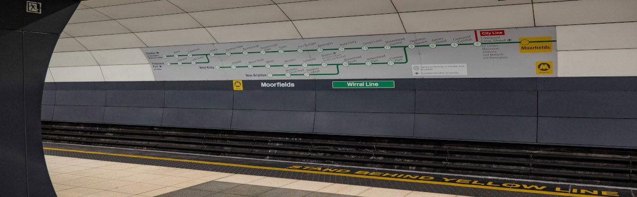
The diagrammatic route maps on the back wall of the Wirral Line platforms at Lime Street and Liverpool Central have also been drawn incorrectly.

They show the Ellesmere Port line branching off to the right of the Chester line at Hooton when, in fact, it branches off to the left.


While the map at Moorfields gets the directions wrong at Hamilton Square and at Birkenhead North.

wirral-line-platfrom-banner-1290-x-400.jpg


At Moorfields trains depart to the left while they depart to the right at the other two stations.
 
Last edited:

zero

Established Member
Joined
3 Apr 2011
Messages
1,590
501a7d8146d975061a24371416386c42169d2b63.png


This is the latest map I've had the displeasure of needing to use
 

plugwash

Established Member
Joined
29 May 2015
Messages
1,988
Interestingly both maps wrongfully suggest they don't provide direct services between Crewe and Stoke (which is the case for Mancs-Bournemouth trains)
Most Manchester to Bournemouth Trains run from Manchester to Stoke via Stockport and Macclesfield, not via Crewe. I don't think ommiting a 1TPD diversionary route retainer is unreasonable.
 

stadler

Established Member
Joined
5 Jun 2023
Messages
3,304
Location
Horsley
This was one of the old maps Southeastern used on the front of the timetable books to show which routes it is for:

SouthEastern tmtbl 11 2009 cropped.jpg

The line to London Victoria and the line to London Charing Cross are the wrong way round to what they should be.
 

styles

Established Member
Joined
7 Dec 2014
Messages
4,617
Location
Gwynedd
This was one of the old maps Southeastern used on the front of the timetable books to show which routes it is for:

View attachment 199452

The line to London Victoria and the line to London Charing Cross are the wrong way round to what they should be.
Is Dover Castle that much of a tourist hotspot?
 

A S Leib

Established Member
Joined
9 Sep 2018
Messages
3,248
Is Dover Castle that much of a tourist hotspot?
In 2023, Visit Britain had it listed as the 19th-most visited paid attraction in South East England, below Canterbury Cathedral and Royal Tunbridge Wells Tourist Information Centre. Maybe marking Harrietsham or Hollingbourne for Leeds should have been done.
 

CarrotPie

On Moderation
Joined
18 Mar 2021
Messages
1,128
Location
In 2023, Visit Britain had it listed as the 19th-most visited paid attraction in South East England, below Canterbury Cathedral and Royal Tunbridge Wells Tourist Information Centre. Maybe marking Harrietsham or Hollingbourne for Leeds should have been done.
"Bearsted for Leeds Castle" was a thing for a time IIRC. Might still be, actually.
 

sprunt

Established Member
Joined
22 Jul 2017
Messages
1,624
I wonder how they're going to deal with future extensions because they could end up walking down the TfL cul-de-sac. Take the Stockport extension, with maybe two or three intermediate stations, that could a squeeze.

If necessary I suspect they'd just redesign the whole map to fit it in - they've never been unduly concerned about maintaining the history of the layout as TfL have been (admittedly with less history to maintain than TfL, if they did the radical redesign they need to I suspect the complaints would be off the scale).

I will not mention the distance between Covent Garden and Leicester Square. I suppose this is just the London equivalent of a tourist tax.
I'm not sure what else they could do there - if they moved the station along the line segment to be closer to Leicester Square on the map it could equally give the incorrect impression that it's worth making a journey from Covent Garden to Holborn, and coud look cramped. I think this kind of thing will always be unavoidable on diagrams when you have stations so close together in central areas.
 

voyagerdude220

Established Member
Joined
13 Oct 2005
Messages
4,248
I notice that Weston super Mare isn't on the XC Network Map referred to by the OP, but is however included in the map referred to by Styles in post 39.
 

vlad

Member
Joined
13 May 2018
Messages
794
As a regular user of the Borderlands Line (Bidston-Wrexham) I remember in the late 90s/early 2000s finding it rather amusing that the Merseyrail timetable map depicted the Wirral peninsula as pointing up, with the line running vertically, whereas the North Western Trains/ First North Western timetable map depicted the Wirral as pointing sideways, with the line running horizontally.View attachment 199366

On a similar subject, note how far away Warrington BQ and Warrington Central are (and also note where the direct line between Liverpool and Runcorn goes).

Regarding the FNW map, I thought it worked well to fit the stations in the space allowed. Then FNW started serving London so the entire map was shrunk a bit and the stations south of Crewe included giving a lot of white space. I can't find a copy of this online but it did look weird in my opinion.
 

stevieinselby

Established Member
Joined
6 Jan 2013
Messages
1,663
Location
Selby
The worst is the new "interactive map" with childish text that attempts to make a tube map at every scale and shows more stations as you zoom. I find it loses any context and the animations are a diatraction, though I concede it's a smart idea.

https://railmap.nationalrail.co.uk/#/mapview
I like the idea, but the implementation is dreadful:
  • Really weird selection of which stations get shown at each zoom level
  • Far too many fiddly lines trying to be geographically accurate
  • Where there are parallel lines, there is often too little colour difference between them and one slides behind the other as you zoom out making it hard-to-impossible to see what colours are there.
 

Gonzoiku

Member
Joined
17 Jul 2016
Messages
294
Obviously these schematics are simplifications, but I thought it was perhaps a bit off having Aberdeen as far 'west' as Penzance.
Yeah, everybody knows that Penzance is west of Stornoway.

Not quite, but it's close!

GZ
 

Helvellyn

Established Member
Joined
28 Aug 2009
Messages
2,567
I find the current Network Rail route diagram to be an abomination. Schematic maps work well for metros and local extracts but not for displaying the whole country with the geography distorted (as below).

A great step backward from the map that used to accompany the National Rail Timetable until it ceased publication.
View attachment 199104
Yes, i never knew why the old BR Passenger Network Map needed ditching. It felt like change by NRE for the sake of it (I also personally find Project Mapping a little smug on their website).

The joy of the old BR map was the schematic diagrams for major urban areas. A nice mix of those on the back of the geographical representative map.

The other operator map that worked well was final incarnation of the InterCity schematic map, The Routes of Britain. A large plastic version was fixed in the vestibule of every InterCity coach. I wonder how many thousands just got skipped during those initial privatisation refurbishments.

1772996070096.jpeg
 

Mcr Warrior

Veteran Member
Joined
8 Jan 2009
Messages
17,155
The other operator map that worked well was final incarnation of the InterCity schematic map, The Routes of Britain.
Not a bad map that. Noted, however, that Manchester Victoria wasn't included / didn't rate a mention, and also that the 'direct' line for Eastbourne seems to branch off just after Gatwick Airport!
 

zwk500

Veteran Member
Joined
20 Jan 2020
Messages
18,401
Location
Northampton
and also that the 'direct' line for Eastbourne seems to branch off just after Gatwick Airport!
Not inaccurate, though, at the resolution of that map. Slightly bigger gripe that Eastbourne is shown as the junction for the lines from Gatwick and Brighton, instead of Lewes!
However, arguably the omission of Newhaven completely despite being a Sealink port is worse than either of those errors.
 

Merle Haggard

Established Member
Joined
20 Oct 2019
Messages
3,851
Location
Northampton
There was also a GNER map which seemed to be intended as a successor to the Inter City map (though obviously showing only East Coast routes) and also fitted in vestibules. They were the same dimensions (I think) making replacement simple.

Virgin West Coast had theirs, too, but was perhaps not so stylish..

The Inter City map sometimes crops up at 'railwayana' swap meets and auctions - I bought one at Quorn for about £50. The material seems pretty rigid and durable, some laminated combination of board and plastic. Acceptable to hang on your hallway wall, in my opinion.
 

Retorus

Member
Joined
30 Mar 2012
Messages
340
Yes, i never knew why the old BR Passenger Network Map needed ditching. It felt like change by NRE for the sake of it (I also personally find Project Mapping a little smug on their website).

The joy of the old BR map was the schematic diagrams for major urban areas. A nice mix of those on the back of the geographical representative map.

The other operator map that worked well was final incarnation of the InterCity schematic map, The Routes of Britain. A large plastic version was fixed in the vestibule of every InterCity coach. I wonder how many thousands just got skipped during those initial privatisation refurbishments.

View attachment 199830
God that takes me back. Remember staring at it in wonder as a child.
 
Status
Not open for further replies.

Top