Hey folks,
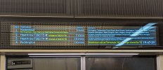
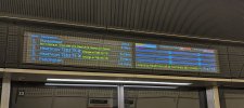
Spotted these two different layouts on the Platform Edge Information Screens at Liverpool St. today. Only on the screens closest to the Liverpool St end of the platform and not at Farringdon at all so assuming it's an experiment?
One shows a written list similar to what you'd see on a National Rail info screen and the other shows the usual line diagram but for all three upcoming departures instead of just the next one.
On the diagrams the stations the train won't be calling at were marked with a red X which shows much clearer than the white strike out through the station name currently used.
Does anyone know anything about it?
Spotted these two different layouts on the Platform Edge Information Screens at Liverpool St. today. Only on the screens closest to the Liverpool St end of the platform and not at Farringdon at all so assuming it's an experiment?
One shows a written list similar to what you'd see on a National Rail info screen and the other shows the usual line diagram but for all three upcoming departures instead of just the next one.
On the diagrams the stations the train won't be calling at were marked with a red X which shows much clearer than the white strike out through the station name currently used.
Does anyone know anything about it?