61653 HTAFC
Veteran Member
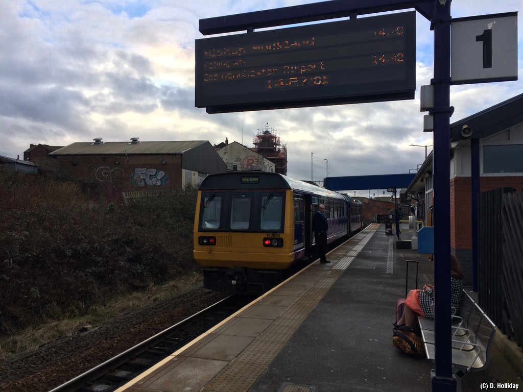
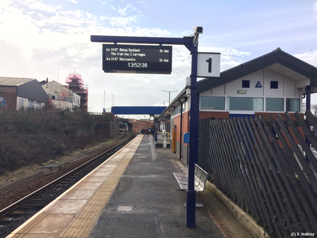
The new white LED PIS screens at Huddersfield have a redundant box on the left indicating the platform number, as a result only list the next 2 services rather than the next 3 as seen in the old ones. A backwards step imo. 

Whilst Huddersfield is a TPE station rather than Northern, I'll not bother starting a new thread for one query:
The new white LED PIS screens at Huddersfield have a redundant box on the left indicating the platform number, as a result only list the next 2 services rather than the next 3 as seen in the old ones. A backwards step imo.
I thought the old screens only had one line at the bottom to show subsequent services which alternate between showing the 2nd and 3rd service? Do the new screens not work like this?Whilst Huddersfield is a TPE station rather than Northern, I'll not bother starting a new thread for one query:
The new white LED PIS screens at Huddersfield have a redundant box on the left indicating the platform number, as a result only list the next 2 services rather than the next 3 as seen in the old ones. A backwards step imo.
I thought the old screens only had one line at the bottom to show subsequent services which alternate between showing the 2nd and 3rd service? Do the new screens not work like this?

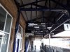
Can you still get into the West Riding pub from the platform at Dewsbury, or is it locked now?The new displays at HUD and DEW are far harder to read from a distance than the previous orange ones because the font is so much smaller.
I had a look at HUD this evening - the bottom row was scrolling 2nd and 3rd (when it wasn't showing info about the timetable changes). Only P4 had the platform displayed, which makes sense, as it's often subdivided into two platforms.
Attached photo is of one of the Dewsbury screens. View attachment 46877
^ Related to that photo. What's the point of ticket barriers being installed if they are left open in the evening peak?

The new displays at HUD and DEW are far harder to read from a distance than the previous orange ones because the font is so much smaller.
I had a look at HUD this evening - the bottom row was scrolling 2nd and 3rd (when it wasn't showing info about the timetable changes). Only P4 had the platform displayed, which makes sense, as it's often subdivided into two platforms.
Attached photo is of one of the Dewsbury screens. View attachment 46877
The platform door is still open.Can you still get into the West Riding pub from the platform at Dewsbury, or is it locked now?


The formation always seems to be (in my own observations!) C - B - A at the moment. Hopefully there's something in the data feed that will allow for correct formation display at some point in the future which would be very useful for those with bikes or using wheelchairs.Formation diagram a very good thing
Small wins though
This is one of the new screens at Thornaby.
And at Middlesbrough.

Both the old one & new one for comparison. New screen is certainly a lot less wide & perhaps slightly less height?Are the new 3 liners smaller than the old ones?
And at Middlesbrough.
Formation diagram a very good thing - we're catching up Germany...only about 20 years later. Shame it isn't a nice little picture of a train, though, and it doesn't seem to clearly indicate the front with an arrow, picture of a cab or something. Would also be nice to have platform zones marked along it.
Small wins though
I understand even members of the station staff aren't particularly happy with the extremities of the screens. They seemed to imply that the screens are positioned well for the guards on class 185 trains ready for dispatch, but useless as you say for passengers.Ah now I'm little bit annoyed by what they've done at Middlesbrough! That summary of departures screen is located where the old orange LED screens were and that location is ideal as it's basically in the middle of the area where people wait to board trains on the platform so it's right next to passengers who are waiting.
When they took the orange ones out they put in those panels with a summary of departures and then added two white LED next train indicators but then put them at the far ends of the platform miles away from where anyone actually waits! Meaning that you're constantly squinting either at the summary screen which is next to you but the writing is small or at the next train indicators which have larger writing but are miles away!
I must say that, despite the criticism of placement, I do like the new screens an awful lot so I'm pleased that they've been put in. Middlesbrough has also gained a proper set of screens in the concourse area including a summary of arrivals, departures and four screens showing the next set of departures in detail. Very welcome improvement. Just as shame they put the screens on the platform in the wrong place.
CIS-related, but there is a new message onboard the 185's (maybe the 350's) about CCTV, it now incorporates everyone's favourite 'If you see it, say it, and we'll sort it' message - this was noted aboard 1B87 on Wednesday.


I was impressed by the new screens at Middlesbrough. All the information you could possibly want.
Platform 1 still has an old screen.There's also a bank of A-Z departure screens in Huddersfield that's located on the opposite wall from the older departure board. Its only platform eight that still has the original LED departure screens, the other platforms have the new white ones.


These are the new screens on the concourse at Huddersfield.