

Flange Squeal
Established Member
- Joined
- 17 Jul 2012
- Messages
- 1,856
The Shearings holiday brand is getting a new look from 19th December. Can’t help but think it looks a bit ‘Megabus-sy’ to me, or maybe that’s the intention with it said to be “a complete change in tone” for the brand with “more casual brochure language” to appeal to a younger market. I guess the main Leger identity caters for the more established higher quality offering?
Source: https://www.route-one.net/news/new-coach-livery-forms-part-of-shearings-rebrand-by-leger/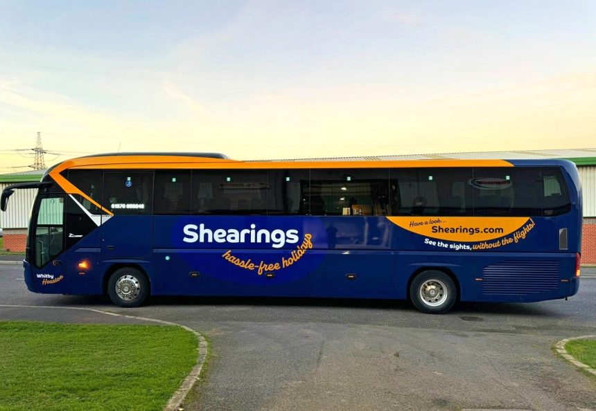
Leger Shearings Group has announced a rebrand of the Shearings identity. That work includes a new livery for coaches used on Shearings work and a repositioning of the customer proposition.
The blue and yellow anchor colours are retained on vehicles, albeit with a deeper tone of the former. An early coach to be treated is a Neoplan Tourliner operated by Leger Shearings Group partner Unicorn Travel of Wrexham. It is christened Whitby Houston.
Leger purchased the Shearings brand and assets in 2020. The rebrand will come into force from 19 December and is described as holistically representing “a complete change in tone” for Shearings. More casual brochure language and changes to its layout and photography and writing style are further components of the overhaul.
A “more meaningful” logo also comes with the workover. Leger Holidays CEO Liam Race says that the business purposely retained the Shearings brand as-is from acquisition to recognise its customer base’s loyalty. “We didn’t want to alienate any customers with major changes too soon,” he adds.
Nevertheless, the group has been researching travellers’ opinions in the background. Those have helped to shape the new brand, Mr Race continues. “We found that the edges were becoming blurred between coach holiday companies. We were all looking the same; we wanted Shearings to stand out and be the first choice,” he explains.
One of the first coaches to gain the new Shearings livery is this Neoplan Tourliner with Unicorn Travel of Wrexham
Customer research extended to neuromarketing technology and electroencephalography (EEG), which records electrical activity of the brain.
Participants in that were invited to Leger’s head office in Rotherham to undertake the EEG study. 62 pieces of content were tested. Actual reactions to those were measured across attention, engagement, excitement, interest, relaxation, and stress.
Anxiety around travelling was identified as a particular issue. Mitigating that is thus key to the new tagline, carried on coaches, of hassle-free holidays. It is also leveraged in brochure wording. A TV and radio campaign will be mounted as part of promotion of the new brand for Shearings.

