

-
Our new ticketing site is now live! Using either this or the original site (both powered by TrainSplit) helps support the running of the forum with every ticket purchase! Find out more and ask any questions/give us feedback in this thread!
You are using an out of date browser. It may not display this or other websites correctly.
You should upgrade or use an alternative browser.
You should upgrade or use an alternative browser.
RailUK banners
- Thread starter P156KWJ
- Start date
- Status
- Not open for further replies.


Sponsor Post - registered members do not see these adverts; click here to register, or click here to log in
R
RailUK Forums
P156KWJ
Established Member
I like the second one, but the text needs to stand out a bit more IMO.
agreed. I don't like the first one very much now! Even though it's mine!
devon_metro
Established Member
Pictures aren't exactly brilliant quality. OOI what are you using to edit them as it looks like something that was made in paint 

D306
Established Member
I can send some DRS 20s to you if you want, from the railtour yesterday
P156KWJ
Established Member
Pictures aren't exactly brilliant quality. OOI what are you using to edit them as it looks like something that was made in paint
some are 35mm prints that were put on to CD from Truprint, I used to use my Nikon FM2 SLR a lot!
some are 35mm prints that were put on to CD from Truprint, I used to use my Nikon FM2 SLR a lot!
He asked how you're editing them, not what you took them with.

P156KWJ
Established Member
He asked how you're editing them, not what you took them with.
thank you for telling me what I should post :roll::x
I use a combo of Microsoft Picture manager (to crop them accurately), Adobe Photoshop (to do any other stuff), and occasionally paint although that's rubbish so I only use it at last resort
P156KWJ
Established Member
Anyway, I like the new banner uploads thus far. I'm using the XC Voyager ATM.
same, I like the FL shed and the FGW *ahem* MTU HST one

christopher
Member
P156KWJ
Established Member
they are the wrong size IIRC
D306
Established Member



devon_metro
Established Member
Should be using Verdana font. (at least thats what i think they use)
D306
Established Member
Should be using Verdana font. (at least thats what i think they use)
I wasn't to sure if it was Arial or Calibri, but thanks for that one. I'll change it around later
P156KWJ
Established Member
I usually use either MS san-serif or Tahoma. I like the 2nd one Parsonz, can see halfords too

P156KWJ
Established Member
New Tickets theme added and this is suitable for resolutions up to 1920px wide.
mojo, you have an email
D306
Established Member
Here's some I just made, using paint to do the cropping, and photoscape to add the text.


Comments?
Comments?

nath9425
Member
I like the 20 one.
Many thanks to Mojo for putting my Freightliner 66 one up.
Many thanks to Mojo for putting my Freightliner 66 one up.

devon_metro
Established Member
Good to see a nice sharp, not grainy shot for a change 

P156KWJ
Established Member
D306
Established Member
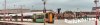
Southern 377 banner for 800x600 (with better text this time)
that wavy text doesn't look to professional

D306
Established Member
Just another two from me


P156KWJ
Established Member
that wavy text doesn't look to professional
oh so your bog standard straight text looks much more professional. people tell me to make the text better, then tell me off for doing that :? can't seem to please certain individuals at the moment............
- Status
- Not open for further replies.