
• Our new ticketing site is now live! Using either this or the original site (both powered by TrainSplit) helps support the running of the forum with every ticket purchase! Find out more and ask any questions/give us feedback in this thread!

NS destination boards

Status
Not open for further replies.

citycat

Member
Joined
18 Dec 2013
Messages
330
Location
Woerden, The Netherlands
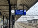
I probably missed it in the news at the time, but can one of our Dutch correspondents please enlighten me as to why the NS changed the destination boards from a white background to a blue background? Google doesn’t throw up any answers.

I suspect it’s to do with some disability ruling, but it would be nice to know the definitive answer. Thanks.
 

Attachments

  • IMG_8546.jpeg
    IMG_8546.jpeg
    2.8 MB · Views: 108
Sponsor Post - registered members do not see these adverts; click here to register, or click here to log in
R

RailUK Forums

nilvaj395

Member
Joined
11 Oct 2025
Messages
217
Location
Not Dutch, but I believe it is due to both easier legibility for people with visual impairments and a 5% energy saving.

https://nos.nl/artikel/2583640-ns-schermen-op-stations-vanaf-oktober-in-donkere-modus
According to NS, the screens are thus more visible to people with visual impairments. "For example, research shows that the new signs are more readable for color-blind people," a spokesman told news agency ANP. Some foreign train carriers already use a dark mode for that reason.
In addition, the screens consume less power in a dark mode. The new layout saves 5 percent energy compared to the current situation, the spokesperson said. The NS has a total of 3600 screens hanging at stations.
 
Last edited by a moderator:

scragend

Member
Joined
27 Feb 2016
Messages
209
I don't know the reason for it - although the legibility and energy saving reasons are both plausible - but I like the look of it. Plus it's consistent with the station name boards, which are also white on blue.

One thought I did have is what colour text are they using for delay minutes/messages? Previously it was red, but red on blue wouldn't really work. This I mean:

stock-photo-utrecht-holland-ns-public-transport-train-systems-grind-to-a-halt-as-storm-poly-hits-2327135855.jpg
 

nilvaj395

Member
Joined
11 Oct 2025
Messages
217
Location
I don't know the reason for it - although the legibility and energy saving reasons are both plausible - but I like the look of it. Plus it's consistent with the station name boards, which are also white on blue.

One thought I did have is what colour text are they using for delay minutes/messages? Previously it was red, but red on blue wouldn't really work. This I mean:

stock-photo-utrecht-holland-ns-public-transport-train-systems-grind-to-a-halt-as-storm-poly-hits-2327135855.jpg
I believe they are still using red for the delay information. The screens are not really in a 'blue' mode in terms of the background; they are supposed to be black, but because they are LCD's they can show up looking blue from time to time.
 

citycat

Member
Joined
18 Dec 2013
Messages
330
Location
Woerden, The Netherlands
It’s definitely a shade of blue whenever I see the monitors. I must admit though, I haven’t seen any delay minutes shown on my rare travels on the NS so not sure if they still use red. The link kindly provided by nilvaj395 states they will use yellow.

Thanks for some answers.
 
Last edited:

nilvaj395

Member
Joined
11 Oct 2025
Messages
217
Location
I found this image on Google with a delay being shown:
normal_20251107_16065328129.jpg

It seems to be not as vivid a red as it used to be, maybe slightly brighter to make it more legible.
 

dutchflyer

Established Member
Joined
17 Oct 2013
Messages
1,550
Its since early/mid october and at that time was even ´big´ news-likely as there was hardly anything else worth reporting then- still being busy with forming a new govmt after elections. Am dutch-but far from home since 16 days now. niivaj above has the right answer that was given then- and it was a decision by NS themselves- and also applies to the stops where they do not stop, but only ´other companies´. That ´red´ in the last picture is oranje=orange. IF among you are people really interested that much in such trivia: a site like ´treinreiziger´ has every day a few items on what may be considered news on the trains+railways in Nederland- the last weeks nearly half of it about longer reroutes/delays/cancellations due to whatever work needs to be done. Followed by a discussion panel. NS itself had a ´community/forum´ but stopped that early this year-it was very similar to what EU/INterrail still has - after all that scheme is since many years administrated by NS - as a split-off of it, sitting in one of their office-buildings in Utrecht
 

nilvaj395

Member
Joined
11 Oct 2025
Messages
217
Location
It looks to be yellow which is what they stated they would be using in your link.
You are correct, I should have read the whole article myself :D. I saw some other photos, which show it very clearly in a yellow (or oranje/orange as @dutchflyer said).

I personally would much prefer it if it were actually black instead of a dark blue, it seems like that would be more logical when it comes to maximising the legibility and maximising the power saving, but you could say having a bit of blue makes it not entirely soulless looking. It seems to perform better on much more modern screens than some of the ones installed across the NS network which if I remember are sometimes very old.

IF among you are people really interested that much in such trivia: a site like ´treinreiziger´ has every day a few items on what may be considered news on the trains+railways in Nederland- the last weeks nearly half of it about longer reroutes/delays/cancellations due to whatever work needs to be done. Followed by a discussion panel. NS itself had a ´community/forum´ but stopped that early this year-it was very similar to what EU/INterrail still has - after all that scheme is since many years administrated by NS - as a split-off of it, sitting in one of their office-buildings in Utrecht
Thank you for that suggestion, will look into it!
 

rvdborgt

Established Member
Joined
24 Feb 2022
Messages
2,473
Location
Leuven
NS itself had a ´community/forum´ but stopped that early this year-it was very similar to what EU/INterrail still has - after all that scheme is since many years administrated by NS
It is not.
- as a split-off of it, sitting in one of their office-buildings in Utrecht
This may have been the case at some point, but neither Eurail's current office nor their previous office is in an NS building.
 

AdamWW

Established Member
Joined
6 Nov 2012
Messages
5,900
Not Dutch, but I believe it is due to both easier legibility for people with visual impairments and a 5% energy saving.

Interesting. I know someone who finds light on dark signs harder to read than dark on light.
 
Status
Not open for further replies.

Top