
hexagon789
Veteran Member
The intention, as I posted above, is that the version with seconds displayed is installed on platforms.I note that shows a version with seconds. To me that's far more useful and it actually looks better.

The intention, as I posted above, is that the version with seconds displayed is installed on platforms.I note that shows a version with seconds. To me that's far more useful and it actually looks better.

Railways have been doing branding and station clock design for a VERY long time. A daresay in 1953 there was some Swiss naysayer complaining about the "stupid red blob" on the second hand. Moan all you like - I think it's great, a really good piece of design.A load of old bollocks in my view. A pathetic PR excercise.
Just make the trains run in time. You don't need a w*nk of a clock to do that.
Question: How much did they pay to some shyster for this?
Totally agree. Pooh and fiddlesticks to people who don't like it. This is a very good piece of design and I expect it to be around for a long time.Railways have been doing branding and station clock design for a VERY long time. A daresay in 1953 there was some Swiss naysayer complaining about the "stupid red blob" on the second hand. Moan all you like - I think it's great, a really good piece of design.
15s on London Underground alsoThe Swiss working timetable uses 15 second intervals I believe, 30s in the UK.
Railways have been doing branding and station clock design for a VERY long time. A daresay in 1953 there was some Swiss naysayer complaining about the "stupid red blob" on the second hand. Moan all you like - I think it's great, a really good piece of design.
Totally agree. Folk will moan about anything these days. Costs NOTHING to put this up on a customer Info Screen. It's CODE! And if stations want a physical version they'll pay for it. It's not rocket science.Totally agree. Pooh and fiddlesticks to people who don't like it. This is a very good piece of design and I expect it to be around for a long time.
Having looked at it a bit longer, I think the design works really well with a static logo at the top, and I think the break of the logo to only appear at 30 and 60 might be a bit of a detraction. Otherwise it looks really good.Railways have been doing branding and station clock design for a VERY long time. A daresay in 1953 there was some Swiss naysayer complaining about the "stupid red blob" on the second hand. Moan all you like - I think it's great, a really good piece of design.

If platform versions are going to display seconds as well, then I have no issue with the design at all - as the revolving split double arrow then just becomes a feature of interest.Railways have been doing branding and station clock design for a VERY long time. A daresay in 1953 there was some Swiss naysayer complaining about the "stupid red blob" on the second hand. Moan all you like - I think it's great, a really good piece of design.
If platform versions are going to display seconds as well, then I have no issue with the design at all - as the revolving split double arrow then just becomes a feature of interest.
I think we will need to wait to see how the Seconds/not seconds display is used in wider deployment.I think not showing the seconds numerically is pathetic. The design itself is clear and excellent, but the stupidity of the seconds' depiction is staggering. As others have said, style over function yet again.
Well, it has been released in a fanfare of publicity, so I would have expected widespread critique! It is interesting in that it appears to reveal a division between those who believe seconds are important on the railway and those who don't. I find it worrying (but depressingly predictable) that the designers were seemingly not told by senior management that seconds ARE vital. The design style is excellent, but fundamentally flawed by the seconds' depiction.Honestly, i've never known so much naysaying over a clock before, it's what I imagine a Reform convension to be likeIt's also quite interesting how many folk read the time as 13:30:56, i've never had anyone tell me the time so intrinsically...
GBR doesn't exist yet, let alone have a "brand" and that style of clock in red, white and blue would most likely be unreadable...
Personally, it's functional, stylish and a nice change from having just a boggo "clock"... I want one!
From the brand guidelines posted above, there IS a seconds version:Well, it has been released in a fanfare of publicity, so I would have expected widespread critique! It is interesting in that it appears to reveal a division between those who believe seconds are important on the railway and those who don't. I find it worrying (but depressingly predictable) that the designers were seemingly not told by senior management that seconds ARE vital. The design style is excellent, but fundamentally flawed by the seconds' depiction.

However, the London Bridge clock is, as I understand it, inside the station and should therefore have the seconds displayed sensibly. I am happy to wait for further developments to emerge, but my gut tells me that, as with almost every other design/marketing 'improvement' on the railways of late, it will be lacking. I hope I am wrong.I think we will need to wait to see how the Seconds/not seconds display is used in wider deployment.
If I am outside the station, I would prefer the minutes to be ever so slightly larger because the individual seconds will not be relevant. Similarly for central clocks on the concourse as the video shows, Seconds aren't really needed. However I think the seconds should be shown at entrances to and on Platforms because if it's actually at 18.05.53 you might get caught thinking you've got a minute more than you think just seeing 18.05
I think the central position of the clock in the concourse means that the seconds aren't as vital there. However the seconds absolutely *should* be placed at the lifts and escalators up to each platformHowever, the London Bridge clock is, as I understand it, inside the station and should therefore have the seconds displayed sensibly.
I can't disagree with you. How long did it take for the "trial" at Euston of the rotated departure boards to get reverted?I am happy to wait for further developments to emerge, but my gut tells me that, as with almost every other design/marketing 'improvement' on the railways of late, it will be lacking. I hope I am wrong.
Having looked at it a bit longer, I think the design works really well with a static logo at the top, and I think the break of the logo to only appear at 30 and 60 might be a bit of a detraction. Otherwise it looks really good.
If it was tweaked so that the Double-arrow stayed static at the top but a single arrow on the outer ring indicated the seconds I think it would be a much clearer statement of the branding and you could incorporate the swiss style 'jump' to the top of the minute.
Part of me misses the older style dot-matrix LED boards where the numbers rotated around the vertical axis as they changed, but that's just because I grew up with them at my local station. (these ones, or something very similar:)
I think people will get used to estimating the seconds by looking at the position of the arrow circulating clockwise. It's also less frantic than seconds ticking over. Even the speed of the arrows will give an idea of whether you have enough time to board a train. Having seconds on a clock when you're inside a large concourse like London Bridge would only encourage people to run. You don't want people doing that in a crowd with steps, etc. It's a safety issue.However, the London Bridge clock is, as I understand it, inside the station and should therefore have the seconds displayed sensibly. I am happy to wait for further developments to emerge, but my gut tells me that, as with almost every other design/marketing 'improvement' on the railways of late, it will be lacking. I hope I am wrong.
EDIT - just seen your further post - good (-ish), but I share you thoughts. I don't see why all digital clocks these days don't show seconds. Those who don't care about them can ignore them, but the railway's mantra on timekeeping in privatisation had been "every second counts", especially when trying to justify failing to hold trains for a few seconds for connections!
I like it too, simple, smart looking and effective. I'd like to have a version for smart watches too, although I'd end up missing my train watching the logos spin around!Excellent. I love it. I want the app on my phone.
Let's hope we get some installed in Leeds asap to admire.
The inner arrow literally unwinds time!I think it looks awesome. Forward looking...not backward. Futuristic.

It does show seconds. The logo is effectively a sweep second hand. And analogue is easier to mentally process than digital.I think we will need to wait to see how the Seconds/not seconds display is used in wider deployment.
If I am outside the station, I would prefer the minutes to be ever so slightly larger because the individual seconds will not be relevant. Similarly for central clocks on the concourse as the video shows, Seconds aren't really needed. However I think the seconds should be shown at entrances to and on Platforms because if it's actually at 18.05.53 you might get caught thinking you've got a minute more than you think just seeing 18.05
It does. The analogue display shows very clearly what fraction of the current minute you have left.From the brand guidelines posted above, there IS a seconds version:
Although the branding description "it should only be used when replacing a clock that currently features and should contain seconds" is concerning. I would prefer it to be more clearly stated that platform clocks (in particular) should contain seconds.
It is but I don't think it'll be wonderfully clear at distance when trying to also find your train and not trip up over anybody in a crowd.It does show seconds. The logo is effectively a sweep second hand.
But a mix of them is a nightmare.And analogue is easier to mentally process than digital.
Not so - plenty of situations where a comnbibnation is betterBut a mix of them is a nightmare.
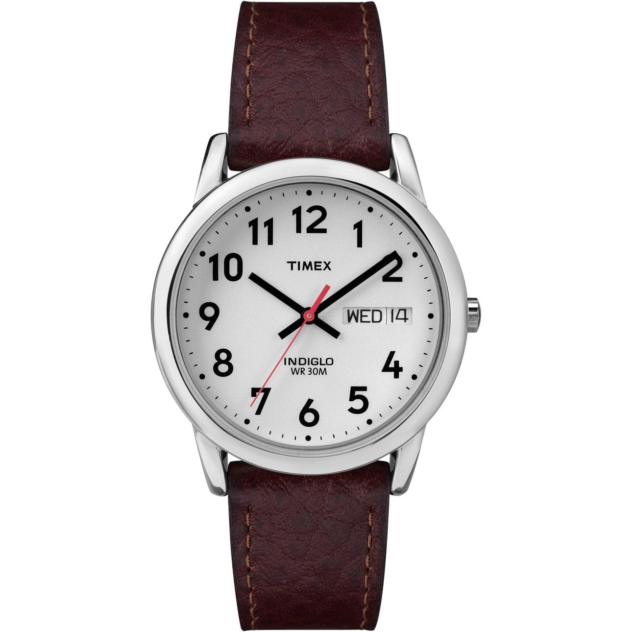
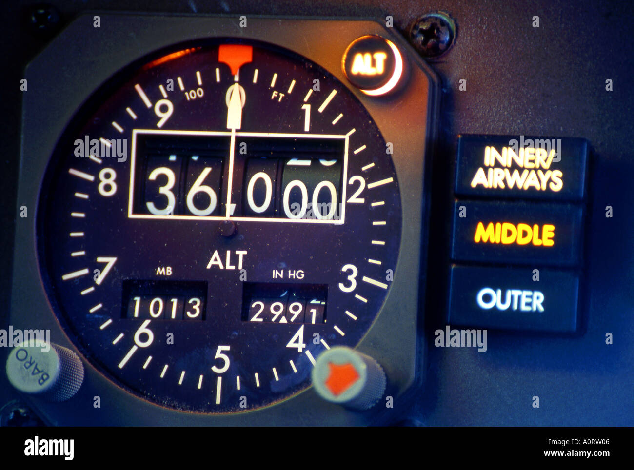
Certainly in the case of the watch, the date is effectively completely different information which you largely need for different contexts. The date is a relatively constant value which you might look at as a reminder, for when you are writing cheques or the heading of a letter. The time (including seconds) is a dynamic value, and you are unlikely to want to know the seconds without the minutes or vice-versa.Not so - plenty of situations where a comnbibnation is better
(analogue watch with date and day displayed as text)
(Altimeter with thousands of feet shown digitally and hundred in analogue. Gives a clear indication both of absolute height (digital) and how fast it is changing (analogue)
Ina clock, of course, the crucial information of the swecond hand is not hiow fast it is moving but how close to the top you are. And a moving symbol is easier to make out at a distace than the difference between, say, a 3 and a 5.
Excellent, good work. One with actual seconds would be good too!I plan to emulate it for Wear OS smartwatches, just for the sake of beating a bunch of consultants to their own game...
I can agree with that second preference!Your comments are absolutely correct and valid. It isn't how I would choose to do it - my preference* would be for a single dot to be added every second, like the SNCF clock shown in post #14.
But we have to play the hand we are dealt, rather than the hand we wanted - my point is merely that people will get the hang of it.
* - Second preference actually - my first preference would be to simply license the SBB clock and stick a double arrow on it
I quite like it. Modern, simple, does the job of getting the BR logo in.
I think the importance of seconds is exaggerated. Casual rail users shouldn't really be aiming to get to a platform exactly 50 seconds before departure knowing that doors close 40 seconds before departure. Regular travellers and commuters will no doubt work out fairly quickly that the arrows represent part of a minute. Also really doors aren't often closed to the actual second so if you're rocking up to the platform that close to the wire you're risking it anyway.
I agree that there are clearer ways of displaying seconds and maybe I'd prefer them, but overall I don't think it's a big issue.
The Network Rail press release refers to the last national station clock design having been created as part of British Rail's 1974 design manual. I presume that refers to the analogue clockface with a single black line in place of each number, similar to the Swiss Railways clock. Before that, station clocks had clockfaces with the actual numbers (or Roman numerals) on them, examples of which can still be found at some stations such as on the facade of Sheffield Midland station.Network Rail have today unveiled a new national clock design with a standalone clock at London Bridge and the design to also appear on digital screens at managed stations
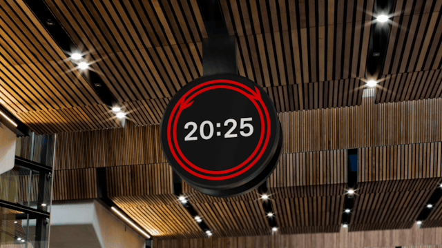
New railway timepiece marks new beginning for Britain’s railway and celebrates 200 years of trains
Today, Network Rail and partners across the Government and railway industry marked the launch of the railway’s first national clock design for over 50 years*, at London Bridge station.www.networkrailmediacentre.co.uk
Wonder if it’ll be as successful as other designs such as the Swiss railway clock which sells across the world as watches and wall clocks?
It's on my list -- current version (with optional date below the HH:mm) is in review with Google at the moment for WearOS.Excellent, good work. One with actual seconds would be good too!

It also refers to Lewisham having been the first station, owing to its proximity to Greenwich. I presume that means Lewisham was the first station to get a 1974 style clock.
I think its referring to Lewisham having the first ever railway clock (pre London Bridge in 1852) I think clocks could keep time on thier own by 1974, rather than being hooked up to GreenwichLondon Bridge station is the perfect location to launch the physical clock as it was home to the second electrically-controlled railway clock in the world, installed in 1852, linked to a master clock at the Royal Observatory in Greenwich.
No. It was the first to get an electrically-controlled clock, back in 1852. Controlled from the Greenwich Observatory..
It also refers to Lewisham having been the first station, owing to its proximity to Greenwich. I presume that means Lewisham was the first station to get a 1974 style clock.


