• Our new ticketing site is now live! Using either this or the original site (both powered by TrainSplit) helps support the running of the forum with every ticket purchase! Find out more and ask any questions/give us feedback in this thread!

New clock unveiled

Mojo

Forum Staff
Staff Member
Administrator
Joined
7 Aug 2005
Messages
21,168
Location
0035
Network Rail have today unveiled a new national clock design with a standalone clock at London Bridge and the design to also appear on digital screens at managed stations
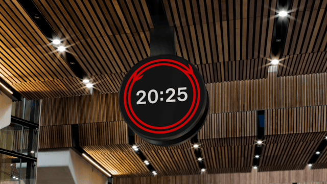
Today, Network Rail and partners across the Government and railway industry marked the launch of the railway’s first national clock design for over 50 years*, at London Bridge station.

The London timepiece by WPP brand design agency Design Bridge and Partners was the winning entry in an international design competition run in a partnership between Network Rail and the Royal Institute of British Architects and the Design Museum.

Selected out of more than 100 entrants, Design Bridge and Partners’ winning piece was chosen as it works as a physical and digital timepiece, while reflecting the design and brand history of the railway and most importantly, make it easy to know what time it is in a busy railway station.

The railway clock has been designed to provide an easy to read and accessible clock that passengers can read on the move, as well as providing a place to meet and help navigate busy stations.

Now created as a huge 1.8m physical clock at London Bridge, the rail clock will also appear in digital form on departure boards across the network, launching across several other Network Rail-managed stations today, including London Waterloo, London Victoria and London Charing Cross station.

Wonder if it’ll be as successful as other designs such as the Swiss railway clock which sells across the world as watches and wall clocks?
 
Sponsor Post - registered members do not see these adverts; click here to register, or click here to log in
R

RailUK Forums

RailWonderer

Established Member
Joined
25 Jul 2018
Messages
2,217
Location
All around the network
I've been an advocate of signature clocks on this forum for a while because they give a sense of grandeur, consistent branding and are easier to read. The railways of Europe, famously SBB, have their Mondaine clock while we only have digital clocks with the exception of some the London terminals and key stations like York.

The BR arrows look a bit randomly placed and the all digital look of it and generic font makes it a bit bland so I can't say I'm a fan. At least we'll get consistent branding for better or for worse. What's suprising is how that managed to beat 99 other submissions - I'd like to see the rest of them, some of those must be better surely.
 

Bletchleyite

Veteran Member
Joined
20 Oct 2014
Messages
112,941
Location
"Marston Vale mafia"
I've been an advocate of signature clocks on this forum for a while because they give a sense of grandeur, consistent branding and are easier to read. The railways of Europe, famously SBB, have their Modaine clock while we only have digital clocks with the exception of some the London terminals and key stations like York.

The BR arrows look a bit randomly placed and the all digital look of it and generic font makes it a bit bland so I can't say I'm a fan. At least we'll get consistent branding for better or for worse.

I am wondering if the bits of arrow are the seconds, i.e. they rotate around the face in opposite directions once a minute and meet at the top on the strike of the minute?

Would be a nice nod to the Swiss clock if they take 57 seconds to go all the way around and pause there for three before the minute ticks over :)
 

takno

Verified Rep - Traksy
Joined
9 Jul 2016
Messages
6,574
It's a very exciting development. It's round to remind old-time people of those old-fashioned clocks, and half the arrows even point clockwise, which is the way the hands used to go. Obviously it doesn't have hands, because that's ridiculous, and it doesn't have seconds because that would suggest you're in a place where accurate timekeeping is valued.

Luckily nobody will be able to read it anyway because the use of a circle means that by the time it's wide enough to have a decent-sized font, it will be too tall to fit on the platform.
 

josh-j

Member
Joined
14 Sep 2013
Messages
319
The arrows do rotate around the face, there is a video here:
https://www.networkrail.co.uk/stories/a-new-timepiece-for-the-railway/
New railway timepiece marks new beginning for Britain’s railway and celebrates 200 years of trains

Takno, I'll jump to the defence of analogue dials here - I think an analogue clock is much nicer as a way of understanding the time at a glance in a lot of ways, but you have to be used to reading it that way (I mean, it's not just looking which number the hands are point to, it's more that it visualises instantly how far through the day and the hour you are).

That said in the context of a timetabled train service digital may well work better.

Anyway while my first reaction was that I'd prefer an analogue dial, I do quite like this. I'm not entirely convinced by how the rotating arrows look but it's a neat touch and will probably help this stand out as a signature design of sorts, which is the whole point after all. What they need to do to achieve that though is roll it out widely, and keep it for several decades without deciding it's time for a refresh every few years.

Overall, I like this a lot :)
 
Last edited:

8ace

Member
Joined
25 Dec 2019
Messages
270
Location
Brighton
The 1.8-metre timepiece takes inspiration from the timeless graphic symbol of the railway: the iconic double arrow logo, created by Gerry Barney in 1965. The double arrow motif is dynamically integrated into the clock face, with its two halves travelling in opposing directions, converging precisely every 30 seconds. This subtle yet powerful visual metaphor speaks to the constant flow and convergence of journeys
 

Mojo

Forum Staff
Staff Member
Administrator
Joined
7 Aug 2005
Messages
21,168
Location
0035
I am wondering if the bits of arrow are the seconds, i.e. they rotate around the face in opposite directions once a minute and meet at the top on the strike of the minute?
Reading the notes at the bottom of the press release they meet up every 30 seconds to display the BR logo (one can only guess at 30 seconds past and on the minute).
 

JonathanH

Veteran Member
Joined
29 May 2011
Messages
23,253
I am wondering if the bits of arrow are the seconds, i.e. they rotate around the face in opposite directions once a minute and meet at the top on the strike of the minute?
Yes, having just seen it in operation, the arrows move in a smooth manner around the edge to meet up at top and bottom.
 

AlterEgo

Verified Rep - Wingin' It! Paul Lucas
Joined
30 Dec 2008
Messages
29,180
Location
LBK
Analogue clocks are on the way out. Many younger people - apparently about a fifth - cannot now tell the time at a glance if it's analogue.

This design is very nice, and most casual users do not need to know how many seconds have elapsed. Power users will get used to it in time.
 

LNW-GW Joint

Veteran Member
Joined
22 Feb 2011
Messages
21,897
Location
Mold, Clwyd
I am wondering if the bits of arrow are the seconds, i.e. they rotate around the face in opposite directions once a minute and meet at the top on the strike of the minute?
Would be a nice nod to the Swiss clock if they take 57 seconds to go all the way around and pause there for three before the minute ticks over :)
I came across this SNCF digital clock at Toulouse a couple of years ago.
I thought it was quite smart, and included a sweep seconds display.
No specific branding, though.

vid2 toulouse clock_22.jpgvid2 toulouse clock_42.jpgvid2 toulouse clock_50.jpg
 

Electrostar

Member
Joined
18 May 2009
Messages
315
The video features the clock face on a watch but there’s no suggestion in the press release that it will be available to download to smart watches.
 

takno

Verified Rep - Traksy
Joined
9 Jul 2016
Messages
6,574
Reading the notes at the bottom of the press release they meet up every 30 seconds to display the BR logo (one can only guess at 30 seconds past and on the minute).

The arrows do rotate around the face, there is a video here:
https://www.networkrail.co.uk/stories/a-new-timepiece-for-the-railway/


Takno, I'll jump to the defence of analogue dials here - I think an analogue clock is much nicer as a way of understanding the time at a glance in a lot of ways, but you have to be used to reading it that way (I mean, it's not just looking which number the hands are point to, it's more that it visualises instantly how far through the day and the hour you are).

That said in the context of a timetabled train service digital may well work better.

Anyway while my first reaction was that I'd prefer an analogue dial, I do quite like this. I'm not entirely convinced by how the rotating arrows look but it's a neat touch and will probably help this stand out as a signature design of sorts, which is the whole point after all. What they need to do to achieve that though is roll it out widely, and keep it for several decades without deciding it's time for a refresh every few years.

Overall, I like this a lot :)
I was being sarcastic. Mostly I'm irritated that they've chosen to lose a piece of important rectangular information (the digital time) in the middle of a massive double-bordered circle, which hugely decreases the font size they can use for any given space. Apart from paying some kind of weird homage to a way of telling the time which they have opted not use, there is really no benefit to using a circle at all.

To read the seconds you'll need to both know and be able to read analogue time anyway, and be able to identify that that's what one of the arrows is doing, whilst also knowing to ignore the other arrow. You'll also need to know which part of the arrow is actually the pointer. It's like a weird bit of insider knowledge designed to make the railways a bit less accessible to casual users or visitors.

I'm also worried about how awful this is going to look at various people to try roll it out on displays that have less than about 500 pixels available to it, which is bound to happen. Stick this in the corner of a normal departure board and it will look like an absolute dog's breakfast.
 

tbtc

Veteran Member
Joined
16 Dec 2008
Messages
18,051
Location
Reston City Centre
I read the negative comments on here before I clicked on the article and video, but I like it

It's really simple, quick to understand, a clear font, only straightforward eye-catching colours (without being "trendy" with splashes of pink/ orange/ turquoise or unnecessary distractions)

The arrows meet every thirty seconds, giving a dynamic image, moving quickly around parallel lines, recreating the old BR image without looking "quaint" and dated

A number of people struggle with analogue clocks, so that has to be born in mind

The seconds aren't intrusive but easily noticeable (since those who need to see them will do, but they don't get in the way of easily reading the hours and minutes - not everyone is looking for the same degree of information as you)

Would work reasonably well on a large scale at a large station but also on something as small as the face of a smart watch

And, you can just glance at it without needing to process the data
 

Sorcerer

Established Member
Joined
20 May 2022
Messages
2,043
Location
Liverpool
I think it's nice that the railway has it's own clock to coincide with nationalisation. It helps build a brand image and isn't too unlike SBB having their own signature Mondaine clock (of which I actually have a watch). My primary gripe is the colour scheme. Even though it'd be nice to have an analogue clock I can live with it being digital, but the red and black doesn't feel on brand with the red, white and blue of the Great British Railways, so it sort of feels out of place while SBB's clock is white with black frame and hands and the red second finger, very in line with SBB's federal livery. Not bothered about the lack of seconds though because our timetable isn't so strictly timed like the Japanese one.
 

Horizon22

Established Member
Associate Staff
Jobs & Careers
Joined
8 Sep 2019
Messages
10,942
Location
London
I don’t mind it - besides not showing seconds - but it isn’t exactly groundbreaking in any way. Looks like a perfectly adequate digital clock.
 

Leyland Bus

Member
Joined
20 May 2021
Messages
1,163
Location
York
Honestly, i've never known so much naysaying over a clock before, it's what I imagine a Reform convension to be like :lol: It's also quite interesting how many folk read the time as 13:30:56, i've never had anyone tell me the time so intrinsically...
I think it's nice that the railway has it's own clock to coincide with nationalisation. It helps build a brand image and isn't too unlike SBB having their own signature Mondaine clock (of which I actually have a watch). My primary gripe is the colour scheme. Even though it'd be nice to have an analogue clock I can live with it being digital, but the red and black doesn't feel on brand with the red, white and blue of the Great British Railways, so it sort of feels out of place while SBB's clock is white with black frame and hands and the red second finger, very in line with SBB's federal livery. Not bothered about the lack of seconds though because our timetable isn't so strictly timed like the Japanese one.
GBR doesn't exist yet, let alone have a "brand" and that style of clock in red, white and blue would most likely be unreadable...

Personally, it's functional, stylish and a nice change from having just a boggo "clock"... I want one! :lol:
 

takno

Verified Rep - Traksy
Joined
9 Jul 2016
Messages
6,574
Personally, it's functional, stylish and a nice change from having just a boggo "clock"... I want one! :lol:
And you can have one when it's released as an Android watch-face.

It's not ugly, it's just not really as functional as it needs to be.
 

Sorcerer

Established Member
Joined
20 May 2022
Messages
2,043
Location
Liverpool
GBR doesn't exist yet, let alone have a "brand" and that style of clock in red, white and blue would most likely be unreadable...
But at the moment it seems very clear that Great British Railways will utilise a red, white and blue colour scheme as part of it's branding. It would also be far from unreadable to use those colours on a clock as long as they're contrasting enough. I did a quick edit and managed to actually integrate the future GBR branding colours into the new timepiece without actually changing the design, and I actually believe it looks even better (others are welcome to disagree). It's not always going to translate this well in different weather and lighting conditions of course, but it's far from unreadable.

1760624195559.png
 

Prime586

Member
Joined
26 May 2023
Messages
286
Location
Knowsley
I was being sarcastic. Mostly I'm irritated that they've chosen to lose a piece of important rectangular information (the digital time) in the middle of a massive double-bordered circle, which hugely decreases the font size they can use for any given space. Apart from paying some kind of weird homage to a way of telling the time which they have opted not use, there is really no benefit to using a circle at all.

To read the seconds you'll need to both know and be able to read analogue time anyway, and be able to identify that that's what one of the arrows is doing, whilst also knowing to ignore the other arrow. You'll also need to know which part of the arrow is actually the pointer. It's like a weird bit of insider knowledge designed to make the railways a bit less accessible to casual users or visitors.

I'm also worried about how awful this is going to look at various people to try roll it out on displays that have less than about 500 pixels available to it, which is bound to happen. Stick this in the corner of a normal departure board and it will look like an absolute dog's breakfast.
For the standalone version shown in the video, going with a round face to have the animation running around the edge also means having to get custom-made round LED matrix display modules made (standard LED matrix modules are either square or rectangular), and then at least 50% of the screen area of that custom-made matrix will never be used.
 
Joined
28 Nov 2021
Messages
372
Location
Leith
The NR press release (linked in post #01) says that the new design is going to appear "in digital form on departure boards across the network". That means it's going to appear alongside departure information written in digital format. In that kind of situation, showing the time in the same format seems helpful. Whether it's an appropriate design for external clocks is another question - I'm trying to erase from my mind's eye an unwanted image of the Balmoral (ex-North British) Hotel above Waverley with four of these on its tower (even if adjusted to the traditional five minutes fast)...
 

zwk500

Veteran Member
Joined
20 Jan 2020
Messages
18,401
Location
Northampton
But at the moment it seems very clear that Great British Railways will utilise a red, white and blue colour scheme as part of it's branding. It would also be far from unreadable to use those colours on a clock as long as they're contrasting enough. I did a quick edit and managed to actually integrate the future GBR branding colours into the new timepiece without actually changing the design, and I actually believe it looks even better (others are welcome to disagree). It's not always going to translate this well in different weather and lighting conditions of course, but it's far from unreadable.

View attachment 190502
TO me, those colours make the arrows for the seconds much less distinct, and if doing that I'd say it would be better to just have a static logo. Which would be totally fine for an external clock.
 

xotGD

Established Member
Joined
4 Feb 2017
Messages
7,804
Excellent. I love it. I want the app on my phone.

Let's hope we get some installed in Leeds asap to admire.
 

kkong

Member
Joined
8 Sep 2008
Messages
1,126
The video features the clock face on a watch but there’s no suggestion in the press release that it will be available to download to smart watches.

The article says:
Rail Clock can also be adapted for use in any digital format, from phones to smart watches. Developed in partnership with professional services company Cognizant, the clock will be made available to the public as a watchface via the Android app stores in the coming months.
 

The exile

Established Member
Joined
31 Mar 2010
Messages
9,307
Location
Somerset
Honestly, i've never known so much naysaying over a clock before, it's what I imagine a Reform convension to be like :lol: It's also quite interesting how many folk read the time as 13:30:56, i've never had anyone tell me the time so intrinsically
One of the few places where it is useful is at a railway station. Where “doors may be locked up to 40seconds before departure” and you’re hurrying (not running!) for the 12.30, it makes a difference whether it is now 12.28.01 or 12.28.59! Left up to me, I would go for a big analogue clock (with second hand) on concourses (where people are likely to be glancing at it from a distance) but digital ones on platforms.
 

Top