• Our new ticketing site is now live! Using either this or the original site (both powered by TrainSplit) helps support the running of the forum with every ticket purchase! Find out more and ask any questions/give us feedback in this thread!

Network SouthEast branding still in daily use?

Status
Not open for further replies.
Sponsor Post - registered members do not see these adverts; click here to register, or click here to log in
R

RailUK Forums

Eagle

Established Member
Joined
20 Feb 2011
Messages
7,106
Location
Leamingrad / Blanfrancisco
Good going, but to be honest I find this attempt a lot better.

That livery's so good-looking it's almost turned me pro-renationalization. :P
--- old post above --- --- new post below ---
To be fair, that is excellent, but he didn't attempt to deal with the door issue !

Again (and I know you'll disagree with this) the most contrastive option is probably to have red doors, with a small buffer area of white to separate it from the blue.

All-white doors might not work enough, being as the livery has quite a lot of white on it.
 

yorksrob

Veteran Member
Joined
6 Aug 2009
Messages
44,432
Location
Yorks
Again (and I know you'll disagree with this) the most contrastive option is probably to have red doors, with a small buffer area of white to separate it from the blue.

All-white doors might not work enough, being as the livery has quite a lot of white on it.

I think we'll have to agree to disagree ! I sort of agree your point because liveries with too much white tend to be horrible - but I think that with toothpaste, the white stripe is narrow enough not to be a problem.
 

Muzer

Established Member
Joined
3 Feb 2012
Messages
2,784
I can't see that particular livery working (ie looking good) with contrasting doors, as good as it looks without.

(My position on contrasting doors are that many liveries are improved by them - but I don't think that's one of them).
 

transmanche

Established Member
Joined
27 Feb 2011
Messages
6,021
(My position on contrasting doors are that many liveries are improved by them - but I don't think that's one of them).
Yep, liveries with stripes (and that means BR's InterCity/NSE/Regional liveries) are always going to be difficult to find a suitable contrasting colour for the door whilst still having an attractive livery.

I think that designs such as SWT red, SWT blue and LM have shown how the doors can be highlighted well, without ruining the overall effect.
 

Muzer

Established Member
Joined
3 Feb 2012
Messages
2,784
I'd add SWT white to that list. And I'm sure plenty of others, but my mind has suddenly drawn a blank now I'm trying to think of train liveries ;)

In general (again, just my opinion, this is very subjective!) I find more "flowing" liveries to often look better with contrasting doors, as it breaks the flow anyway when they try to flow "through" the doors - so isn't it better to make it look intentional? More flat/angular/straight liveries like the NSE one will therefore never quite look as good in my opinion.
 

transmanche

Established Member
Joined
27 Feb 2011
Messages
6,021
I'd add SWT white to that list.
I left that one out, as they haven't done anything special around the doors!

In general (again, just my opinion, this is very subjective!) I find more "flowing" liveries to often look better with contrasting doors, as it breaks the flow anyway when they try to flow "through" the doors - so isn't it better to make it look intentional? More flat/angular/straight liveries like the NSE one will therefore never quite look as good in my opinion.
I think you're right there.

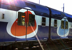
I also like liveries where they've tried to do something a bit different for highlighting the doors. Such as this SNCF Transilien livery:


Transilien SNCF, Orry la ville by blafond, on Flickr

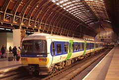
Or the Thames Trains 'standard'...

165005 at Paddington by R~P~M, on Flickr

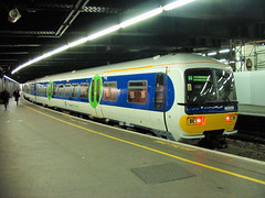
... and 'express' liveries:

166214 London Paddington by RyanTaylor1986, on Flickr
 

Bungle73

On Moderation
Joined
19 Aug 2011
Messages
3,216
Location
Kent
This isn't quite what was asked for, but I noticed this evening that one of the old CRT screens at Chatham has "British Rail Computing" on it.
 
Status
Not open for further replies.

Top