• Our new ticketing site is now live! Using either this or the original site (both powered by TrainSplit) helps support the running of the forum with every ticket purchase! Find out more and ask any questions/give us feedback in this thread!

Mis-spelt station name on SET!

Status
Not open for further replies.

blakey1152

Member
Joined
5 Sep 2011
Messages
461
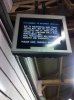
While coming back from the Rail Fare Workshop...Saw this great mis-spelt sign at Waterloo East....

Ramsgaste :)

Chris
 

Attachments

  • ramsgaste.jpg
    ramsgaste.jpg
    97.9 KB · Views: 281
Sponsor Post - registered members do not see these adverts; click here to register, or click here to log in
R

RailUK Forums

142094

Established Member
Joined
7 Nov 2009
Messages
8,789
Location
Newcastle
Railway Eye would love to see that!

Was at a branch of Santander yesterday, and one of the tills was out of order. Notice on the front read:

This till is closed due to fault

Awaiting engineer

Sorry for the inconvience

Always amazes me how many people can't spell inconvenience correctly..
 

LE Greys

Established Member
Joined
6 Mar 2010
Messages
5,389
Location
Hitchin
Won't be the first time this has happened in Kent.
http://news.bbc.co.uk/1/hi/england/kent/4174057.stm

This is what happens when you let private operators re-brand stations with their own signage. Instead, Network Rail should provide uniform system wide station signage.

I keep forgetting that Folkestone has two "E"s in it as well. So does the spelling checker on Foxbat, which just told me that it should be "Folkstone".

The other thing of course is that so many signs are so small that you cannot read them anyway, however they are spelt.
 

craigwilson

Member
Joined
3 Jan 2010
Messages
424
Location
Buxton, Derbyshire
The other thing of course is that so many signs are so small that you cannot read them anyway, however they are spelt.

The ones that I struggle to read sometimes (especially from a passing train, or in the dark) are the London Midland ones. White on black is not the best combo for these types of signs, especially in the font they use.
 

Schnellzug

Established Member
Joined
22 Aug 2011
Messages
2,926
Location
Evercreech Junction
The ones that I struggle to read sometimes (especially from a passing train, or in the dark) are the London Midland ones. White on black is not the best combo for these types of signs, especially in the font they use.

I think I'd beg to differ. Personally I think white on black (or white on any dark background) is much clearer than the traditional black on white. It's a different story if you're looking at a website that uses white on a dark background, which makes your eyes go funny, but for signs I do think it's an improvement.
 

Barn

Established Member
Joined
3 Sep 2008
Messages
1,487
Ah yes, yet further proof that the railways should be run by the State.


:roll:

Of course, South Eastern Trains (predecessor of Southeastern) WERE being run by the state when they messed up that sign. :D


craigwilson

Member
Joined
3 Jan 2010
Messages
424
Location
Buxton, Derbyshire
I think I'd beg to differ. Personally I think white on black (or white on any dark background) is much clearer than the traditional black on white. It's a different story if you're looking at a website that uses white on a dark background, which makes your eyes go funny, but for signs I do think it's an improvement.


Maybe it's the font they use - maybe if the lettering was a bit thicker it'd be easier.
 

LE Greys

Established Member
Joined
6 Mar 2010
Messages
5,389
Location
Hitchin
Maybe it's the font they use - maybe if the lettering was a bit thicker it'd be easier.

I think it's just a matter of size. The old SR "target" signs for instance had font of a similar size to Underground signs, nice and easy to read. The BR totems were slightly smaller, and the corporate/NSE signs were about the same, but NSE compensated by having big Welcome to XXXXXXXX boards at either end of the platform in some places. Southern has now shrunk their lettering to half the size of the BR signs. Not nice of them.

As for the other companies, just go to any preserved line to see lettering six inches high. Not sure what the current standard is, but it's a lot less than that.
 

TheJRB

Established Member
Joined
14 Feb 2011
Messages
1,208
Location
Ashford, Kent
I think it's just a matter of size. The old SR "target" signs for instance had font of a similar size to Underground signs, nice and easy to read. The BR totems were slightly smaller, and the corporate/NSE signs were about the same, but NSE compensated by having big Welcome to XXXXXXXX boards at either end of the platform in some places. Southern has now shrunk their lettering to half the size of the BR signs. Not nice of them.

As for the other companies, just go to any preserved line to see lettering six inches high. Not sure what the current standard is, but it's a lot less than that.

The Eurostar signs at Ashford use a noticeably larger font than the Southeastern signs (I took this photo which shows one) and also use a good colour scheme that makes it easy to read.
 

pendolino

Member
Joined
22 Nov 2010
Messages
737
The ones that I struggle to read sometimes (especially from a passing train, or in the dark) are the London Midland ones. White on black is not the best combo for these types of signs, especially in the font they use.

I agree with that - at night they're terrible.

Meanwhile, at Ashurst (New Forest) a sign on platform 2 advises passengers to cross to platform 1 for trains to Eastliegh (sic).
 

jon0844

Veteran Member
Joined
1 Feb 2009
Messages
30,920
Location
UK
Can't a train operator, or Network Rail, consider placing station signs somewhere near lights - and in a position that said lights will light up the sign? Or, perhaps investing in illuminated signs (hint: LED + solar panels = nicely lit signs with no wiring required - most would only need to be lit from dusk until 1-2am).

Also, with most platforms having trains stopping in known locations, would it be that hard to place signs at least somewhere near the doors, to give people at least a fighting chance of knowing where they are at night on trains that have no announcements?

I've been asked numerous times where we are, and if I haven't been looking myself, even I can take a few seconds to recognise where we actually are for some poor traveller who isn't sure. It's pretty bad when you can get off at some stations and still not know until you walk a bit and pass an almost invisible sign!
 

brad465

Veteran Member
Joined
11 Aug 2010
Messages
11,513
Location
Taunton or Kent
Of course, South Eastern Trains (predecessor of Southeastern) WERE being run by the state when they messed up that sign. :D


Maybe that would be a good excuse for the messup, they knew that they were not going to run for ages so they were pretty relaxed on ensuring certain factors were in order.
 
Status
Not open for further replies.

Top