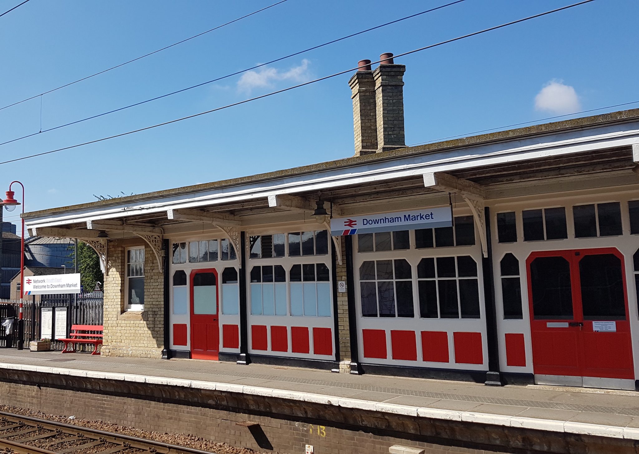
Oh, that MDTR (Modern Dynamic Thrusting Railway) we were promised 25 years ago... We're still waiting.
The railway certainly
looks vastly better than it did in the 1980s. It's fragmented, but most of the branding genuinely looks good, modern, colourful, attractive etc. Blue and grey, and black on white signage, doesn't. It just looks drab and boring. Crikey, even most road signs aren't black on white.
You're as guilty as those wanting to go back to BR, but the opposite - everything BR was bad. It's somewhere between, and one of the things BR got right was things like signage
Disagree, it was drab. Heathrow, for example, had been using the black on yellow for a good while - bright, attractive and still readable. London Underground uses blue on white with line highlighting and other colour such as the roundel.
and, equally importantly, being consistent with it.
I agree about consistency, but it can be consistent and look good. The LM branding was done to an absolute "T" - always consistent, always clean, always attractive. LNR looks mediocre and amateur in comparison, for instance - but it is still better than simple, boring black on white.
Here we go... Get Best Impressions in, presumably to re-hash the same old ideas that they've been doing time after time for the last 20+ years. As long as it has Grammer seats and Best Impressions squiggles on it, you're happy.

Best Impressions haven't done everything right (I don't for instance like the VTEC branding package, particularly the livery, I think VTWC looked better*), but the entire London Midland marketing package was an absolute masterstroke, making a boring commuter railway with a low-cost operation on the side look really attractive. It's that sort of thing we need, not just making it look like the 1970s which was interesting for enthusiasts (because of the variety of diesel locomotives pulling window-leanable Mk1s and Mk2s) but down-at-heel and drab to everyone else.
And yes, I would hope for Grammer seating but am conscious that that is personal opinion. But what looks better, a knackered old 319 in tatty, debranded Thameslink livery and torn Thameslink interior, or how Northern have spruced them up to the point of looking brand-new?
* It's interesting that VTWC's in house designer then went on to do the LNR brand package, which to me is markedly inferior. I wonder if Virgin Group's standards and design briefs were better, or at least better managed?