• Our new ticketing site is now live! Using either this or the original site (both powered by TrainSplit) helps support the running of the forum with every ticket purchase! Find out more and ask any questions/give us feedback in this thread!

Gradients

Would you find it useful?

  • Yes

    Votes: 7 58.3%
  • No

    Votes: 5 41.7%

  • Total voters
    12
  • Poll closed .
Status
Not open for further replies.

Legolash2o

Member
Joined
27 Sep 2018
Messages
687
Hello,

Recently I put in a FOI request for the gradient change locations and they kindly gave me the data.

Would anyone find it useful if I gave public access to an interactive map? It's not designed to be super user friendly and thought other users may find it helpful.

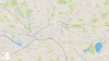
Attached is a screenshot zoomed in near Manchester Victoria.
 

Attachments
  • Gradients.png
    Gradients.png
    1.5 MB · Views: 164
  • GradientsUK.png
    GradientsUK.png
    771.4 KB · Views: 153
Last edited:
Sponsor Post - registered members do not see these adverts; click here to register, or click here to log in
R

RailUK Forums

AndrewE

Established Member
Joined
9 Nov 2015
Messages
7,335
Interesting, but I don't understand "Downhill!" In which direction? It's uphill in the other direction...
 

Tomnick

Established Member
Joined
10 Jun 2005
Messages
5,933
It's a fascinating resource - thanks for sharing. I'd echo AndrewE's comment though - is there any way that the data could be separated in the "downhill" direction in the same way that it is for "uphill"? I guess, from what I can see, that it's all relative to the Down direction, so a second range of colours might be useful but maybe not necessarily helpful for the average user.
 

Legolash2o

Member
Joined
27 Sep 2018
Messages
687
Each line has arrows indicating the direction of the train if it was going in the same direction as the arrows. You can also click on the lines to see the 1 in XX or -XX.

I can add more colours for the downhill. The only reason I didn't is because I struggled to think of enough colours.

I have a map for speeds as well but that's difficult as hell to read. The data I received doesn't indicate direction properly. Do /Speeds instead of /Gradients.
 
Last edited:

Legolash2o

Member
Joined
27 Sep 2018
Messages
687
I've added more colours and made the arrows stand out a bit more.

Not sure what other types of maps people will find interesting?
 

snowball

Established Member
Joined
4 Mar 2013
Messages
8,144
Location
Leeds
Thank you for doing this.

I suggest removing the up/down distinction and just having one set of colours for steepness, plus the arrows to show which way the gradient is.
 

Legolash2o

Member
Joined
27 Sep 2018
Messages
687
No problem. I'll think about removing the up/down distinction but will keep the colours and arrows.

Would it be worth for me to publish an electrification one? I try to keep up with the electrified threads but they are also on OpenStreetMap.

There's one for loading gauges too but that's also available from NESA, took nearly a full year to go through all that to map it.
 
Last edited:

alistairlees

Established Member
Joined
29 Dec 2016
Messages
4,396
No problem. I'll think about removing the up/down distinction but will keep the colours and arrows.

Would it be worth for me to publish an electrification one? I try to keep up with the electrified threads but they are also on OpenStreetMap.

There's one for loading gauges too but that's also available from NESA, took nearly a full year to go through all that to map it.
This is a very useful resource, thank you for doing it.
As others have said, it could be much improved (and simplified) by simply having "gradient" without any distinction of direction; this is supplied by the arrows.
If I may suggest, the colour gradients also need looking at; the darkest colours should be for the steepest gradients and the lightest for the least steep / entirely flat. Having black for "level" breaks that and makes it difficult visually; "level" should be white, though I appreciate that may not work easily on the background you have chosen to use. The whole point is (I assume) to draw the eye to the most severe / challenging gradients.
 

Harbornite

Established Member
Joined
7 May 2016
Messages
3,627
Not seen anything like it before (gradient profile maps aside), thanks for sharing
 

Legolash2o

Member
Joined
27 Sep 2018
Messages
687
This is a very useful resource, thank you for doing it.
As others have said, it could be much improved (and simplified) by simply having "gradient" without any distinction of direction; this is supplied by the arrows.
If I may suggest, the colour gradients also need looking at; the darkest colours should be for the steepest gradients and the lightest for the least steep / entirely flat. Having black for "level" breaks that and makes it difficult visually; "level" should be white, though I appreciate that may not work easily on the background you have chosen to use. The whole point is (I assume) to draw the eye to the most severe / challenging gradients.
I removed the down and up words but will have to think about what colours to use.

Not seen anything like it before (gradient profile maps aside), thanks for sharing
No problem. I'm working on a version that uses the tracks rather than straight lines which will hopefully make it better.
 
Last edited:
Status
Not open for further replies.

Top